Progarchives.com has always (since 2002) relied on banners ads to cover web hosting fees and all.
Please consider supporting us by giving monthly PayPal donations and help keep PA fast-loading and ad-free forever.
/PAlogo_v2.gif "Progarchives.com Homepage") |
|
Post Reply 
|
Page <12345> |
| Author | ||
darksideof 
Forum Senior Member 

Joined: February 22 2007 Location: Newark N.J. Status: Offline Points: 2318 |
 Posted: October 12 2010 at 21:50 Posted: October 12 2010 at 21:50 |
|
 thanks! thanks! |
||
|
http://darksideofcollages.blogspot.com/
http://www.metalmusicarchives.com/ https://www.facebook.com/pages/Darksideof-Collages/ |
||
 |
||
|
Finnforest
Special Collaborator 
Honorary Collaborator Joined: February 03 2007 Location: . Status: Offline Points: 16913 |
Posted: October 12 2010 at 21:51 |
|
You're probably right that in a week we'll all be used to it and it'll be weird to change it back |
||
|
|
||
|
||
|
darksideof
Forum Senior Member
Joined: February 22 2007 Location: Newark N.J. Status: Offline Points: 2318 |
Posted: October 12 2010 at 21:57 |
|
T H A N K Y O U ! |
||
|
http://darksideofcollages.blogspot.com/
http://www.metalmusicarchives.com/ https://www.facebook.com/pages/Darksideof-Collages/ |
||
|
||
|
darksideof
Forum Senior Member
Joined: February 22 2007 Location: Newark N.J. Status: Offline Points: 2318 |
Posted: October 12 2010 at 22:04 |
|
Thanks a lot man! I appreciated your comments. I am not really. I don't mind criticism as long there aren't negative. It is fine. Everyone are entitled to it, However I am aware that everyone won't be please and go crazy about my collages that is fine!.  we all are not alike and we all don't like the same Art, but it is Max who has the last voice here and I am guessing that he is happy with it because he put it in. I did several versions of headers and banner but he is the one who made the last decision.
Edited by darksideof - October 12 2010 at 22:25 |
||
|
http://darksideofcollages.blogspot.com/
http://www.metalmusicarchives.com/ https://www.facebook.com/pages/Darksideof-Collages/ |
||
|
||
|
Triceratopsoil
Forum Senior Member

Joined: April 03 2010 Location: Canada Status: Offline Points: 17995 |
Posted: October 12 2010 at 22:07 |
|
|
No offense, but the new banner makes me glad that I have the forums bookmarked and not the frontpage
|
||
|
||
|
Conor Fynes
Prog Reviewer 
Joined: February 11 2009 Location: Vancouver, CA Status: Offline Points: 3196 |
Posted: October 12 2010 at 22:08 |
|
|
The collage itself is well done, but it's way too much for a logo. The old logo fit into the rest of the page perfectly... The forum logo also shouldn't have been changed however many months ago.. |
||
|
||
|
darksideof
Forum Senior Member
Joined: February 22 2007 Location: Newark N.J. Status: Offline Points: 2318 |
Posted: October 12 2010 at 22:22 |
|
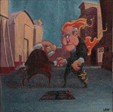
Well Henry that is fine! Like I said earlier in a comment. I am not hopping that everyone will like the collages and I am not expecting it either. that is fine that don't like them or find them pretty ugly. that is fine they are so many pretty popular artist that I find their work pretty ugly as well, however my voice won't make them change their mind of how to satisfy my taste or the type of art work I like. Art is free and words! and complex in my eyes specially when it is made for Prog music in mind. When I listen to Tangerine Dream, Gong,Vdgg, Genesis, Pink FLoyd, DT, PT, Ozric Tentacles, Opeth, Yes, Area, Henry Cow, ELP, Frank Zappa, etc. etc, etc, There aren't much of anything simple in the sound that there bands created it to my ears. When I create these collage I have that in mind vividly! these complex, psychedelics sounds and of course the albums covers themselves are a great influence. ( Roger Dean and Storm are all time fav) it isn't that I don't care what prog fans might think about my collages, but what really matter is how satisfy I am with them. If I listen to everyone comments all the time. It won't be my imagination that will create them but only everyone else comments and ideas. sorry ! Wikipedia: Art is the product or process of deliberately arranging symbolic elements in a way that influences and affects the senses, emotions, and/or intellect. It encompasses a diverse range of human activities, creations, and modes of expression. A collage (From the French: coller, to glue) is a work of formal art, primarily in the visual arts, made from an assemblage of different forms, thus creating a new whole.The material used in a college can be both original and borrowed, and the medium is limited only by the imagination of the artist.
Edited by darksideof - October 12 2010 at 22:49 |
||
|
http://darksideofcollages.blogspot.com/
http://www.metalmusicarchives.com/ https://www.facebook.com/pages/Darksideof-Collages/ |
||
|
||
|
spookytooth
Forum Senior Member

Joined: April 06 2008 Location: Atlanta, Ga Status: Offline Points: 438 |
Posted: October 12 2010 at 22:45 |
|
|
I have to say...it looks fantastic.
|
||
 Would you like some Bailey's? |
||
|
||
|
Stooge
Forum Senior Member

Joined: April 09 2009 Location: Toronto, Canada Status: Offline Points: 1003 |
Posted: October 12 2010 at 23:45 |
|
|
I actually like the look of the main page (the header). I don't find it all that distracting, but my memory is so bad that I'm having a hard time visualizing what it looked like before.
Edited by Stooge - October 12 2010 at 23:45 |
||
|
||
|
Evolutionary Sleeper
Special Collaborator
Honorary Collaborator Joined: December 30 2008 Location: Berkeley, CA Status: Offline Points: 7037 |
Posted: October 12 2010 at 23:50 |
|
|
Well, I for one like it.
|
||

|
||
|
||
|
A Person
Forum Senior Member
Joined: November 10 2008 Location: __ Status: Offline Points: 65760 |
Posted: October 12 2010 at 23:55 |
|
I sometimes have the same problem when someone changes their avatar, for some reason I can't remember the old one at all. |
||
|
||
|
mourningknight
Forum Senior Member
Joined: October 20 2007 Location: United States Status: Offline Points: 203 |
Posted: October 13 2010 at 00:13 |
|
|
I think the new header is very cool and adds a touch of class to the site. I love it. Great job Abel!
|
||

|
||
|
||
|
Rosebud
Forum Newbie 

Joined: October 05 2010 Status: Offline Points: 6 |
Posted: October 13 2010 at 00:18 |
|
|
I think the banner is sick! The old one was getting a little stale (new on forums, been coming to this site forever)
|
||
|
||
|
Viajero Astral
Forum Senior Member
Joined: January 16 2006 Location: Mexico Status: Offline Points: 3118 |
Posted: October 13 2010 at 00:42 |
|
Sounds like a good idea for a contest to me, like this blog, they had made contest or invite designer to make new headers so every time you enter you will see a diferent one. Edited by Viajero Astral - October 13 2010 at 00:44 |
||

|
||
|
||
|
progkidjoel
Prog Reviewer
Joined: March 02 2009 Location: Australia Status: Offline Points: 19643 |
Posted: October 13 2010 at 01:51 |
|
|
I actually thought it looked awesome, like all of Abel's work. It's one of those ones that you can take for face value and enjoy with a half a second look or stare into for 10 minutes and still notice new stuff. Really loving it.
|
||

|
||
|
||
|
someone_else
Forum Senior Member
VIP Member Joined: May 02 2008 Location: Going Bananas Status: Offline Points: 23994 |
Posted: October 13 2010 at 02:44 |
|
|
Being a rather conservative person, I'm not too often to be found among the ones who cheer loudly because of a change. But this one is quite an improvement. I like it for its colourfulness.
Edited by someone_else - October 13 2010 at 02:47 |
||
|
||
|
||
|
Easy Livin
Special Collaborator
Honorary Collaborator / Retired Admin Joined: February 21 2004 Location: Scotland Status: Offline Points: 15585 |
Posted: October 13 2010 at 02:55 |
|
|
I like it, it brightens things up on the home page. Will it be used for the forum too M@x?
|
||
|
||
|
Dean
Special Collaborator
Retired Admin and Amateur Layabout Joined: May 13 2007 Location: Europe Status: Offline Points: 37575 |
Posted: October 13 2010 at 03:02 |
|
Edited by Dean - October 13 2010 at 03:02 |
||
|
What?
|
||
|
||
|
Sean Trane
Special Collaborator
Prog Folk Joined: April 29 2004 Location: Heart of Europe Status: Offline Points: 19612 |
Posted: October 13 2010 at 04:49 |
|
|
This'new design" hit me in the eye right away and I wondered why an add had replaced the logo and headlining band.... until I saw that the logo was still there....
It actually clashes (a bit) with the purple and orange colours of the site
It plays to much on the prog D&D clichés for its own good... Im not sure it's good for the prog cause...
I guess I'll get used to it. Edited by Sean Trane - October 13 2010 at 04:51 |
||
|
let's just stay above the moral melee
prefer the sink to the gutter keep our sand-castle virtues content to be a doer as well as a thinker, prefer lifting our pen rather than un-sheath our sword |
||
|
||
|
Snow Dog
Special Collaborator
Honorary Collaborator Joined: March 23 2005 Location: Caerdydd Status: Offline Points: 32995 |
Posted: October 13 2010 at 04:58 |
|
|
Seems I'm not so alone in my views.
|
||

|
||
|
||
|
Post Reply
|
Page <12345> |
| Forum Jump | Forum Permissions You cannot post new topics in this forum You cannot reply to topics in this forum You cannot delete your posts in this forum You cannot edit your posts in this forum You cannot create polls in this forum You cannot vote in polls in this forum |


 New site header design, thanks to ABEL ADAMES
 Topic Options
 Slartibartfast wrote:
