| Author |
 Topic Search Topic Search  Topic Options Topic Options
|
Mellotron Storm 
Prog Reviewer

Joined: August 27 2006
Location: The Beach
Status: Offline
Points: 12903
|
 Posted: March 07 2013 at 15:28 Posted: March 07 2013 at 15:28 |
I'm a big fan of botht he Corvus Stone and latest Glass Hammer covers. Both have that dark, haunting and mysterious vibe to them. 
|
|
"The wind is slowly tearing her apart"
"Sad Rain" ANEKDOTEN
|
 |
The Bearded Bard
Special Collaborator

Honorary Collaborator
Joined: January 24 2012
Location: Behind the Sun
Status: Offline
Points: 12859
|
Posted: March 08 2013 at 12:27 |
|
|
|
|
|
jude111
Forum Senior Member

Joined: October 20 2009
Location: Not Here
Status: Offline
Points: 1725
|
Posted: March 08 2013 at 22:38 |
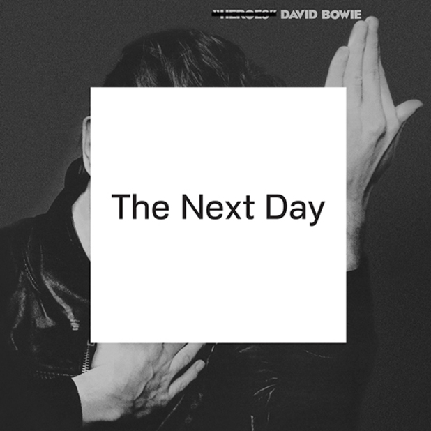
I don't think any album cover from the past year garnered more attention than this one, and for good reason:
|
|
jude111
Forum Senior Member
Joined: October 20 2009
Location: Not Here
Status: Offline
Points: 1725
|
Posted: March 08 2013 at 22:43 |
 akamaisondufromage wrote: akamaisondufromage wrote:
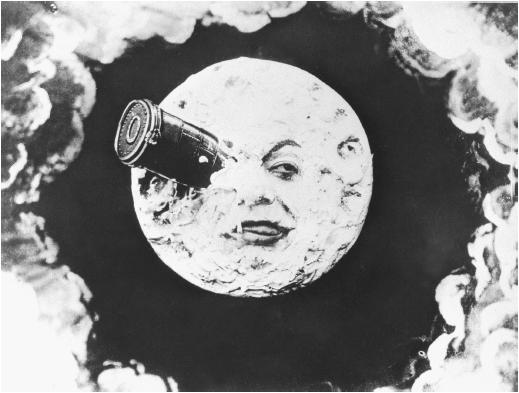
I don't like THe Raven it just reminds me of The Scream and I just think its another in a long line... |
I think it's great. It reminds me of Méliès' Le voyage dans la lune:
Edited by jude111 - March 08 2013 at 22:50
|
|
infocat
Forum Senior Member

VIP Member
Joined: June 10 2011
Location: Colorado, USA
Status: Offline
Points: 4671
|
Posted: March 08 2013 at 22:55 |
jude111 wrote:
I don't think any album cover from the past year garnered more attention than this one, and for good reason:
|
God is that one lame. I still can't believe its not just a joke!
|
|
--
Frank Swarbrick
Belief is not Truth.
|
|
jude111
Forum Senior Member
Joined: October 20 2009
Location: Not Here
Status: Offline
Points: 1725
|
Posted: March 08 2013 at 23:03 |
infocat wrote:
God is that one lame. I still can't believe its not just a joke! |
Not many in the press agreed. When the image of the album was made public, the web was abuzz. No other album cover generated as much discussion and dialogue:
London Guardian: "Why David Bowie's new album cover is a masterstroke":
The Quietus: "Jonathan Barnbrook Talks Bowie Artwork":
Barnbrook Blog: "David Bowie: The Next Day. That album cover design":
Nearly every review of the album mentions the artwork. The Sun talks about "the bombshell artwork by Brit graphic designer Jonathan Barnbrook," while Pitchfork calls it "provocative." NPR writes that it's "a brilliantly simple yet shrewd piece of appropriated art, a gesture announcing that Bowie will not try to break with his past, but instead will transmute it, refract it and, if he's lucky, deepen it." The Independent calls it a "typically artful cover" for Bowie, while according to NME it's a "gleeful, meme-tastic defacement of Heroes."
Edited by jude111 - March 08 2013 at 23:29
|
|
Guldbamsen
Special Collaborator

Retired Admin
Joined: January 22 2009
Location: Magic Theatre
Status: Offline
Points: 23098
|
Posted: March 15 2013 at 06:19 |
|
We all have different views of what constitutes art, good or bad, but I must also confess to thinking that Bowie cover art extremely easy bought and unimaginative. He's essentially doing the same as Ian did with Thick as a Brick mark 2. I haven't heard the music yet though, but it has to be a true reflection/distance taken between the image of Heroes overslapped by the nothingness of that sticker. I seriously doubt it.
|
|
The Guide says there is an art to flying or rather a knack. The knack lies in learning how to throw yourself at the ground and miss.
- Douglas Adams
|
|
jude111
Forum Senior Member
Joined: October 20 2009
Location: Not Here
Status: Offline
Points: 1725
|
Posted: March 15 2013 at 06:34 |
Guldbamsen wrote:
We all have different views of what constitutes art, good or bad, but I must also confess to thinking that Bowie cover art extremely easy bought and unimaginative. He's essentially doing the same as Ian did with Thick as a Brick mark 2. I haven't heard the music yet though, but it has to be a true reflection/distance taken between the image of Heroes overslapped by the nothingness of that sticker. I seriously doubt it. |
I think it's more like if Pink Floyd had made a new album, used the "Dark Side of the Moon" cover and crossed out their name at the top (if their name was on that cover) and put a block of white over the prism. That would be shocking and it would get all of us talking about what it means. Warhol slapped a banana on a cover and it's still one of the most iconic album covers ever made. It would be easy for me to say, "Oh, I could have thought of that." But I didn't though. One could say that about Picasso's art as well, or some of the found objects presented as art pieces by the likes of Duchamp. Yes, it's not a still life of fruit or a reclining nude. But then, Bowie always was a modernist kind of guy. Of course, it's not a prog album cover - there are no elves and pixies 
Edited by jude111 - March 15 2013 at 06:56
|
|
Guldbamsen
Special Collaborator
Retired Admin
Joined: January 22 2009
Location: Magic Theatre
Status: Offline
Points: 23098
|
Posted: March 15 2013 at 06:38 |
jude111 wrote:
Guldbamsen wrote:
We all have different views of what constitutes art, good or bad, but I must also confess to thinking that Bowie cover art extremely easy bought and unimaginative. He's essentially doing the same as Ian did with Thick as a Brick mark 2. I haven't heard the music yet though, but it has to be a true reflection/distance taken between the image of Heroes overslapped by the nothingness of that sticker. I seriously doubt it. |
I don't think people are getting it. It's more like if Pink Floyd had made a new album, used the "Dark Side of the Moon" cover and crossed out their name at the top (if their name was on that cover) and put a block of white over the prism. That would be shocking and it would get all of us talking about what it means.
Yeah it seems easy to say, "Oh, I could have thought of that." You didn't though. One could say that about Picasso's art as well, or some of the found objects presented as art pieces by the likes of Duchamp.
Yes, it's not a still life of fruit or a reclining nude. But then, Bowie always was a modernist kind of guy.
|
I get what you're saying, and I don't really think I can judge the cover before I've investigated in the album's content - all I'm saying is that I found it rather dull and uninspired, is all.
|
|
The Guide says there is an art to flying or rather a knack. The knack lies in learning how to throw yourself at the ground and miss.
- Douglas Adams
|
|
jude111
Forum Senior Member
Joined: October 20 2009
Location: Not Here
Status: Offline
Points: 1725
|
Posted: March 15 2013 at 06:41 |
Guldbamsen wrote:
I get what you're saying, and I don't really think I can judge the cover before I've investigated in the album's content - all I'm saying is that I found it rather dull and uninspired, is all. |
Sorry, I didn't mean to come off so strongly,  I haven't heard the album yet either I edited my post to reflect my meaning more ;-)
Edited by jude111 - March 15 2013 at 06:43
|
|
Guldbamsen
Special Collaborator
Retired Admin
Joined: January 22 2009
Location: Magic Theatre
Status: Offline
Points: 23098
|
Posted: March 15 2013 at 06:49 |
No problemo dude - I tend to do the same some times.
Hey I didn't catch you edit before, but I just gotta say that I adore the banana cover by Andy, but that is something completely different, at least to me personally. I've always had a thing for patterns, irregular and organic, and those two things appear mostly in nature. So I've always had a thing for bananas, which means taht I've loved that cover ver since the first time I saw it. What speaks to me the most, is the way he's incorporated shades in the peel (Those patterns I was on about). He really "got that", and I find it beautiful without all the trickery of peeling it off and discovering pink flesh Conversely, I am not at all intrigued by the recent Bowie. I don't find it appealing. Doesn't grab me. And it sure isn't beautiful imo. Anyway - eye of the beholder and all...
|
|
The Guide says there is an art to flying or rather a knack. The knack lies in learning how to throw yourself at the ground and miss.
- Douglas Adams
|
|
mageestout
Forum Newbie


Joined: May 10 2013
Location: NJ, USA
Status: Offline
Points: 32
|
Posted: May 10 2013 at 10:51 |
|
Can't pick one since none do anything for me.
However Steven Wilson - The Raven that Refused to Sing's cover is just lame. I really enjoy most of his music (even though the lyrics can be a downer), and just seen his great concert at the Keswick, the LP (umm...CD) cover is just lame. As much thought and care as he puts into his music its as none is put forth in the cover - and I always thought FEAR OF A BLANK PLANETS's cover was a rip-off of Marillion's MARBLES to a degree
|
|
Metalmarsh89
Forum Senior Member

Joined: January 15 2013
Location: Oregon, USA
Status: Offline
Points: 2673
|
Posted: May 10 2013 at 11:21 |
RedNightmareKing wrote:
The Raven has always caught my eye for some reason.
|
Same here, I could see that cover being one of the "classic covers" of the 2010's 30+ years from now.
|
|
BrufordFreak
Collaborator
Honorary Collaborator
Joined: January 25 2008
Location: Wisconsin
Status: Offline
Points: 7954
|
Posted: May 10 2013 at 20:44 |
|
Lagartija's Particelle
|
|
Drew Fisher
https://progisaliveandwell.blogspot.com/
|
|
stegor
Forum Senior Member
Joined: March 23 2013
Location: Minnesota
Status: Offline
Points: 1987
|
Posted: May 11 2013 at 00:10 |
|
Bowie: Heroes was a Masterstroke. I listened to The Next Day once (when it was streamed online for a day) and when it was over I didn't remember any of it. I don't normally judge anything at a glance, but there wasn't anything about it that made me want to listen again. I think the cover is a contrived marketing ploy. It seems to have worked.
|
|
stegor
Forum Senior Member
Joined: March 23 2013
Location: Minnesota
Status: Offline
Points: 1987
|
Posted: May 11 2013 at 00:41 |
fusaka wrote:
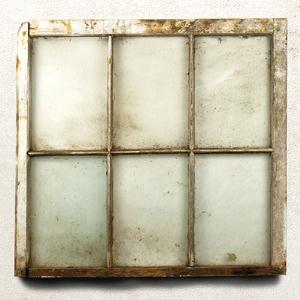
echolyn - Echolyn
It's a window. Kind of dirty. The shade is pulled. The shadow below it is of the fake Photoshop variety. I find this cover unremarkable.
The Flower Kings - Banks of Eden
Flower Kings album covers are hit or miss. This one's a hit. The colors and textures are really beautiful.
The Pineapple Thief - All The Wars
This one's pretty cool. Kind of a science experiment. Chemistry Set Apocalypse. The typography is kept simple and understated so as to not detract from the image.
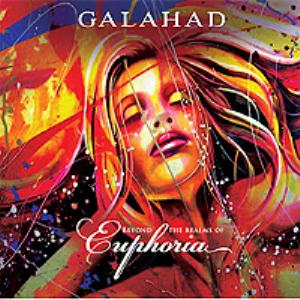
Galahad - Beyond the Realms of Euphoria
I don't know. Reminds me of a glamor shot, sort of painted over by an art student. Nothing against art students.
Spock's Beard - Brief Noctures and Dreamless Sleep
Rather cliche, isn't it? So Photoshoppy, like most of their covers.
Steven Wilson - The Raven that Refused to Sing
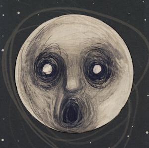
This image is so ubiquitous. I see it everywhere. I'm kind of tired of looking at it and I don't even own it. It's kind of powerful in it's blank stare. The moon. Why doesn't the moon have a name? It's the moon. Like the planet. Is it even capitalized? I've always been drawn to the moon. The Frozen Gray Dwarf. I like it.
Thieves' Kitchen - One for Sorrow, Two for Joy
I like this one. Sort of a colorized woodcut. It has a genuine feel to it, not computer generated, though it may be, and that's ok because it's not obvious.
|
|
|
Gerinski
Prog Reviewer
Joined: February 10 2010
Location: Barcelona Spain
Status: Offline
Points: 5090
|
Posted: May 11 2013 at 01:53 |
My vote goes to Galahad, TFK is also a nice one. Spock's Beard's is too archetypal Prog art, flying boats and vessels, how many of them have we already seen? From Fragile to Olias Of Sunhillow to Transatlantic...
|
|
Gerinski
Prog Reviewer
Joined: February 10 2010
Location: Barcelona Spain
Status: Offline
Points: 5090
|
Posted: May 11 2013 at 01:56 |
Kati wrote:
I like that album cover too, cstack3  Very much, infact that cover I saw before I was inspired to make this one  unfortunately many/most don't know it's handpainted all of it nothing was photoshopped/copied, everything was hand drawn and painted from nothing only using paint wich comes standard with microsoft accessories on microsoft office (not to be mistaken with paint.net program) lol I am very limited :)  |
That's a great work, congratulations! (sorry that I was a bit more critical with the music)
|
|
twseel
Forum Senior Member

Joined: December 15 2012
Location: abroad
Status: Offline
Points: 22767
|
Posted: May 18 2013 at 10:49 |
I seem to be one of the few to like Thieves' Kitchen's cover. I think it's much more artistic than those other basic pictures.
|
|
Neo-Romantic
Forum Senior Member
Joined: January 09 2013
Status: Offline
Points: 928
|
Posted: May 18 2013 at 14:42 |
|
My pick is other for Riverside's Shrine of New Generation Slaves.
|
|
Donate monthly and keep PA fast-loading and ad-free forever.
/PAlogo_v2.gif "Progarchives.com Homepage")


 Recent album covers