| Author |
 Topic Search Topic Search  Topic Options Topic Options
|
Billy Pilgrim 
Forum Senior Member


Joined: September 28 2010
Location: Austin
Status: Offline
Points: 1505
|
 Posted: August 22 2014 at 03:18 Posted: August 22 2014 at 03:18 |
|
I agree that cover art was not Genesis's strong suit. Music still rocks though. Yes had the best cover artwork, and I wonder why that was...
|
 |
Tom Ozric
Prog Reviewer

Joined: September 03 2005
Location: Olympus Mons
Status: Offline
Points: 15916
|
Posted: August 22 2014 at 03:20 |
|
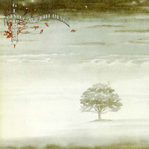
^^ are they leaves from an Autumnal deciduous tree, or are they birds.....
.....are the seasons changing, what the heck is going on.....?? The scene of the tree, the colours and the tone really match the mood of the album, not to mention the opening minute or so of Eleventh Earl Of Mar sums up the cover better than I could visually......
Edited by Tom Ozric - August 22 2014 at 03:21
|
|
Atavachron
Special Collaborator

Honorary Collaborator
Joined: September 30 2006
Location: Pearland
Status: Offline
Points: 64338
|
Posted: August 22 2014 at 03:30 |
 Billy Pilgrim wrote: Billy Pilgrim wrote:
I agree that cover art was not Genesis's strong suit. Music still rocks though. Yes had the best cover artwork, and I wonder why that was... |
I'm guessing because they wisely hired a world class artist to represent their hard-worked music.
Edited by Atavachron - August 22 2014 at 03:37
|
|
"Too often we enjoy the comfort of opinion without the discomfort of thought." -- John F. Kennedy
|
|
Libor10
Forum Senior Member

Joined: July 19 2005
Location: Czech republic
Status: Offline
Points: 692
|
Posted: August 22 2014 at 03:54 |
|
WaW cover is the winner for me. And it is fine. As somebody said before me - it adds to the album music another tone... BTW Genesis art covers really hasn't been nothing special. I quite like Nursery Cryme and Foxtrot covers (they are strange but in some way entertaining with pieces of songs pictured on them). SEBTP is neutral and TLLDOB is not so good. And then it IMO goes worse (except WaW) all the time.
|
|
|
|
PrognosticMind
Forum Senior Member
Joined: August 02 2014
Location: New Hampshire
Status: Offline
Points: 1195
|
Posted: August 22 2014 at 05:23 |
|
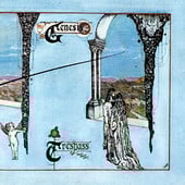
I've always liked A Trick of The Tail's album art. Whimsical and fitting.
|
|
Mormegil
Forum Senior Member

Joined: January 03 2010
Location: NE PA
Status: Offline
Points: 6438
|
Posted: August 22 2014 at 08:18 |
|
I'm partial to Wind and Wuthering.
|
|
Welcome to the middle of the film.
|
|
twosteves
Forum Senior Member
Joined: May 01 2007
Location: NYC/Rhinebeck
Status: Offline
Points: 4070
|
Posted: August 22 2014 at 09:25 |
Atavachron wrote:
To me Genesis has always had consistently bad cover art; the only one worth its salt is Selling England. Trick of the Tail is okay but Wuthering? It's some friggin trees in a meadow with some birds.
|
 I think it's a nice painting that evokes a mood---but my complaint about it is it's very subtle and doesn't stand out unless you have the album---it doesn't read well on a small CD---but it's still a tough choice as I like both--as art I'd choose W&W as an album cover Trick.
Love lot's of Genesis covers especially, SEBTP (a great illustration) The Lamb, Foxtrot, Trick and W&W and Seconds Out!
Edited by twosteves - August 22 2014 at 09:28
|
|
Rednight
Forum Senior Member
Joined: January 18 2014
Location: Mar Vista, CA
Status: Offline
Points: 4807
|
Posted: August 22 2014 at 12:41 |
|
Wind and Wuthering's cover art is rather subdued compared to its predecessor's. That one had the appropriate amount of what was needed right out of the gate with Collins taking over on vocals: a grand visual statement of the band's new direction and vision. A lesser effort, art-wise, would have somewhat diminished the effect of the band's restart. All hail A Trick of the Tail!
|
|
Progosopher
Forum Senior Member
Joined: May 12 2009
Location: Coolwood
Status: Offline
Points: 6393
|
Posted: August 22 2014 at 14:47 |
Especially at the flip side. It is true that the image has more impact on the larger vinyl cover, the medium for which the image was designed. Many albums in the 70s had this quality - what you see on the obverse is modified or reflected on the reverse in some clever way.
|
|
The world of sound is certainly capable of infinite variety and, were our sense developed, of infinite extensions. -- George Santayana, "The Sense of Beauty"
|
|
richardh
Prog Reviewer
Joined: February 18 2004
Location: United Kingdom
Status: Offline
Points: 26108
|
Posted: August 23 2014 at 02:52 |
|
Got to admit I've never cared that much for Genesis artwork apart from maybe Cryme and Foxtrot at a push.
|
|
Chris S
Special Collaborator
Honorary Collaborator
Joined: June 09 2004
Location: Front Range
Status: Offline
Points: 7028
|
Posted: August 23 2014 at 13:27 |
Tom Ozric wrote:
Both artworks suit the music contained within, but W&W is my preferred cover. |
This
|
|
<font color=Brown>Music - The Sound Librarian
...As I venture through the slipstream, between the viaducts in your dreams...[/COLOR]
|
|
proggman
Forum Senior Member
Joined: October 14 2013
Location: Sweden
Status: Offline
Points: 1458
|
Posted: August 23 2014 at 16:40 |
|
A Trick of the Tail.
|
|
When he rides, my fears subside.
For darkness turns once more to light.
Through the skies, his white horse flies.
To find a land beyond the night.
|
|
Xonty
Forum Senior Member
Joined: June 23 2013
Location: Cornwall
Status: Offline
Points: 1759
|
Posted: August 23 2014 at 18:32 |
Wind And Wuthering - fits the music better, and ATOTT's cover feels a bit taped together (as with Foxtrot) 
|
|
midnightmadness
Forum Newbie

Joined: September 14 2014
Location: Australia
Status: Offline
Points: 5
|
Posted: September 30 2014 at 02:59 |
As you can probably tell from my avatar, my choice is Wind and Wuthering.I love how it tells a story (albeit a very short one) and amplifies the album's autumnal feel. It's my favourite album musically, so I'm probably a bit partial towards it. As for A Trick of the Tail's artwork, like someone else mentioned, it's really just some characters from the songs thrown onto a parchment, as compared to W&W, which has a lot more depth and serves more of a purpose. I also think that ATOTT's artwork gives the album an antiquated feel (for better or worse). I haven't decided whether ATOTT's art reflects the music or if I have just come to associate the two. Although, I do quite like ATOTT's art.
|
|
Svetonio
Forum Senior Member

Joined: September 20 2010
Location: Serbia
Status: Offline
Points: 10213
|
Posted: September 30 2014 at 04:10 |
|
ATOTT
|
|
Darious
Forum Senior Member
Joined: August 30 2014
Location: Poole, UK
Status: Offline
Points: 246
|
Posted: September 30 2014 at 05:19 |
|
Sorry to say that, but lonely tree in a field surrounded by the mist is as cliché and bad to me as the picture of some blonde virgin riding a white horse along the beach, or even worse, Manhattan skyline at night. Wind & Wuthering cover is, I personally feel, the most unfortunate Genesis album cover of all. I prefer the Trick of the Tail album cover as I like to observe behaviours. And the Trick of the Tail cover is very rich in presenting behaviours. Therefore my vote goes for the Trich of the Tail album cover
|
|
Writing about truth is a little bit like getting your dick out in public and hoping no one laughs (Steve Hogarth)
|
|
Donate monthly and keep PA fast-loading and ad-free forever.
/PAlogo_v2.gif "Progarchives.com Homepage")


 Genesis album art
