Do you like the new PA Header?
Printed From: Progarchives.com
Category: Topics not related to music
Forum Name: General Polls
Forum Description: Create polls on topics not related to music
URL: http://www.progarchives.com/forum/forum_posts.asp?TID=72191
Printed Date: April 28 2024 at 01:09
Software Version: Web Wiz Forums 11.01 - http://www.webwizforums.com
Topic: Do you like the new PA Header?
Posted By: darksideof
Subject: Do you like the new PA Header?
Date Posted: October 13 2010 at 10:36
 Here the earlier versions and Banners.
        ------------- http://darksideofcollages.blogspot.com/ http://www.metalmusicarchives.com/ https://www.facebook.com/pages/Darksideof-Collages/ |
Replies:
Posted By: DisgruntledPorcupine
Date Posted: October 13 2010 at 10:38
I love the new banner.
^^^ But that one is the best out of them all IMO. |
 darksideof wrote:
Posted By: darksideof
Date Posted: October 13 2010 at 10:44
------------- http://darksideofcollages.blogspot.com/ http://www.metalmusicarchives.com/ https://www.facebook.com/pages/Darksideof-Collages/ |
Posted By: Dean
Date Posted: October 13 2010 at 10:49
|
Unfair Poll!
I don't like it, but I don't think it's crap, I just don't like it. ------------- What? |
Posted By: Epignosis
Date Posted: October 13 2010 at 10:50
|
The poll is messed up. The first option is in the question box.
------------- https://epignosis.bandcamp.com/album/a-month-of-sundays" rel="nofollow - https://epignosis.bandcamp.com/album/a-month-of-sundays |
Posted By: darksideof
Date Posted: October 13 2010 at 10:54
------------- http://darksideofcollages.blogspot.com/ http://www.metalmusicarchives.com/ https://www.facebook.com/pages/Darksideof-Collages/ |
Posted By: darksideof
Date Posted: October 13 2010 at 10:55
fixed
thanks!!! buddy! ------------- http://darksideofcollages.blogspot.com/ http://www.metalmusicarchives.com/ https://www.facebook.com/pages/Darksideof-Collages/ |
Posted By: Shevrzl
Date Posted: October 13 2010 at 10:58
Yup |
Posted By: Snow Dog
Date Posted: October 13 2010 at 10:59
Yes, I agree, with these options you are to hard on yourself.  ------------- http://www.last.fm/user/Snow_Dog" rel="nofollow"> 
|
Posted By: Jim Garten
Date Posted: October 13 2010 at 11:00
Agreed - should just be 'yes' or 'no' -------------  Jon Lord 1941 - 2012 |
Posted By: Jörgemeister
Date Posted: October 13 2010 at 11:10
|
lol, i have been around the forums too much, didnt notice we have a new header! i like it but i like better one of the early versions: and this but the GONG is too obvius ( i lol'd at the camel) good job with the banners!
------------- |
Posted By: Slartibartfast
Date Posted: October 13 2010 at 11:10
|
Thanks for showing us the alternates. I think if a change is going to be made at least keep the current one up for a while. This one's also nice: ------------- Released date are often when it it impacted you but recorded dates are when it really happened... 
|
Posted By: Jörgemeister
Date Posted: October 13 2010 at 11:14
|
Any chance you guys can also change the forum header? never really liked it ... is there in one corner looking lame and stuff, just like a nerd at a party. ------------- |
Posted By: TheGazzardian
Date Posted: October 13 2010 at 11:27
I think this one is the best one compositionally. Visually, the other elements don't distract from the progarchives logo, which is nicely centered. The faces on either side are the most prominent of the other elements, and they face towards the center, so they really draw the eye to the logo. The background has lots of nice details, but they feel like the background. The only thing that maybe could be changed in this one is using some of the iconic album art used in the one we hav now - I don't actually recognise too much of what's in this one. Plus, I can't be 100% certain until I see it in the website  And, once again, I don't think you'll take offense but I am a fan of your work so this feedback applies to the use of your collage as a banner, not to your collages themselves.
|
Posted By: Nightfly
Date Posted: October 13 2010 at 11:31
| I like it. |
Posted By: sleeper
Date Posted: October 13 2010 at 11:42
I like it but as others have said this ones the best. ------------- Spending more than I should on Prog since 2005  |
Posted By: darksideof
Date Posted: October 13 2010 at 11:44
I hear ya! ------------- http://darksideofcollages.blogspot.com/ http://www.metalmusicarchives.com/ https://www.facebook.com/pages/Darksideof-Collages/ |
Posted By: darksideof
Date Posted: October 13 2010 at 11:46
------------- http://darksideofcollages.blogspot.com/ http://www.metalmusicarchives.com/ https://www.facebook.com/pages/Darksideof-Collages/ |
Posted By: darksideof
Date Posted: October 13 2010 at 11:47
I Agree 1000% ------------- http://darksideofcollages.blogspot.com/ http://www.metalmusicarchives.com/ https://www.facebook.com/pages/Darksideof-Collages/ |
Posted By: Gandalff
Date Posted: October 13 2010 at 11:48
|
What to say? A kind of chocolate-box art? ------------- A Elbereth Gilthoniel silivren penna míriel o menel aglar elenath! Na-chaered palan-díriel o galadhremmin ennorath, Fanuilos, le linnathon nef aear, sí nef aearon! |
Posted By: SaltyJon
Date Posted: October 13 2010 at 11:52
I like that one and I like this one the most: ------------- http://www.last.fm/user/Salty_Jon" rel="nofollow"> 
|
Posted By: Henry Plainview
Date Posted: October 13 2010 at 11:53
|
I don't like any of the options. The old logo really wasn't that great (I've never understood the font choice and color scheme), but all of those make it abrasive, jarring, and horrendously '90s. Just, make it all go away. ------------- if you own a sodastream i hate you |
Posted By: friso
Date Posted: October 13 2010 at 11:56
| Sorry but I think the new logo looks non-professional. It makes PA look like a one-man-with-hobby site. |
Posted By: lazland
Date Posted: October 13 2010 at 12:02
A vote for leave it as it is from me. Nice work, as ever
------------- Enhance your life. Get down to www.lazland.org |
Posted By: The T
Date Posted: October 13 2010 at 12:08
|
Good job. I seldom visit the main site anymore, only the forum, and I just noticed it. Good job! ------------- 
|
Posted By: darksideof
Date Posted: October 13 2010 at 12:14
that is fine with me I think music and art should be consider to be a Hobie not a job. ------------- http://darksideofcollages.blogspot.com/ http://www.metalmusicarchives.com/ https://www.facebook.com/pages/Darksideof-Collages/ |
Posted By: darksideof
Date Posted: October 13 2010 at 12:16
------------- http://darksideofcollages.blogspot.com/ http://www.metalmusicarchives.com/ https://www.facebook.com/pages/Darksideof-Collages/ |
Posted By: horsewithteeth11
Date Posted: October 13 2010 at 12:18
It looks like a toddler threw up their baby food on the front page. Sorry, but I just can't stand it.  Not to say it wasn't designed very well and professionally (which it was). I just think it's ugly. *Haters gonna hate* ------------- 
|
Posted By: Henry Plainview
Date Posted: October 13 2010 at 12:25
PA is a business. It has to be or it would shut down, this argument is ridiculous. ------------- if you own a sodastream i hate you |
Posted By: Passionist
Date Posted: October 13 2010 at 12:27
|
Don't like it. To me it looks too plastic, like a stickerbook filled with random images. I'd rather see a clear logo-banner that you can take in your grip and feel it. Now that I think of it, it's kinda like a DT cover: just things put together looking like a random photoshop. Just a bit too much. |
Posted By: darksideof
Date Posted: October 13 2010 at 12:30
I guess you are right ------------- http://darksideofcollages.blogspot.com/ http://www.metalmusicarchives.com/ https://www.facebook.com/pages/Darksideof-Collages/ |
Posted By: Jörgemeister
Date Posted: October 13 2010 at 12:44
is not business for most of us (the users), is entertainement and learning/research. ------------- |
Posted By: Slartibartfast
Date Posted: October 13 2010 at 12:49
|
Seeing as how a lot of us are unpaid contributors I totally agree. But I think M@x isn't in it for the love of the money but for the love of the prog. Still you need something coming in to keep it up and running. Anyway, I hope darksideof isn't wounded too bad by the slings and arrows. I think what I like most about this one is that there isn't much artwork that is readily identified as being from any particular artist. But then, it's always possible I'm not familiar with artwork it was synthesized from. In the end, the banner doesn't matter as much as the site content and utility anyway. Is someone seriously going to run away because of the banner? If so, I'd suggest Abel work on something actually horrendous.  ------------- Released date are often when it it impacted you but recorded dates are when it really happened...
|
Posted By: crimhead
Date Posted: October 13 2010 at 12:53
| Like it. |
Posted By: Snow Dog
Date Posted: October 13 2010 at 12:57
The site has to took professional though, and of course M@X makes money from it. Anyway, he seems to like the banner, otherwise he wouldn't have changed it. He is now asking for how to improve it. (not in this thread, in the one he started.) http://www.progarchives.com/forum/forum_posts.asp?TID=72167 - http://www.progarchives.com/forum/forum_posts.asp?TID=72167
------------- http://www.last.fm/user/Snow_Dog" rel="nofollow">
|
Posted By: Padraic
Date Posted: October 13 2010 at 13:01
| Sorry, these are just too busy for my tastes. |
Posted By: darksideof
Date Posted: October 13 2010 at 13:02
------------- http://darksideofcollages.blogspot.com/ http://www.metalmusicarchives.com/ https://www.facebook.com/pages/Darksideof-Collages/ |
Posted By: darksideof
Date Posted: October 13 2010 at 13:03
|
this has to be the logest I even been on the site since a very long time.!!wow!! ------------- http://darksideofcollages.blogspot.com/ http://www.metalmusicarchives.com/ https://www.facebook.com/pages/Darksideof-Collages/ |
Posted By: darksideof
Date Posted: October 13 2010 at 13:13
Anyway, I hope darksideof isn't wounded too bad by the slings and arrows. A BIT!
NOT! I am just kidding! I am fine seriously! ------------- http://darksideofcollages.blogspot.com/ http://www.metalmusicarchives.com/ https://www.facebook.com/pages/Darksideof-Collages/ |
Posted By: Lark the Starless
Date Posted: October 13 2010 at 13:32
|
It's alright but, it needs some improvement...better than anything I could muster up though ------------- 
|
Posted By: Viajero Astral
Date Posted: October 13 2010 at 13:39
|
From a designer point of view, I dont like it, it doesnt work well and is unprofesional. And no, the argument "art is subjetive" doesn't apply here because in graphic design (especialy web design) you have to take in mind a lot of aspects that doesnt have to do with your point of view. The header looks more like the typical "forum user signature", in fact, the other versions looks much better than the chosen one, but they still looks like a typical "forum user signature", or maybe they will look good as wallpapers. ------------- 
|
Posted By: Slartibartfast
Date Posted: October 13 2010 at 13:52
Kind of hard to create something and put it out before many people and not get those. ------------- Released date are often when it it impacted you but recorded dates are when it really happened...
|
Posted By: Jörgemeister
Date Posted: October 13 2010 at 14:08
did you actually show it to a designer and ask for his opinion?  ------------- |
Posted By: JLocke
Date Posted: October 13 2010 at 14:13
|
I think virtually every other 'earlier version' looks better than what was ultimately chosen. Just my opinion. |
Posted By: Anthony H.
Date Posted: October 13 2010 at 14:18
|
It's amazing. -------------  |
Posted By: Gandalff
Date Posted: October 13 2010 at 14:43
|
New headline, but old glaring Lucassen below! That´s unfair! ------------- A Elbereth Gilthoniel silivren penna míriel o menel aglar elenath! Na-chaered palan-díriel o galadhremmin ennorath, Fanuilos, le linnathon nef aear, sí nef aearon! |
Posted By: Evolver
Date Posted: October 13 2010 at 14:58
------------- Trust me. I know what I'm doing. |
Posted By: 40footwolf
Date Posted: October 13 2010 at 14:58
|
I sort of hate it-I think the use of colors are garish and the way things were photoshopped looks needlessly amateurish. I like the banner of the guys from Moving Pictures carrying pictures of famous prog artists, actually, I don't know why that one wasn't used. I think it's sort of clever. ------------- Heaven's made a cesspool of us all. |
Posted By: JJLehto
Date Posted: October 13 2010 at 15:12
|
Nah, I don't really like it but I don't think its crap... Less was more! Also this one just seems so BLARGH! EXPLOSION OF PROG! Its just like, all there. I just don't really like it |
Posted By: Padraic
Date Posted: October 13 2010 at 15:17
Haha! Yes, the smirking picture of Lucassen actually annoys me more than the banner.
|
Posted By: Dean
Date Posted: October 13 2010 at 15:25
------------- What? |
Posted By: TheProgtologist
Date Posted: October 13 2010 at 15:41
Same here,sorry DSO. -------------  |
Posted By: Epignosis
Date Posted: October 13 2010 at 15:42
There's no Epignosis in the graphic. 
------------- https://epignosis.bandcamp.com/album/a-month-of-sundays" rel="nofollow - https://epignosis.bandcamp.com/album/a-month-of-sundays |
Posted By: DisgruntledPorcupine
Date Posted: October 13 2010 at 15:45
You perfectly described my thoughts about it.
|
Posted By: Viajero Astral
Date Posted: October 13 2010 at 16:01
Im a designer, so I can tell you the all graphic design work is more than just play with Photoshop, and I know my colleges, they will say worse things than I. BTW, Im not saying is horrible, is just not good for PA. -------------
|
Posted By: Paravion
Date Posted: October 13 2010 at 16:03
| I couldn't care less. It's ugly though. |
Posted By: Bonnek
Date Posted: October 13 2010 at 16:26
horrendously '90s, that was the word I'm looking for. Besides, I don' like blue (a real 90s color) and there's not one kraut reference in it  |
Posted By: yanch
Date Posted: October 13 2010 at 16:35
| It's okay, but so many of the cool band graphics included, that they are small and hard to enjoy. |
Posted By: darksideof
Date Posted: October 13 2010 at 16:37
Believe me fellas I just don't only play with photoshop twinging. I am an Illustrator/ Painter/ graphic Designer. This Collage is only a tiny portion of my collages really are.
I edit the images in photoshop true, but I add vector color and something I even create the images in illustrator but in this case. I wanted to use iconic prog albums images. that is it! ------------- http://darksideofcollages.blogspot.com/ http://www.metalmusicarchives.com/ https://www.facebook.com/pages/Darksideof-Collages/ |
Posted By: darksideof
Date Posted: October 13 2010 at 16:38
------------- http://darksideofcollages.blogspot.com/ http://www.metalmusicarchives.com/ https://www.facebook.com/pages/Darksideof-Collages/ |
Posted By: Dean
Date Posted: October 13 2010 at 16:51
|
twinging? ------------- What? |
Posted By: GY!BE
Date Posted: October 13 2010 at 16:58
|
It can be worse but it's definitly not the best one, it's a bit too much, simple is better.
------------- It is all a dream, a dream in death... |
Posted By: Formentera Lady
Date Posted: October 13 2010 at 17:05
I agree to the above. Also I think the header should more blend into its surrounding. The blue colour of the current header does not really fit to the surrounding violet colour, IMHO. |
Posted By: Stooge
Date Posted: October 13 2010 at 17:07
|
Of the ones in the initial post, I like the 1st (the current header), 3rd and 4th ones the best for what my opinion is worth. The 6th and 7th ones work for me as well. As for the vote, the closest option for me is the 4th one. I like it, but I wouldn't be bothered by any tweaks if they are requested and implemented. I can't think what I'd change about it, maybe if the logo was centered??? I'd say "sharpen" the logo or something to that effect, but my graphic design jargon is rather rusty . I guess some of the character overlap of the logo is a concern, so maybe a more defined border around the lettering could hep (at least for where that Kansas guy stands).It's probably easier to leave it as it is than to try to decipher what I'm trying to suggest. I'm better off giving thumbs up or thumbs down with regards to these issues. In terms of better or worse with how the main page looks, I'll say better than from how I remember it. |
Posted By: Evolutionary Sleeper
Date Posted: October 13 2010 at 17:40
|
I like this one best. ------------- 
|
Posted By: Slartibartfast
Date Posted: October 13 2010 at 18:28
|
Hey dude, careless is two words unless you actually mean careless.... Well, I've changed my mind, the last time I looked at it, it sprained my eyes. Now I have no choice to sue. Either that or Wake Up Little Susie. ------------- Released date are often when it it impacted you but recorded dates are when it really happened...
|
Posted By: darksideof
Date Posted: October 13 2010 at 20:11
it can care less or careless don't matter! ------------- http://darksideofcollages.blogspot.com/ http://www.metalmusicarchives.com/ https://www.facebook.com/pages/Darksideof-Collages/ |
Posted By: clarke2001
Date Posted: October 13 2010 at 20:12
|
I don't like it, and it looks half-baked. Why? 1. Well, I don't mind the change, and the collage, but first and foremost it clashes with traditional PA colours: it's blue - moreover it's Royal Navy Bule - and the rest of the website's surface is purple. If it had been purple (and/or orange) I wouldn't object. 2. The characters from the various album covers look they're cut out in papers and glued to the surface, not doing justice to the effort the designer did with blending, transparent layers, and authors drawing (as seen in the right corner). 3. In my opinion, it should be more sublime and less fanboyish. 4. It should 'melt' with the background, perhaps with some nice gradient on the edges, so that is not visible the banner is square, more like a hazy nebula without defined edges. Or, it may have the rough edges but then it must with the rest of the site's appearance. 5. I can forgive everything (and get used to) but I can't stand a smudge of purple colour that remain in 'P' of 'ProgArchives'. There's more (as well as a few positive things) but enough of my criticism. ------------- |
Posted By: darksideof
Date Posted: October 13 2010 at 20:18
Let see if you guys can notice the improvements or a bit changes that I just did.
------------- http://darksideofcollages.blogspot.com/ http://www.metalmusicarchives.com/ https://www.facebook.com/pages/Darksideof-Collages/ |
Posted By: darksideof
Date Posted: October 13 2010 at 20:21
check it out.! ------------- http://darksideofcollages.blogspot.com/ http://www.metalmusicarchives.com/ https://www.facebook.com/pages/Darksideof-Collages/ |
Posted By: darksideof
Date Posted: October 13 2010 at 20:34
I am horrbible speller  Man! Man!I meant tingling. ------------- http://darksideofcollages.blogspot.com/ http://www.metalmusicarchives.com/ https://www.facebook.com/pages/Darksideof-Collages/ |
Posted By: 40footwolf
Date Posted: October 13 2010 at 22:05
|
Compositionally it's an improvement, but that color scheme has still got to go. ------------- Heaven's made a cesspool of us all. |
Posted By: peart_lee_lifeson
Date Posted: October 13 2010 at 22:06
| I like it. Some of the others are better though. |
Posted By: cyclysm748
Date Posted: October 13 2010 at 22:14
| I like the simplicity and elegance of the original. |
Posted By: stonebeard
Date Posted: October 13 2010 at 22:35
|
In all seriousness, PA needs some of that good old Geocities charm.
------------- http://soundcloud.com/drewagler" rel="nofollow - My soundcloud. Please give feedback if you want! |
Posted By: Jörgemeister
Date Posted: October 13 2010 at 22:45
|
Cone and jaw crusher? damn! my work still haunts me even at PA forums
------------- |
Posted By: Chela
Date Posted: October 14 2010 at 01:11
|
My problem with it, is that it's a bit too bright that, and nothing seems to flow, images are just put on there...
Not as bright as THIS, but still bright :
These two are my favorite though :
Don't recognize the images on the first one, but i love the color scheme and both seem to flow right to the logo
Good job on all these though
I could never do that |
Posted By: Ivan_Melgar_M
Date Posted: October 14 2010 at 01:17
|
I like more the original serious one, not because the collage is bad, but because we have already a personality (this looks more like a fan club art), and also looks too similar to the idea of the one used by Musica Progresiva.org  Which BTW is much more sober than ours. But most important, I will talk as a lawyer: All this drawings are protected by copyright laws, and even when some artists and bands are friendly, some are not. Even when the author of the "ITCOTCK" has died, the band already protected this art cover with a copyright sign I verified) and King Crimson's lawyers are not famous for authorizing the use of their property. If I'm not wrong, they already made Prog Archive delete all the samples of King Crimson music. We are risking ourselves to a legal process, and that will end the site as we know it, because even if we win, the costs will be so high that M@X could be able to close the site. So unless you have got the EXPRESS CONSENT of each and every artist and band, I would suggest to delete it. Iván ------------- 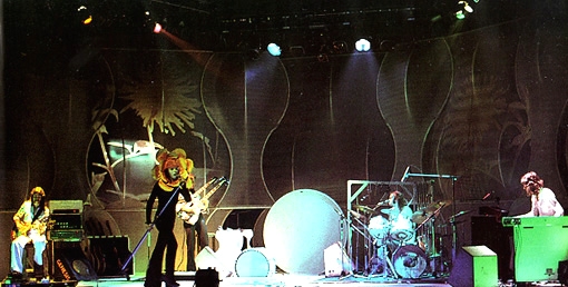
|
Posted By: progkidjoel
Date Posted: October 14 2010 at 02:11
Exactly what I was thinking  ------------- 
|
Posted By: someone_else
Date Posted: October 14 2010 at 02:41
|
Voted for the 3rd option, but I like this one:
and this one:
as well. ------------- 
|
Posted By: Gandalff
Date Posted: October 14 2010 at 02:48
Gosh! Serious warning! We certainly don´t want to this site should be closed.
Simultaneously, I don´t trust that such experienced admins here would make that schoolboyish goof. ------------- A Elbereth Gilthoniel silivren penna míriel o menel aglar elenath! Na-chaered palan-díriel o galadhremmin ennorath, Fanuilos, le linnathon nef aear, sí nef aearon! |
Posted By: Dean
Date Posted: October 14 2010 at 03:01
|
^ the admins have no say over how M@X wants the site to look - it is his site, not ours. ------------- What? |
Posted By: Viajero Astral
Date Posted: October 14 2010 at 03:03
...MY GOD!!!  -------------
|
Posted By: Vompatti
Date Posted: October 14 2010 at 03:05
| I care some, so I guess I could care less. |
Posted By: Dean
Date Posted: October 14 2010 at 03:10
------------- What? |
Posted By: Jim Garten
Date Posted: October 14 2010 at 03:10
|
I think there is a place for the artwork on the front page, but not as the site logo - just my opinion. ------------- Jon Lord 1941 - 2012 |
Posted By: Easy Livin
Date Posted: October 14 2010 at 03:12
|
I think it is a significant improvement, and I support it as it is.
I have my usual concerns concering copyright. Providing these can be sorted out and the site is fully protected from any action against it, I'm all for it.
|
Posted By: Viajero Astral
Date Posted: October 14 2010 at 03:15
Nah, Abel has much better skills and thaste to do this. -------------
|
Posted By: Gandalff
Date Posted: October 14 2010 at 03:19
------------- A Elbereth Gilthoniel silivren penna míriel o menel aglar elenath! Na-chaered palan-díriel o galadhremmin ennorath, Fanuilos, le linnathon nef aear, sí nef aearon! |
Posted By: Dean
Date Posted: October 14 2010 at 03:22
------------- What? |
Posted By: Gandalff
Date Posted: October 14 2010 at 03:23
------------- A Elbereth Gilthoniel silivren penna míriel o menel aglar elenath! Na-chaered palan-díriel o galadhremmin ennorath, Fanuilos, le linnathon nef aear, sí nef aearon! |
Posted By: Jim Garten
Date Posted: October 14 2010 at 03:37
Not Almighty, but he is the reason we're all here. ------------- Jon Lord 1941 - 2012 |
Posted By: Easy Livin
Date Posted: October 14 2010 at 03:39
I think in the other thread he does say he's obtained some agreements and is seeking others.
|
Posted By: toroddfuglesteg
Date Posted: October 14 2010 at 04:24
|
That need to be clarified and M@X need to seek and then receive a written statement absolving him and our community from any blame whatsoever, Bob. |
Posted By: b_olariu
Date Posted: October 14 2010 at 05:14
|
yes is ok, PA needed a little colour because that purple was already for years on top. Still some improving can be made in the future. |
Posted By: darksideof
Date Posted: October 14 2010 at 08:56
I hear ya Ivan. I sent an emal to Max regaring this very important matter!. I don't mind creating a all original collage of none copyright material. I don't want to see this website to get sue or anyone who is involve.. We are all here for the love off the music for God sake! not for nothing else!.
also that is a real horrible, reeeal bad photoshop collage you have up here! ------------- http://darksideofcollages.blogspot.com/ http://www.metalmusicarchives.com/ https://www.facebook.com/pages/Darksideof-Collages/ |
Posted By: darksideof
Date Posted: October 14 2010 at 09:20
no this collages wasn't made by me, but I have several people out there copying ( or metioning me as main influence )my collages look at these:
   ------------- http://darksideofcollages.blogspot.com/ http://www.metalmusicarchives.com/ https://www.facebook.com/pages/Darksideof-Collages/ |
Posted By: darksideof
Date Posted: October 14 2010 at 09:22
------------- http://darksideofcollages.blogspot.com/ http://www.metalmusicarchives.com/ https://www.facebook.com/pages/Darksideof-Collages/ |
Posted By: Ivan_Melgar_M
Date Posted: October 14 2010 at 11:37
That's true Dean: 1.- Fair use (Fair Dealing in Canada is a doctrine that according o CANADIAN laws protects in the case of Criticism and Review (I believe this could be the case of Prog Archives)::
I believe Prog Archives' location is in Canada, so I post this laws, and also because USA laws are much more restrictive. 2.- So we should cite the source of each and every fragment of the collage (the album in which it appears) and the name of the author. 3.- As far as I know and in USA, Fair Use or Fair Dealing (In UK system countries) is a defense,
Fair dealing is a http://en.wikipedia.org/wiki/Doctrine - doctrine of http://en.wikipedia.org/wiki/Limitations_and_exceptions_to_copyright - limitations and exceptions to copyrigh t which is found in many of the http://en.wikipedia.org/wiki/Common_law - common law jurisdictions of the http://en.wikipedia.org/wiki/Commonwealth_of_Nations - Commonwealth of Nation s.. Fair dealing is an enumerated set of possible defenses against an action for infringement of an http://en.wikipedia.org/wiki/Exclusive_right - exclusive right of http://en.wikipedia.org/wiki/Copyright - copyright . http://en.wikipedia.org/wiki/Fair_dealing - http://en.wikipedia.org/wiki/Fair_dealing I know Wikipedia is not the most serious source, but living in Përú and rarely having to use Canadian laws here, my sources are limited In other words, somebody sues you and in the trial you can yse this as a defense, even when this defense won't stop a subpoena and probably a trial. Plus the judge may accept or not that some act is really a fair use. Not trying to frighten anybody, but as lawyer, I'm forced to take the worst scenarios. Iván -------------
|
Posted By: Slartibartfast
Date Posted: October 14 2010 at 11:45
That's just not fair.
------------- Released date are often when it it impacted you but recorded dates are when it really happened...
|