Recent album covers
Printed From: Progarchives.com
Category: Progressive Music Lounges
Forum Name: Prog Polls
Forum Description: Create polls on topics related to progressive music
URL: http://www.progarchives.com/forum/forum_posts.asp?TID=92340
Printed Date: April 27 2024 at 04:18
Software Version: Web Wiz Forums 11.01 - http://www.webwizforums.com
Topic: Recent album covers
Posted By: fusaka
Subject: Recent album covers
Date Posted: March 05 2013 at 18:50
|
There have been a lot of very nice prog album covers in the last year... which one is your favorite, and which one have I left out? 
echolyn - Echolyn  The Flower Kings - Banks of Eden 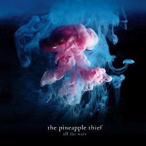 The Pineapple Thief - All The Wars 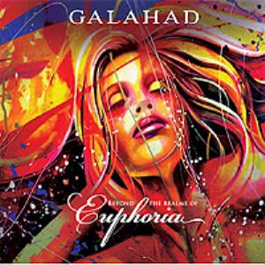 Galahad - Beyond the Realms of Euphoria  Spock's Beard - Brief Noctures and Dreamless Sleep 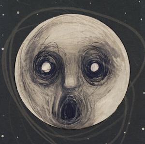 Steven Wilson - The Raven that Refused to Sing 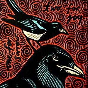 Thieves' Kitchen - One for Sorrow, Two for Joy ------------- http://www.last.fm/user/fusaka/" rel="nofollow - my last.fm |
Replies:
Posted By: Roland113
Date Posted: March 05 2013 at 18:53
| I'll lead off with one for the Beard. |
Posted By: tszirmay
Date Posted: March 05 2013 at 19:44

------------- I never post anything anywhere without doing more than basic research, often in depth. |
Posted By: Mellotron Storm
Date Posted: March 05 2013 at 20:04
|
Of the ones in the poll i'd say Spock's Beard but to me it wasn't that impressive of a year for album cover (ducks). Some nice ones though no doubt.
I did like Rush's cover with the clock set on 2112. iamthemorning does it for me for some reason and also Suspyre's cover. ------------- "The wind is slowly tearing her apart" "Sad Rain" ANEKDOTEN |
Posted By: Barbu
Date Posted: March 05 2013 at 21:25
|
List : Other : 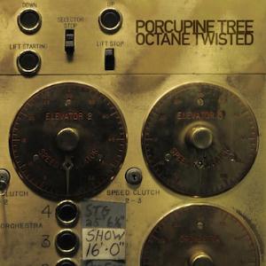 ------------- |
Posted By: Man With Hat
Date Posted: March 05 2013 at 22:00
|
Spock's Beard is really the only one out of that selection I really really like. ( ------------- Dig me...But don't...Bury me I'm running still, I shall until, one day, I hope that I'll arrive Warning: Listening to jazz excessively can cause a laxative effect. |
Posted By: RedNightmareKing
Date Posted: March 05 2013 at 22:01
|
The Raven has always caught my eye for some reason.
------------- I consider drone metal to be progressive... |
Posted By: infocat
Date Posted: March 05 2013 at 22:34
|
Own most of 'em. Like 'em all!
------------- -- Frank Swarbrick Belief is not Truth. |
Posted By: Progosopher
Date Posted: March 05 2013 at 23:38
|
I'm not real wild about most of these, but the Spock's Beard is really cool. After that, I would go with Pineapple Thief and then Flower Kings. The rest are meh. ------------- The world of sound is certainly capable of infinite variety and, were our sense developed, of infinite extensions. -- George Santayana, "The Sense of Beauty" |
Posted By: Wanorak
Date Posted: March 05 2013 at 23:43
|
Spock's Beard, followed by TFKs and SW. ------------- A GREAT YEAR FOR PROG!!! |
Posted By: octopus-4
Date Posted: March 05 2013 at 23:49
|
I like more the one from Pineapple Thief ------------- Curiosity killed a cat, Schroedinger only half. My poor home recorded stuff at https://yellingxoanon.bandcamp.com |
Posted By: Gallifrey
Date Posted: March 05 2013 at 23:59
|
I adore All The Wars' cover, mainly because I love colourful things. They've got a new EP coming out soon which has an equally colourful cover. I like keeping lists, so I've been compiling one of artwork so far in 2013: http://rateyourmusic.com/list/Gallifrey337/2013_in_album_art ------------- http://thedarkthird.bandcamp.com/ |
Posted By: Gallifrey
Date Posted: March 06 2013 at 00:01
 One of the best from last year.
------------- http://thedarkthird.bandcamp.com/ |
Posted By: SaltyJon
Date Posted: March 06 2013 at 00:23
 Partial to this one. ------------- http://www.last.fm/user/Salty_Jon" rel="nofollow"> 
|
Posted By: b_olariu
Date Posted: March 06 2013 at 02:05
| Galahad |
Posted By: someone_else
Date Posted: March 06 2013 at 03:00
|
The Thief just before the Beard. ------------- 
|
Posted By: zeqexes
Date Posted: March 06 2013 at 04:14
|
Pineapple Thief, but I like most of these ------------- 
|
Posted By: doctorphil
Date Posted: March 06 2013 at 05:07
|
Going to vote other. Wonderful artwork by none other than Annie Haslam Album highly recommended too.  ------------- Time flies like an arrow, fruit flies like a banana. |
Posted By: Earthmover
Date Posted: March 06 2013 at 10:01
|
1. The Pineapple Thief 2. Stevie Wilson
|
Posted By: Metalmarsh89
Date Posted: March 06 2013 at 10:07
| Steve Wilson's Raven has a wonderful simplistic awesomeness there that I enjoy. There are some great ones on this list. |
Posted By: Guldbamsen
Date Posted: March 06 2013 at 10:18
|
None of these are really my cup of tea - apart for the Pineapple Thief one, which I find particularly beautiful. Love those colours. Also rather like this one for some reason:  ------------- The Guide says there is an art to flying or rather a knack. The knack lies in learning how to throw yourself at the ground and miss. - Douglas Adams |
Posted By: The Doctor
Date Posted: March 06 2013 at 10:20
|
Pineapple Thief, followed by Spock's Beard. ------------- I can understand your anger at me, but what did the horse I rode in on ever do to you? |
Posted By: sleeper
Date Posted: March 06 2013 at 10:57
|
I don't really like any of those. This one is probably my favorite from the last couple of years though.  ------------- Spending more than I should on Prog since 2005  |
Posted By: lazland
Date Posted: March 06 2013 at 14:13
What a great choice  The album ain't half bad, either. Review will be posted soon. ------------- Enhance your life. Get down to www.lazland.org |
 doctorphil wrote:
Posted By: octopus-4
Date Posted: March 06 2013 at 14:35
Review??? Has Annie Haslam been included? When? ------------- Curiosity killed a cat, Schroedinger only half. My poor home recorded stuff at https://yellingxoanon.bandcamp.com |
Posted By: sorcerer kermes
Date Posted: March 06 2013 at 15:12
none of them worth a thing! 
|
Posted By: lazland
Date Posted: March 06 2013 at 15:15
Well, thank you for that positive contribution. I can see you are going to be a great success on this site ------------- Enhance your life. Get down to www.lazland.org |
Posted By: akamaisondufromage
Date Posted: March 06 2013 at 15:32
|
Banks of Eden from these. I don't like THe Raven it just reminds me of The Scream and I just think its another in a long line... ------------- Help me I'm falling! |
Posted By: Eria Tarka
Date Posted: March 06 2013 at 22:04
| I like the new SW art, so I guess I'll vote for that. |
Posted By: Kati
Date Posted: March 06 2013 at 22:18
|
I could vote Echolyn in terms of one of the ultimate best albums, band everything, but artwork this I can't, I cannot even describe it as simplistic art, to be honest I do not know how to classify it but it is certainly not artistic enough for me to be one of the best 2012 album covers tho' |
Posted By: cstack3
Date Posted: March 06 2013 at 22:28
I quite liked this cover, and the music is excellent.... |
Posted By: ProgMetaller2112
Date Posted: March 06 2013 at 22:31
Kati  I don't really like the Echolyn album cover. I'm voting for Spock's Beard I don't really like the Echolyn album cover. I'm voting for Spock's Beard------------- War is peace. Freedom is slavery. Ignorance is strength. ― George Orwell, Nineteen Eighty-Four "Ignorance and Prejudice and Fear walk Hand in Hand"- Neil Peart |
Posted By: Kati
Date Posted: March 06 2013 at 22:48
I like that album cover too, cstack3  |
Posted By: martinprog77
Date Posted: March 06 2013 at 23:03
------------- Nothing can last there are no second chances. Never give a day away. Always live for today. |
Posted By: Kati
Date Posted: March 06 2013 at 23:34
| My vote went to The Flower Kings - Banks of Eden |
Posted By: Kati
Date Posted: March 06 2013 at 23:35
|
If The Tea Club would be above I would vote for them too |
Posted By: Roj
Date Posted: March 07 2013 at 06:57
Me too, though I do like the Spock's Beard one too. |
Posted By: Roland113
Date Posted: March 07 2013 at 07:02
Ok, I hadn't seen this cover until now, that's really cool. Kati, the one that you did is fantastic as well, I believe we actually exchanged a few messages about it.
|
Posted By: cstack3
Date Posted: March 07 2013 at 13:13
Wonderful work, Kati! Please keep sharing! My own cover artwork is as bad as my music, alas....
|
Posted By: Aragon
Date Posted: March 07 2013 at 15:20
 This cover is awesome. SilverKey i recomended even the band, very interesting! ------------- http://postimage.org/" rel="nofollow">  http://postimage.org/" rel="nofollow - picture hosting |
Posted By: Mellotron Storm
Date Posted: March 07 2013 at 15:28
|
I'm a big fan of botht he Corvus Stone and latest Glass Hammer covers. Both have that dark, haunting and mysterious vibe to them. ------------- "The wind is slowly tearing her apart" "Sad Rain" ANEKDOTEN |
Posted By: The Bearded Bard
Date Posted: March 08 2013 at 12:27
|
List: Other:  -------------  
|
Posted By: jude111
Date Posted: March 08 2013 at 22:38
I don't think any album cover from the past year garnered more attention than this one, and for good reason: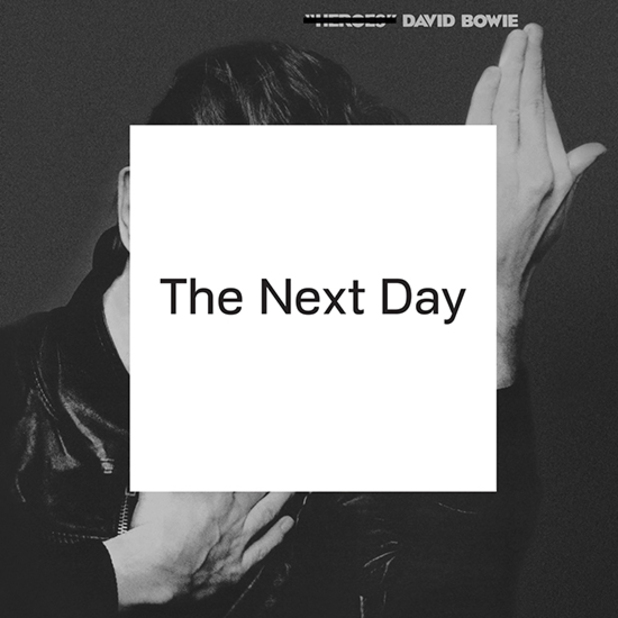 |
Posted By: jude111
Date Posted: March 08 2013 at 22:43
I think it's great. It reminds me of Méliès' Le voyage dans la lune: 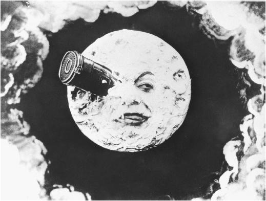 |
Posted By: infocat
Date Posted: March 08 2013 at 22:55
------------- -- Frank Swarbrick Belief is not Truth. |
Posted By: jude111
Date Posted: March 08 2013 at 23:03
Not many in the press agreed. When the image of the album was made public, the web was abuzz. No other album cover generated as much discussion and dialogue: London Guardian: "Why David Bowie's new album cover is a masterstroke": http://www.guardian.co.uk/music/musicblog/2013/jan/09/david-bowie-new-album-cover" rel="nofollow - http://www.guardian.co.uk/music/musicblog/2013/jan/09/david-bowie-new-album-cover The Quietus: "Jonathan Barnbrook Talks Bowie Artwork": http://thequietus.com/articles/11062-david-bowie-the-next-day-jonathan-barnbrook-cover-artwork" rel="nofollow - http://thequietus.com/articles/11062-david-bowie-the-next-day-jonathan-barnbrook-cover-artwork Barnbrook Blog: "David Bowie: The Next Day. That album cover design": http://virusfonts.com/news/2013/01/david-bowie-the-next-day-that-album-cover-design/" rel="nofollow - http://virusfonts.com/news/2013/01/david-bowie-the-next-day-that-album-cover-design/ Nearly every review of the album mentions the artwork. The Sun talks about "the bombshell artwork by Brit graphic designer Jonathan Barnbrook," while Pitchfork calls it "provocative." NPR writes that it's "a brilliantly simple yet shrewd piece of appropriated art, a gesture announcing that Bowie will not try to break with his past, but instead will transmute it, refract it and, if he's lucky, deepen it." The Independent calls it a "typically artful cover" for Bowie, while according to NME it's a "gleeful, meme-tastic defacement of Heroes."
|
Posted By: Guldbamsen
Date Posted: March 15 2013 at 06:19
|
We all have different views of what constitutes art, good or bad, but I must also confess to thinking that Bowie cover art extremely easy bought and unimaginative. He's essentially doing the same as Ian did with Thick as a Brick mark 2. I haven't heard the music yet though, but it has to be a true reflection/distance taken between the image of Heroes overslapped by the nothingness of that sticker. I seriously doubt it. ------------- The Guide says there is an art to flying or rather a knack. The knack lies in learning how to throw yourself at the ground and miss. - Douglas Adams |
Posted By: jude111
Date Posted: March 15 2013 at 06:34
I think it's more like if Pink Floyd had made a new album, used the "Dark Side of the Moon" cover and crossed out their name at the top (if their name was on that cover) and put a block of white over the prism. That would be shocking and it would get all of us talking about what it means. Warhol slapped a banana on a cover and it's still one of the most iconic album covers ever made. It would be easy for me to say, "Oh, I could have thought of that." But I didn't though. One could say that about Picasso's art as well, or some of the found objects presented as art pieces by the likes of Duchamp. Yes, it's not a still life of fruit or a reclining nude. But then, Bowie always was a modernist kind of guy. Of course, it's not a prog album cover - there are no elves and pixies  |
Posted By: Guldbamsen
Date Posted: March 15 2013 at 06:38
I get what you're saying, and I don't really think I can judge the cover before I've investigated in the album's content - all I'm saying is that I found it rather dull and uninspired, is all. ------------- The Guide says there is an art to flying or rather a knack. The knack lies in learning how to throw yourself at the ground and miss. - Douglas Adams |
Posted By: jude111
Date Posted: March 15 2013 at 06:41
Sorry, I didn't mean to come off so strongly,  I haven't heard the album yet either I edited my post to reflect my meaning more ;-) I haven't heard the album yet either I edited my post to reflect my meaning more ;-) |
Posted By: Guldbamsen
Date Posted: March 15 2013 at 06:49
No problemo dude - I tend to do the same some times.Hey I didn't catch you edit before, but I just gotta say that I adore the banana cover by Andy, but that is something completely different, at least to me personally. I've always had a thing for patterns, irregular and organic, and those two things appear mostly in nature. So I've always had a thing for bananas, which means taht I've loved that cover ver since the first time I saw it. What speaks to me the most, is the way he's incorporated shades in the peel (Those patterns I was on about). He really "got that", and I find it beautiful without all the trickery of peeling it off and discovering pink flesh Conversely, I am not at all intrigued by the recent Bowie. I don't find it appealing. Doesn't grab me. And it sure isn't beautiful imo. Anyway - eye of the beholder and all... ------------- The Guide says there is an art to flying or rather a knack. The knack lies in learning how to throw yourself at the ground and miss. - Douglas Adams |
Posted By: mageestout
Date Posted: May 10 2013 at 10:51
|
Can't pick one since none do anything for me. However Steven Wilson - The Raven that Refused to Sing's cover is just lame. I really enjoy most of his music (even though the lyrics can be a downer), and just seen his great concert at the Keswick, the LP (umm...CD) cover is just lame. As much thought and care as he puts into his music its as none is put forth in the cover - and I always thought FEAR OF A BLANK PLANETS's cover was a rip-off of Marillion's MARBLES to a degree |
Posted By: Metalmarsh89
Date Posted: May 10 2013 at 11:21
Same here, I could see that cover being one of the "classic covers" of the 2010's 30+ years from now.
|
Posted By: BrufordFreak
Date Posted: May 10 2013 at 20:44
|
Lagartija's Particelle ------------- Drew Fisher https://progisaliveandwell.blogspot.com/ |
Posted By: stegor
Date Posted: May 11 2013 at 00:10
|
Bowie: Heroes was a Masterstroke. I listened to The Next Day once (when it was streamed online for a day) and when it was over I didn't remember any of it. I don't normally judge anything at a glance, but there wasn't anything about it that made me want to listen again. I think the cover is a contrived marketing ploy. It seems to have worked. |
Posted By: stegor
Date Posted: May 11 2013 at 00:41
|
Posted By: Gerinski
Date Posted: May 11 2013 at 01:53
|
My vote goes to Galahad, TFK is also a nice one. Spock's Beard's is too archetypal Prog art, flying boats and vessels, how many of them have we already seen? From Fragile to Olias Of Sunhillow to Transatlantic...
|
Posted By: Gerinski
Date Posted: May 11 2013 at 01:56
That's a great work, congratulations! (sorry that I was a bit more critical with the music)
|
Posted By: twseel
Date Posted: May 18 2013 at 10:49
|
I seem to be one of the few to like Thieves' Kitchen's cover. I think it's much more artistic than those other basic pictures.
|
Posted By: Neo-Romantic
Date Posted: May 18 2013 at 14:42
| My pick is other for Riverside's Shrine of New Generation Slaves. |
Posted By: MFP
Date Posted: May 18 2013 at 15:39
| The Pineapple Thief - All The Wars |
Posted By: Kati
Date Posted: May 22 2013 at 21:27
I do not know what the criteria is for one to consider the best album cover. For me the utmost best by far, in terms of artistic originality and creativity is DeeExpus, true painted artwork. I am in love with this cover. The use of colours are extraordinaire, plus I can keep looking at it while discovering new things meanwhile being mesmerized by it too. To me it makes no sense that they are not named above with the other bands as they have certainly in my view the best and most outstanding artwork of all.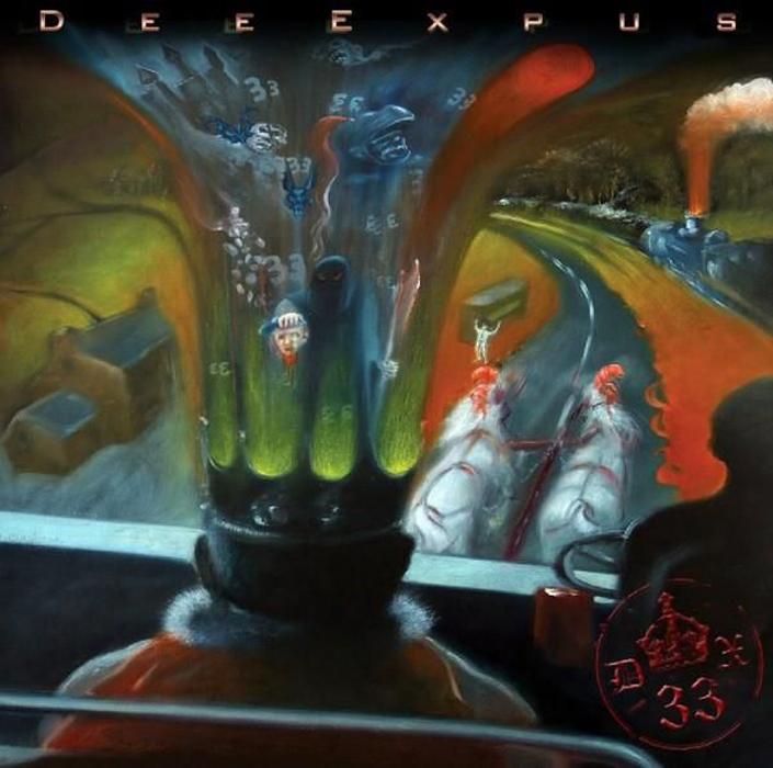
|
Posted By: Kati
Date Posted: May 22 2013 at 21:35
Second best for me are TFK with Banks of Eden and the Tea Club, although The Tea Club win first place in my opinion for the best album title: Quickly, Quickly, Quickly that's prog  
|
Posted By: Kati
Date Posted: May 22 2013 at 21:45
Hello Gerinski  Thank you very much for your wonderful compliment, I am not a pro nor ever will try or claim to be one I just am happy to draw and love to do so in my free time I read your review, it's unfortunate that you don't like it as much as me, however I must be fair/honest, your review was well written plus you do have a great articulate gift :) Even I although I might disagree I cannot dislike you at all, you have great insight and skills, the thoughts you manage so well to put in writing :) It's ok, maybe next album, you will like hopefully 
|
Posted By: Nogbad_The_Bad
Date Posted: May 22 2013 at 22:05
This one
 ------------- Ian Host of the Post-Avant Jazzcore Happy Hour on Progrock.com https://podcasts.progrock.com/post-avant-jazzcore-happy-hour/ |
Posted By: Nogbad_The_Bad
Date Posted: May 22 2013 at 22:07
Or maybe this one
 ------------- Ian Host of the Post-Avant Jazzcore Happy Hour on Progrock.com https://podcasts.progrock.com/post-avant-jazzcore-happy-hour/ |
Posted By: Kati
Date Posted: May 22 2013 at 22:22
hahahaha!!!! Nogbad_The_Bad It is certainly quirky and fun but nope I stand by my choice the send me a postcard makes it so funny  most funny yes most funny yes
|
Posted By: Kati
Date Posted: May 22 2013 at 22:26
I really want to like this one, it's pro, yet it feels wrong, the cartoons and background, I don't know, something not quite right, inc the name placement. My favourite is unbeatable
|
Posted By: Nogbad_The_Bad
Date Posted: May 22 2013 at 22:45
Do you prefer their previous one?
 ------------- Ian Host of the Post-Avant Jazzcore Happy Hour on Progrock.com https://podcasts.progrock.com/post-avant-jazzcore-happy-hour/ |
Posted By: Kati
Date Posted: May 22 2013 at 23:11
Nogbad_The_Bad, you know what, I actually do like this one more. Those cartoon smiles are so infectious, magnetic that even I am grinning and smiling looking at it lolol love those face expressions
|
Posted By: Kati
Date Posted: May 27 2013 at 22:51
MFP, my comments above are not in reply to your comment here. I unfortunately have not seen The Pineapple Thief album artwork, thus cannot comment.  Hugs to you,
|
Posted By: Svetonio
Date Posted: May 27 2013 at 23:00
| From the list, I voted Flower Kings. |
Posted By: Svetonio
Date Posted: May 27 2013 at 23:07
Those are my two favs of recent album jackets; those beautiful surealistic paintings....  Whole that The Didact package is majesticaly designed: a booklet with one fantastic image per each song, also a nice T-shirt. 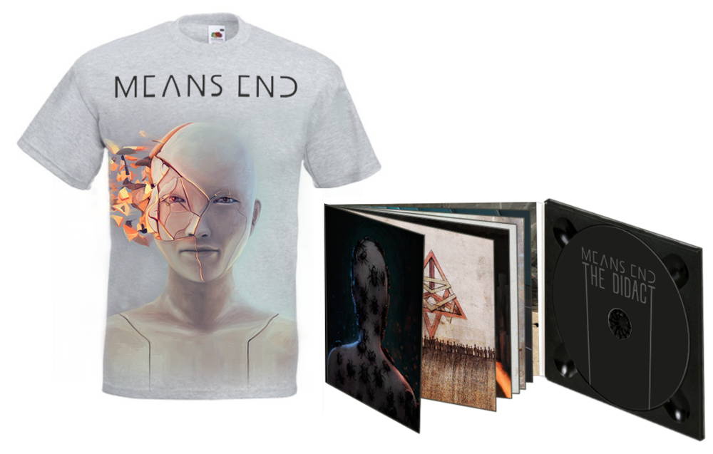 ...and Atlas Volt's debut.  |
Posted By: Svetonio
Date Posted: May 27 2013 at 23:35
As I said in an another thread, Mr Bowie was / is always a fashionable artist. This time he used to settle that Concept art piece for his new album cover. TBH, I hate Concept art with a passion |
Posted By: Svetonio
Date Posted: May 27 2013 at 23:49
A perfect "retro" design for that 70's style Prog album by John Potter: Cellestial Adventures  |
Posted By: Svetonio
Date Posted: May 28 2013 at 00:22
For example, the style of The Last Curlews (solo album by Brett Kull from Echolyn) album ilustration by Tara Jane O'Neil reminds me on the works on paper by Francesco Clemente who was / is the very best painter of Transavantgarde: 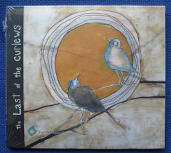 ...also, Tara's artworks for her book Who Takes A Feather shows that influence so evidently:   |
Posted By: Svetonio
Date Posted: May 28 2013 at 01:07
I agree, this is a nice oil pastels work. But, the letters are badly selected; that type of the letters are not visualy corresponding with the painting at all and the whole image is ruined.
|
Posted By: Gandalff
Date Posted: May 28 2013 at 01:10
|
The most beautiful cover art from these is certainly The Pineapple Thief's, the ugliest is Galahad's one. Wilson's cover art looks like some pupil's painting. ------------- A Elbereth Gilthoniel silivren penna míriel o menel aglar elenath! Na-chaered palan-díriel o galadhremmin ennorath, Fanuilos, le linnathon nef aear, sí nef aearon! |
Posted By: Gandalff
Date Posted: May 28 2013 at 01:17
From the others:
 or
 Roger Dean never disappoints! ------------- A Elbereth Gilthoniel silivren penna míriel o menel aglar elenath! Na-chaered palan-díriel o galadhremmin ennorath, Fanuilos, le linnathon nef aear, sí nef aearon! |
Posted By: Kati
Date Posted: May 28 2013 at 02:10
Awww Bowie can do no wrong, he is my ultimate favourite artist, a true musical chameleon, all round musician and ultimate entertainer. Vocals are not most important to me as I focus mostly on instrumentals, to be honest many vocals don't impress me much. I do think David Byron and Freddie's vocals were outstanding and instrumental, recent artist's that I like is Daniel Gildenlow, his vocals are so good plus can sing up to 4 octaves. All this said, many can sound like them, but to date no one sounds like Bowie he is unique. This album cover might not be the most artistic but it's brilliant ha! The cover makes a statement and peaks one's interest, it's Bowie people plus for me the hottest man alive.  
|
Posted By: Svetonio
Date Posted: May 28 2013 at 03:19
 
|