/PAlogo_v2.gif "Progarchives.com Homepage")
|
|
Post Reply 
|
Page <12345 9> |
| Author | |||||||||
keiser willhelm 
Forum Senior Member 

Joined: September 14 2007 Location: United States Status: Offline Points: 1697 |
 Posted: March 16 2008 at 21:04 Posted: March 16 2008 at 21:04 |
||||||||
|
Genesis takes the cake for bad album covers. they might mean well, or have a deaper meaning as to the music inside but man are they ugly. Tresspass is really bad, foxtrot is laughable, Nursury Cryme is pathetic, and The Lamb is very uninspired./ besides most cheese metal prog with dragons and fairies and big swords, genesis has, imo, lowered the bar significantly.
|
|||||||||
 |
|||||||||
|
ghost_of_morphy
Prog Reviewer 

Joined: March 08 2007 Location: United States Status: Offline Points: 2755 |
Posted: March 16 2008 at 21:38 |
||||||||
|
If they had pared that list down to 9, they could have listed a fair amount of the really bad prog covers. |
|||||||||
|
|||||||||
|
micky
Special Collaborator 

Honorary Collaborator Joined: October 02 2005 Location: . Status: Offline Points: 46843 |
Posted: March 16 2008 at 21:45 |
||||||||
|
^ hahha.... if they knew more than the same old same old of of dear old England.. and America (Kansas?.. come on.. what was wrong with that cover) ... they could have expanded it to 50

Edited by micky - March 16 2008 at 21:46 |
|||||||||
|
The Pedro and Micky Experience - When one no longer requires psychotropics to trip
|
|||||||||
|
|||||||||
|
crimson87
Prog Reviewer
Joined: January 03 2008 Location: Argentina Status: Offline Points: 1818 |
Posted: March 16 2008 at 22:00 |
||||||||
|
I personally think Tarkus`s cover is awful and that`s quite a pity becouse is a 5 star album, and the inner pictures showing how tarkus becomes aquatarkus .... come on !!!!! THEY SUCK.
What I DON´T like is that they also started bashing on the music as usual.Is it a national sport among americans to criticise prog?In my country they don`t even know what prog is!!
|
|||||||||
|
|||||||||
|
Logan
Forum & Site Admin Group

Site Admin Joined: April 05 2006 Location: Vancouver, BC Status: Offline Points: 38451 |
Posted: March 16 2008 at 22:22 |
||||||||
|
Watching while most appreciating a sunset in the moment need not diminish all the glorious sunsets I observed before. It can be much like that with music for me; immersed in experiencing the moment.
|
|||||||||
|
|||||||||
|
micky
Special Collaborator
Honorary Collaborator Joined: October 02 2005 Location: . Status: Offline Points: 46843 |
Posted: March 16 2008 at 22:23 |
||||||||
|
^

|
|||||||||
|
The Pedro and Micky Experience - When one no longer requires psychotropics to trip
|
|||||||||
|
|||||||||
|
Dim
Prog Reviewer
Joined: April 17 2007 Location: Austin TX Status: Offline Points: 6890 |
Posted: March 16 2008 at 22:24 |
||||||||
Whatch yourself buddy, the majority of members on this site are americans!
|
|||||||||

|
|||||||||
|
|||||||||
|
Salvo_
Forum Senior Member
Joined: February 27 2008 Status: Offline Points: 110 |
Posted: March 16 2008 at 22:26 |
||||||||
It is a humor website in addition to being informative. Why does it upset you that they are poking at the music some too? Can you not take a joke?
While on the subject, why do so many prog fans have such an incredible martyrdom complex? I've seen "Everyone but us hates prog abloo bloo bloo" expressed so many times on this website (I've been here longer than my join date would make it seem), yet in almost all my experiences, if you play something that isn't too extreme in any direction, people are somewhat receptive to it. But even if they weren't, the only time I've ever seen someone's opinion of a person change over musical taste is on the internet or among 15 year olds, which, not coincidentally, are groups that often intersect.
I don't mean for that to be an attack on crimson87 or anyone else on this site; it's just a general atmosphere that I find baffling.
|
|||||||||
|
|||||||||
|
Ivan_Melgar_M
Special Collaborator
Honorary Collaborator Joined: April 27 2004 Location: Peru Status: Offline Points: 19557 |
Posted: March 16 2008 at 22:29 |
||||||||
Yes of course it's tangential, their point is that any well elaborate artistic and descriptive cover is cjeesy, that everything related with Prog is self indulgent.
I honestly don't care about their artivcles, neither I enjoy them, they are not trying to make a joke, they are being harsh. What I read hear is the same crap I read in Blender orother crappy magazines when they talk about Prog, only uncalled attacks.
As a fact I seen some funny sites where they are informed, this guys don't know what they are talking about, they haven't even read the lyrics or the song titles to know if there's a reason for the cover.
Wouldn't insult them, wouldn't reply to their posts, because I don't want to give them more clicks.
But back to the theme, their point is to piss some progheads so they got violent replies and more clicks, something they wouldn't achieve with Love Beach art cover, because modst Progheads will agree.
BTW: Neither Syteely Dan or their art covers have relation with Prog,
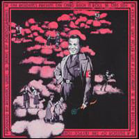
It's obvious you don't like Paul Whitehead paintings, but calling Trespass a bad painting is really strange, this is one of the most delicate works of art, which I have seen.
 The pale blue main color creates the perfect contrast with the view from the windows, the characters in blñack and white are delicate and subtle, almost atmospheric or ethereal (if you notice, you can't almost see the feet and of course there's no floor), everything is calmed with some mystery, except the knife which irrupts in the scene as a touch of violence........Wow, exactly as the album music.
BTW: Genesis, Le Orme, VDGG, Quaam, Clearlight and least 20 other bands have selected him for the covers because of his descriptive detailled work, characteristic of a muralist which casually is his main occupation.
This is a competitive ocupation and the guy is still being requested by several artists............There must be a reason.
Iván
If you don't like it, say it, but you can't qualify as bad what others find outstanding-
Edited by Ivan_Melgar_M - March 16 2008 at 23:35 |
|||||||||

|
|||||||||
|
|||||||||
|
Salvo_
Forum Senior Member
Joined: February 27 2008 Status: Offline Points: 110 |
Posted: March 16 2008 at 22:44 |
||||||||
|
No, Ivan, I'm positive they're trying to funny, not in a satirical way, but that doesn't mean they're dead serious. Have you ever considered that they're coming from the point of view of someone outside prog, which is what makes them look so silly? It doesn't matter if there's a lyrical tie-in, Tarkus is still a silly cover. I think that Steely Dan cover was very early prog.
Really, haven't you ever read The Onion? I think perhaps you need to lighten up a bit. They are not trying to offend you.
Trespass is good, although pretentious. I'm not saying he's a bad artist, but H to He and Nursery Cryme are ugly, ugly covers.
|
|||||||||
|
|||||||||
|
Atavachron
Special Collaborator

Honorary Collaborator Joined: September 30 2006 Location: Pearland Status: Offline Points: 65782 |
Posted: March 16 2008 at 22:47 |
||||||||
|
"...rendered in what appears to be magic marker"
LOL bad covers? - Argent's 'Ring of Hands' ..p.u. - 'Drama' ..what's that all about Rog? Looks like a poster for 'Cat People' - 'Free Hand' ..oookay - 'A' ..yeah - and the Nice never seemed to have a good designer |
|||||||||
|
|||||||||
|
BaldJean
Prog Reviewer

Joined: May 28 2005 Location: Germany Status: Offline Points: 10387 |
Posted: March 16 2008 at 22:50 |
||||||||
It is derivative indeed, but of Magritte paintings  |
|||||||||
 A shot of me as High Priestess of Gaia during our fall festival. Ceterum censeo principiis obsta |
|||||||||
|
|||||||||
|
Ivan_Melgar_M
Special Collaborator
Honorary Collaborator Joined: April 27 2004 Location: Peru Status: Offline Points: 19557 |
Posted: March 16 2008 at 22:50 |
||||||||
Edited by Ivan_Melgar_M - March 16 2008 at 22:55 |
|||||||||
|
|
|||||||||
|
|||||||||
|
micky
Special Collaborator
Honorary Collaborator Joined: October 02 2005 Location: . Status: Offline Points: 46843 |
Posted: March 16 2008 at 22:55 |
||||||||
|
I will say though.. .some of the comments on the albums themselves are quite shrewd.. much more than you find from say... many posters here.
Satirical perhaps.. but the person who wrote it knew the albums. the music.. the groups.
|
|||||||||
|
The Pedro and Micky Experience - When one no longer requires psychotropics to trip
|
|||||||||
|
|||||||||
|
Salvo_
Forum Senior Member
Joined: February 27 2008 Status: Offline Points: 110 |
Posted: March 16 2008 at 23:10 |
||||||||
|
Then you shouldn't be offended, Ivan.
It's a little bit pretentious because it's monks and stuff. But that's ok, I was just saying.
This is what I've been trying to say all along.
|
|||||||||
|
|||||||||
|
BaldJean
Prog Reviewer
Joined: May 28 2005 Location: Germany Status: Offline Points: 10387 |
Posted: March 16 2008 at 23:11 |
||||||||
|
as to the cover of "H to He...":
(excerpt of an interview with Paul Whitehead)
|
|||||||||
|
A shot of me as High Priestess of Gaia during our fall festival. Ceterum censeo principiis obsta |
|||||||||
|
|||||||||
|
Ivan_Melgar_M
Special Collaborator
Honorary Collaborator Joined: April 27 2004 Location: Peru Status: Offline Points: 19557 |
Posted: March 17 2008 at 00:20 |
||||||||
|
|||||||||
|
|
|||||||||
|
|||||||||
|
Garion81
Special Collaborator
Honorary Collaborator Joined: May 22 2004 Location: So Cal, USA Status: Offline Points: 4338 |
Posted: March 17 2008 at 00:59 |
||||||||
|
I have the Trespass cover (a print really) framed and hanging in my bedroom. Articles like this one I agree Ivan are just ways to attack the music. When they came out they were eye catching. People who weren't alive then don't understand in my opinion. Sorry if that offends you. Maybe they are retro now or whatever you think but they were pretty cool back then.
|
|||||||||

"What are you going to do when that damn thing rusts?" |
|||||||||
|
|||||||||
|
keiser willhelm
Forum Senior Member
Joined: September 14 2007 Location: United States Status: Offline Points: 1697 |
Posted: March 17 2008 at 01:04 |
||||||||
|
@ Ivan.
I may have gotten a little carried away, its not the worst genesis cover there(probably the best on the list) but its still very borring. ethereal figures? i find them to be very weighted and heavy, their isn't much movment in their cloths and the thick, static lines really weigh them down. they look like statues. the pale blue is a good choice for color because, like the rest of it, nothing is happening. it just looks so flat and lifeless to me. the knife was a good choice tho and the only thing that provides relief from the bordom. i stand by what i said about the other album covers tho, really horrendous. |
|||||||||
|
|||||||||
|
salmacis
Forum Senior Member
Content Addition Joined: April 10 2005 Status: Offline Points: 3928 |
Posted: March 17 2008 at 04:48 |
||||||||
|
The article is OK and quite fun, IMHO- they're not really making fun of the music itself. I don't think stuff like 'Tormato' can seriously be defended! The tedious 'hipster' types that have posted comments below the article are; notice how they use their supposed indie/punk musical tastes to show how 'cool' they are. If there's one thing I hate, it's that- those people are into fashion, not music.
|
|||||||||
|
|||||||||
|
Post Reply
|
Page <12345 9> |
| Forum Jump | Forum Permissions You cannot post new topics in this forum You cannot reply to topics in this forum You cannot delete your posts in this forum You cannot edit your posts in this forum You cannot create polls in this forum You cannot vote in polls in this forum |


 18 ridiculous prog album covers
 Topic Options


 crimson87 wrote: