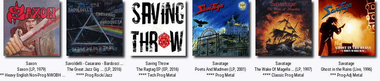
New site header design, thanks to ABEL ADAMES
Printed From: Progarchives.com
Category: Site News, Newbies, Help and Improvements
Forum Name: Internal news
Forum Description: Stay informed about the latest updates regarding the site
URL: http://www.progarchives.com/forum/forum_posts.asp?TID=72167
Printed Date: July 20 2025 at 09:55
Software Version: Web Wiz Forums 11.01 - http://www.webwizforums.com
Topic: New site header design, thanks to ABEL ADAMES
Posted By: M@X
Subject: New site header design, thanks to ABEL ADAMES
Date Posted: October 12 2010 at 13:51
|
Hi fellow proggers !!! Good news! Today I put the new site header design, a prog collage created by our friend Abel Adames. Have a look and post your comments here.  Nice job Abel Nice job Abel------------- Prog On ! |
Replies:
Posted By: SaltyJon
Date Posted: October 12 2010 at 13:52
Just saw it, looks good!  Thanks, Abel! ------------- http://www.last.fm/user/Salty_Jon" rel="nofollow"> 
|
Posted By: Snow Dog
Date Posted: October 12 2010 at 13:53
|
I was told that if you can't say something nice........... ------------- http://www.last.fm/user/Snow_Dog" rel="nofollow"> 
|
Posted By: Snow Dog
Date Posted: October 12 2010 at 13:54
|
.....in other words I don't like it. ------------- http://www.last.fm/user/Snow_Dog" rel="nofollow">
|
Posted By: harmonium.ro
Date Posted: October 12 2010 at 13:54
|
Haha that's fun, bavo!
|
Posted By: M@X
Date Posted: October 12 2010 at 13:55
 ------------- Prog On ! |
 Snow Dog wrote:
Posted By: Snow Dog
Date Posted: October 12 2010 at 13:57
Sorry [email protected] asked for comments. Did you just want positive ones? Oh God.....I've upset M@X now!  ------------- http://www.last.fm/user/Snow_Dog" rel="nofollow">
|
Posted By: M@X
Date Posted: October 12 2010 at 13:59
^ no no no , I am not upset, I just wonder what you don't like (more precisions, to help improve maybe) ------------- Prog On ! |
Posted By: toroddfuglesteg
Date Posted: October 12 2010 at 13:59
|
Will this be released as banners which we can use for our own websites too, M@X ? The current banners are rather toothless compared to the new design you have just implemented to my satisfaction/joy. Please remove your current banners and use the new heading as banners. ............. Did I mention I like the new heading ? No ? Well, it has my thumbs up. Edit: Your http://www.progarchives.com/about_us.asp - current banners are squirrel droppings awful, M@X. Please use the new design, compact it a bit and release it as the new banners. |
Posted By: Snow Dog
Date Posted: October 12 2010 at 14:03
Ok....From a design point its not as clean or neat looking now, The PROG ARCHIVES gets lost in the background. The background itself doesn't seem very high res either. The third point is more personal in that I am not a huge fan of collages I hope thats better!  ------------- http://www.last.fm/user/Snow_Dog" rel="nofollow">
|
Posted By: Epignosis
Date Posted: October 12 2010 at 14:07
|
It often takes me a while to warm up to changes when I am used to something, but I seem to quite like this. My only concern is to be sure using the various images is not a legal problem (I know this has been discussed with respect to Abel's collages themselves, but I just wanted to be sure about the images being used as a heading for a website). But yes, I do like it. ------------- https://epignosis.bandcamp.com/album/a-month-of-sundays" rel="nofollow - https://epignosis.bandcamp.com/album/a-month-of-sundays |
Posted By: snobb
Date Posted: October 12 2010 at 14:09
I like this new one 
Old one was really.... old-fashion one, and too serious for my taste |
Posted By: Snow Dog
Date Posted: October 12 2010 at 14:10
I'm in the minority again. ------------- http://www.last.fm/user/Snow_Dog" rel="nofollow">
|
Posted By: rushfan4
Date Posted: October 12 2010 at 14:13
------------- 
|
Posted By: lazland
Date Posted: October 12 2010 at 14:21
|
Yep, like it Robert, though, has introduced a note of caution - don't get yourself sued M@X, we sure would miss this place  ------------- Enhance your life. Get down to www.lazland.org Now also broadcasting on www.progzilla.com Every Saturday, 4.00 p.m. UK time! |
Posted By: Shevrzl
Date Posted: October 12 2010 at 14:22
|
Not really, I prefer the old one too. This new one seems err... too colourful? Sort of being too prominent. |
Posted By: Marty McFly
Date Posted: October 12 2010 at 14:23
Ian, Ian. But ProgArchives name isn't lost in the background. This orange monster is virtually shining there. Indeed, I have moderate brightness setting on my laptop. With 1280x800 resolution, it's big enough, but you're right that it's not that sharp as it could have been. But I'm fan of sharpened images. Not extremely, but on sharp <=> blurry scale I'm more inclined to sharp point of view. I'm not sharp dressed man though. And third one, I enjoy collages. M@X ? Were you thinking about my suggestions, particulary the one about moving genres / popular bands / alphabetical listing of artists into combo boxes ? It can save a lot of space.
------------- There's a point where "avant-garde" and "experimental" becomes "terrible" and "pointless," -Andyman1125 on Lulu  Even my |
Posted By: Chris S
Date Posted: October 12 2010 at 14:23
|
Love it......great refresh and most prog lovers will immediately identify with the imagery. ------------- ...As I venture through the slipstream, between the viaducts in your dreams...[/COLOR] |
Posted By: Logan
Date Posted: October 12 2010 at 14:39
As Rob pointed out, as long as it does not violate any copyrights for images, then it's fine (I think under fair dealing/ fair use legislation it's acceptable). I would rather the Prog Archives: Your Ultimate Prog Rock Resource" logo thing stood out more rather than having it blend in so much (I would either lighten or darken the area around it or highlight it more in some manner). I also find the collage too busy for my tastes, especially around the "Prog Archives" part. Too many men in the picture too (including man hiney). Personal preference, I'd rather see more females (Gabriel in a dress, and there's a similar other one, doesn't cut it) or non-people things. Though this would have been nice worked into it: Wouldn't expect it, but I'd rather something more original that captures the spirit of Progressive Music somehow. Maybe something a little shocking/ disturbing/ bizarre like a brain or two wearing headphones. One brain is electrically charged, and one is exploding (this is your brain on Prog) Then we could have some guy screaming rather like the King Crimson cover while someone else is laughing. Or, I'd like and angels and demons scene where the angels and demons are dancing on broken vinyl records. Or some good trip/ bad trip imagery. But that's just me. ------------- Watching while most appreciating a sunset in the moment need not diminish all the glorious sunsets I have observed before. It can be much like that with music for me. |
Posted By: Finnforest
Date Posted: October 12 2010 at 14:47
I'm with you Snowie, just because i happen to like traditions and classic brandings/logos. Nothing against the artist Abel.
I love old buildings too, and how many Eurpean towns and cities maintain their classic look architectural streetfronts. Here in the States, everything looks like just another Applebees. ------------- https://www.youtube.com/shorts/sQD8uhpWXCw" rel="nofollow - It's a beautiful day in the neighborhood...Road Rage Edition |
Posted By: Windhawk
Date Posted: October 12 2010 at 15:22
|
It's good looking, but the sites logo does drown in it. Applying the logo on a white background in a gradient towards blank might be an option, so that the logo gets illuminated amidst all the colours, with the gradient ending 4-5 millimeters away from the logo. Or something like that. Experiment so that the site logo gets a tad more focus, basically.
------------- Websites I work with: http://www.progressor.net http://www.houseofprog.com My profile on Mixcloud: https://www.mixcloud.com/haukevind/ |
Posted By: Evolver
Date Posted: October 12 2010 at 15:52
|
I like it as art, but it's too busy for a site header. ------------- Trust me. I know what I'm doing. |
Posted By: darksideof
Date Posted: October 12 2010 at 16:21
thank you sooo much! Max I really apriciate it!. ------------- http://darksideofcollages.blogspot.com/ http://www.metalmusicarchives.com/ https://www.facebook.com/pages/Darksideof-Collages/ |
Posted By: TheGazzardian
Date Posted: October 12 2010 at 16:24
| I hate to voice in against it, especially considering the quality, but I feel that more consideration could have been given to where it appears on the site and its size. The collages usually look good in full size, but as small as this one is many of the images appear tiny and hard to discern, and it seems very visually heavy and noisy, drawing the eye into it but not really focussing anywhere. Again, with collages this is typically fine, but I feel some more technique could have been used to draw the eye towards the prog archives logo and the salient points around the logo in the site. |
Posted By: TheGazzardian
Date Posted: October 12 2010 at 16:26
|
For example on what i mean about the eye not being drawn to the logo, we have some well placed items (Aqualung is facing towards the logo as is the Leftovertures guy) but the Court head way to the left could have drawn the eye closer to it. I think it might have looked better with the logo centered and larger, with items facing left on the right side and items facing right on the left side, so that your eye is inevitably drawn to the center. (Just as one idea)
|
Posted By: darksideof
Date Posted: October 12 2010 at 16:28
True! we spoke about that. I hope it will ok. Get the Ok first. I contact the painter from of Aqualung ( Burton Silverman) and he said it is ok. I know the Artist who did KC in the court had passed. but the rest I guess try to contact. them first. ------------- http://darksideofcollages.blogspot.com/ http://www.metalmusicarchives.com/ https://www.facebook.com/pages/Darksideof-Collages/ |
Posted By: darksideof
Date Posted: October 12 2010 at 16:55
|
Hi Fellas This is abel I hear you all your great constructive criticsims. Thanks fellas for all the one that like it and the one that don't too. I am gonna try to answer all post that brought more attention: 1. the main reason why the images might look kind of blurry is because once an image is being reduce in resolution it gets blurry and its sharpness is mostly lost. It doesn't matter how large it was originally. Believe me i am also a fan of sharp images and details. Look real close at most of my collages. I love sharp images. 2. I hear ya! that maybe PA should of use or create an original collage or "Art" but when I think of prog I think of these famous albums whom we the prog fans love. These bands albums represent prog in the world of many prog fans I believe. If PA would of have an original Artwork it wouldn't have anything to do with prog I think. And Believe I Can create an original collage or art. 2. True it does looks busy and I was trying hard not too. It is hard for a prog collage not to look busy when they are so many quiet awesome albums. which I don't want to leave out. However I had too and at the end it will looks crowded. Also, 3. Also as an collage artist I am pretty sure that I can't please everyone and I am sure that not everyone will like my style or collages. that is fine. You are entitle to your voice. I am fan of prog but I don't like all prog bands. I am a huge fan of Surrealist artists but I don't like all of them. and their style. Thanks you very much! ------------- http://darksideofcollages.blogspot.com/ http://www.metalmusicarchives.com/ https://www.facebook.com/pages/Darksideof-Collages/ |
Posted By: Slartibartfast
Date Posted: October 12 2010 at 17:01
Dean should be upset that his design was passed over. Congrats to Abel. May it have a long life. ------------- Released date are often when it it impacted you but recorded dates are when it really happened... 
|
Posted By: Dean
Date Posted: October 12 2010 at 17:26
Sorry.
------------- What? |
Posted By: Viajero Astral
Date Posted: October 12 2010 at 17:34
|
Looks ok if you want to use it as a wallpaper, but as a header is not very usefull for that purpose, it has a lot of elements, for a website that can gave a heart atack to any web usability purist (thats what a friend of mine said, hes a web developer and honestly, the index page has a lot of elements, but doesn't bother me so much). The other problem is the Logo, its orange, yes, but there are a lot of elements that have a lot of visual weight and every single element has an unique hue, shape and a big contrast to anything in the composition, so you really have no idea of what to look first (collages arent good for websites). This place is, in my opinion, the best and most complete online enciclopedy of prog, so it needs more planiation of every aspect, in this case the visual, so it can work well for everyone, and not just look pretty. To Abel: Im not saying that its horrible, but its not good for a header, and in a more personal opinion, looks very 90's  . .*(Its been a long time since I wrote something significant here in the forum, sorry for not passing by more often here). ------------- 
|
Posted By: Henry Plainview
Date Posted: October 12 2010 at 18:15
Music should be complex, but visual design should be simple. There's just too much crap on it, so it looks like I'm having a bad acid trip in the '90s next to my album collection. And I've always thought darksideof's collages were pretty ugly, but I didn't say anything in the threads because there was no reason for me to crash their party. But when it's right on the front page I feel compelled to share my negativity. ------------- if you own a sodastream i hate you |
Posted By: Conor Fynes
Date Posted: October 12 2010 at 18:41
| I definately prefer it the way it used to be... hate to say it, but the site looks much less professional now. |
Posted By: Icarium
Date Posted: October 12 2010 at 18:55
|
I LIKED IT VERY MUCH
nice jobb, very progressive in style -------------  
|
Posted By: Chris S
Date Posted: October 12 2010 at 19:15
|
Best do a poll I think ... ------------- ...As I venture through the slipstream, between the viaducts in your dreams...[/COLOR] |
Posted By: Slartibartfast
Date Posted: October 12 2010 at 19:35
Yes yes yet another poll. I see most people posting negative or critical comments so far in this thread. I liked it on first impression but perhaps it could do with a little tweaking based on the constructive criticism I've seen. Can we substitute Dean's for the forum header though? ------------- Released date are often when it it impacted you but recorded dates are when it really happened...
|
Posted By: UndercoverBoy
Date Posted: October 12 2010 at 19:43
|
Posted By: Xanatos
Date Posted: October 12 2010 at 19:56
 "I like it..." "I like it..." |
Posted By: JLocke
Date Posted: October 12 2010 at 21:02
|
May I make a suggestion? Why not have a couple of different versions of the banner, then rotate them randomly so as to add some variety to the front page? Plus, it would appease any potential objections to this new look by not having it remain a constant feature. (No offense, Abel. I like what you've done. Just trying to think creatively as always ) |
Posted By: Finnforest
Date Posted: October 12 2010 at 21:14
|
Just want to reiterate that the objections of most are not a slam of Abel. I think most here like and respect Abel's projects.....it's just a matter of what works in that location for a clear and instantly recognizable welcome mat for PA. I truly hope these comments aren't bumming out Abel ------------- https://www.youtube.com/shorts/sQD8uhpWXCw" rel="nofollow - It's a beautiful day in the neighborhood...Road Rage Edition |
Posted By: Epignosis
Date Posted: October 12 2010 at 21:47
|
I generally loathe change, but the more I see it, the more I like it. The colors and visuals react in my brain and gets me excited about music (both listening to it and creating my own). Also, the logo looks fine to me. Stands out just fine. For what that's worth. ------------- https://epignosis.bandcamp.com/album/a-month-of-sundays" rel="nofollow - https://epignosis.bandcamp.com/album/a-month-of-sundays |
Posted By: darksideof
Date Posted: October 12 2010 at 21:50
thanks!------------- http://darksideofcollages.blogspot.com/ http://www.metalmusicarchives.com/ https://www.facebook.com/pages/Darksideof-Collages/ |
Posted By: Finnforest
Date Posted: October 12 2010 at 21:51
You're probably right that in a week we'll all be used to it and it'll be weird to change it back ------------- https://www.youtube.com/shorts/sQD8uhpWXCw" rel="nofollow - It's a beautiful day in the neighborhood...Road Rage Edition |
Posted By: darksideof
Date Posted: October 12 2010 at 21:57
T H A N K Y O U ! ------------- http://darksideofcollages.blogspot.com/ http://www.metalmusicarchives.com/ https://www.facebook.com/pages/Darksideof-Collages/ |
Posted By: darksideof
Date Posted: October 12 2010 at 22:04
Thanks a lot man! I appreciated your comments. I am not really. I don't mind criticism as long there aren't negative. It is fine. Everyone are entitled to it, However I am aware that everyone won't be please and go crazy about my collages that is fine!. we all are not alike and we all don't like the same Art, but it is Max who has the last voice here and I am guessing that he is happy with it because he put it in. I did several versions of headers and banner but he is the one who made the last decision.
------------- http://darksideofcollages.blogspot.com/ http://www.metalmusicarchives.com/ https://www.facebook.com/pages/Darksideof-Collages/ |
Posted By: Triceratopsoil
Date Posted: October 12 2010 at 22:07
| No offense, but the new banner makes me glad that I have the forums bookmarked and not the frontpage |
Posted By: Conor Fynes
Date Posted: October 12 2010 at 22:08
|
The collage itself is well done, but it's way too much for a logo. The old logo fit into the rest of the page perfectly... The forum logo also shouldn't have been changed however many months ago.. |
Posted By: darksideof
Date Posted: October 12 2010 at 22:22
Well Henry that is fine! Like I said earlier in a comment. I am not hopping that everyone will like the collages and I am not expecting it either. that is fine that don't like them or find them pretty ugly. that is fine they are so many pretty popular artist that I find their work pretty ugly as well, however my voice won't make them change their mind of how to satisfy my taste or the type of art work I like. Art is free and words! and complex in my eyes specially when it is made for Prog music in mind. When I listen to Tangerine Dream, Gong,Vdgg, Genesis, Pink FLoyd, DT, PT, Ozric Tentacles, Opeth, Yes, Area, Henry Cow, ELP, Frank Zappa, etc. etc, etc, There aren't much of anything simple in the sound that there bands created it to my ears. When I create these collage I have that in mind vividly! these complex, psychedelics sounds and of course the albums covers themselves are a great influence. ( Roger Dean and Storm are all time fav) it isn't that I don't care what prog fans might think about my collages, but what really matter is how satisfy I am with them. If I listen to everyone comments all the time. It won't be my imagination that will create them but only everyone else comments and ideas. sorry ! Wikipedia: Art is the product or process of deliberately arranging http://en.wikipedia.org/wiki/Symbol - symbolic elements in a way that influences and affects the http://en.wikipedia.org/wiki/Senses - senses , http://en.wikipedia.org/wiki/Emotions - emotions , and/or http://en.wikipedia.org/wiki/Intellect - intellect . It encompasses a diverse range of human activities, creations, and modes of expression. A collage (From the http://en.wikipedia.org/wiki/French_language - French : coller, to glue) is a work of formal art, primarily in the http://en.wikipedia.org/wiki/Visual_arts - visual arts , made from an http://en.wikipedia.org/wiki/Assemblage_%28art%29 - assemblage of different forms, thus creating a new whole.The material used in a college can be both original and borrowed, and the medium is limited only by the imagination of the artist.
------------- http://darksideofcollages.blogspot.com/ http://www.metalmusicarchives.com/ https://www.facebook.com/pages/Darksideof-Collages/ |
Posted By: spookytooth
Date Posted: October 12 2010 at 22:45
|
I have to say...it looks fantastic.
------------- 
Would you like some Bailey's? |
Posted By: Stooge
Date Posted: October 12 2010 at 23:45
|
I actually like the look of the main page (the header). I don't find it all that distracting, but my memory is so bad that I'm having a hard time visualizing what it looked like before. |
Posted By: Evolutionary Sleeper
Date Posted: October 12 2010 at 23:50
|
Well, I for one like it.
------------- 
|
Posted By: A Person
Date Posted: October 12 2010 at 23:55
I sometimes have the same problem when someone changes their avatar, for some reason I can't remember the old one at all. |
Posted By: mourningknight
Date Posted: October 13 2010 at 00:13
|
I think the new header is very cool and adds a touch of class to the site. I love it. Great job Abel! ------------- 
|
Posted By: Rosebud
Date Posted: October 13 2010 at 00:18
| I think the banner is sick! The old one was getting a little stale (new on forums, been coming to this site forever) |
Posted By: Viajero Astral
Date Posted: October 13 2010 at 00:42
Sounds like a good idea for a contest to me, like this http://nfgraphics.com/headers/ - blog , they had made contest or invite designer to make new headers so every time you enter you will see a diferent one. -------------
|
Posted By: progkidjoel
Date Posted: October 13 2010 at 01:51
|
I actually thought it looked awesome, like all of Abel's work. It's one of those ones that you can take for face value and enjoy with a half a second look or stare into for 10 minutes and still notice new stuff. Really loving it.
------------- 
|
Posted By: someone_else
Date Posted: October 13 2010 at 02:44
|
Being a rather conservative person, I'm not too often to be found among the ones who cheer loudly because of a change. But this one is quite an improvement. I like it for its colourfulness. ------------- 
|
Posted By: Easy Livin
Date Posted: October 13 2010 at 02:55
| I like it, it brightens things up on the home page. Will it be used for the forum too mailto:M@x - M@x ? |
Posted By: Dean
Date Posted: October 13 2010 at 03:02
------------- What? |
Posted By: Sean Trane
Date Posted: October 13 2010 at 04:49
|
This'new design" hit me in the eye right away and I wondered why an add had replaced the logo and headlining band.... until I saw that the logo was still there....
It actually clashes (a bit) with the purple and orange colours of the site
It plays to much on the prog D&D clichés for its own good... Im not sure it's good for the prog cause...
I guess I'll get used to it. ------------- let's just stay above the moral melee prefer the sink to the gutter keep our sand-castle virtues content to be a doer as well as a thinker, prefer lifting our pen rather than un-sheath our sword |
Posted By: Snow Dog
Date Posted: October 13 2010 at 04:58
|
Seems I'm not so alone in my views. ------------- http://www.last.fm/user/Snow_Dog" rel="nofollow">
|
Posted By: Snow Dog
Date Posted: October 13 2010 at 05:00
As long as there is a clear defined finish date and time to the second! ------------- http://www.last.fm/user/Snow_Dog" rel="nofollow">
|
Posted By: ExittheLemming
Date Posted: October 13 2010 at 05:38
I must be getting old as this post means the opposite to the words that have been used. Think I'll need to practice this hip street jive first though... I've got it... You're full of crap pilgrim - Goodbye from everyone on PA BTW I'm only kidding ------------- 
|
Posted By: Snow Dog
Date Posted: October 13 2010 at 05:56
Yes.....sick = awesome. ------------- http://www.last.fm/user/Snow_Dog" rel="nofollow">
|
Posted By: Slartibartfast
Date Posted: October 13 2010 at 06:32
Sick is the new awesome? OK, if I'm going to say something critical, you did represent at least one artist more than once. The color scheme works really well with the front page though. I'd like to see another version that includes something from each of the subs. ------------- Released date are often when it it impacted you but recorded dates are when it really happened...
|
Posted By: darksideof
Date Posted: October 13 2010 at 09:52
I did several version of banners that Max can use as header as well I think. what you dothink max? ------------- http://darksideofcollages.blogspot.com/ http://www.metalmusicarchives.com/ https://www.facebook.com/pages/Darksideof-Collages/ |
Posted By: darksideof
Date Posted: October 13 2010 at 10:00
I will do a poll but only voting if you like or not! that's it.!!! ------------- http://darksideofcollages.blogspot.com/ http://www.metalmusicarchives.com/ https://www.facebook.com/pages/Darksideof-Collages/ |
Posted By: darksideof
Date Posted: October 13 2010 at 10:03
GOOD IDEA. ------------- http://darksideofcollages.blogspot.com/ http://www.metalmusicarchives.com/ https://www.facebook.com/pages/Darksideof-Collages/ |
Posted By: Evolver
Date Posted: October 13 2010 at 10:07
------------- Trust me. I know what I'm doing. |
Posted By: Jim Garten
Date Posted: October 13 2010 at 10:21
|
I'm afraid I'm with the dissenters here Max -
Although I am a fan of Abel's work, I don't think it works as a site logo; the older one was more crisp, and (dare I use such a horrid expression) a sharper brand identity (  ). ).
Sorry Max (and Abel) - don't like it. ------------- 
Jon Lord 1941 - 2012 |
Posted By: DisgruntledPorcupine
Date Posted: October 13 2010 at 10:34
| I love it. I'm always a fan of good collages. |
Posted By: Sean Trane
Date Posted: October 13 2010 at 10:36
which implies that if the naysayers win, it won't make a difference.... it'll stay anyway, right!?!?
lemme guess, you vote Republican, right?? ------------- let's just stay above the moral melee prefer the sink to the gutter keep our sand-castle virtues content to be a doer as well as a thinker, prefer lifting our pen rather than un-sheath our sword |
Posted By: darksideof
Date Posted: October 13 2010 at 10:40
|
Please fellas go and vote at the Poll section. ------------- http://darksideofcollages.blogspot.com/ http://www.metalmusicarchives.com/ https://www.facebook.com/pages/Darksideof-Collages/ |
Posted By: darksideof
Date Posted: October 13 2010 at 10:41
Poll created go and vote! please! ------------- http://darksideofcollages.blogspot.com/ http://www.metalmusicarchives.com/ https://www.facebook.com/pages/Darksideof-Collages/ |
Posted By: Nightfly
Date Posted: October 13 2010 at 11:26
| looks good - very eye catching i think. |
Posted By: Jörgemeister
Date Posted: October 13 2010 at 13:15
|
two discussion for the same subject and apparently a poll comming up ... seems like we dont have frequent changes around here as I said before, i like it but i rather this one:  and whats with the forum header?
------------- |
Posted By: darksideof
Date Posted: October 13 2010 at 13:17
thanks ------------- http://darksideofcollages.blogspot.com/ http://www.metalmusicarchives.com/ https://www.facebook.com/pages/Darksideof-Collages/ |
Posted By: M@X
Date Posted: October 13 2010 at 14:52
|
Thanks for your comments and suggestion. About the popular artists + alpha list in a drop down, I will check what I can do, thanks About having multiples banners, random.. I prefer a perfect and unique header design that define PA and prog as we understand it, in a single creation. Will discuss with Abel now... More later, thanks ------------- Prog On ! |
Posted By: mystic fred
Date Posted: October 14 2010 at 01:24
|
I like the idea of a header revamp but as commented the new one is very attractive but maybe a bit contrived, would prefer something more sophisticated, less obvious and symbolic.? along the lines of this one...
.
------------- 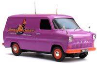 Prog Archives Tour Van Prog Archives Tour Van 
|
Posted By: JLocke
Date Posted: October 14 2010 at 01:49
Not to be argumentative, but what you're describing . . . I don't think a collage captures that. A perfect and unique banner was what we already had before the change. Now, we have a bunch of different pieces of artists that not everyone would agree define 'prog' for them. Not saying to take it down, and I've already told Abel I enjoy his work . . . just giving more opinions.
|
Posted By: Henry Plainview
Date Posted: October 14 2010 at 13:10
It is absolutely impossible to define prog as we understand it in a single image, much less in a 1000x100 banner. If you take an average of 10 bands from each subgenre and condense PP/PR, that is 200 images you have to somehow work into that space, and even then some people will still feel left out. As for clearly defining PA, might I suggest removing all of the things around the PA logo? ------------- if you own a sodastream i hate you |
Posted By: timothy leary
Date Posted: October 14 2010 at 22:04
| ^yes, a collage on the home page does not draw a person further in to the website |
Posted By: Adams Bolero
Date Posted: October 14 2010 at 22:53
|
Just chose the Canterbury Scene themed Collage. It's represents the peak of progressive rock. Fun, Complex, doesn't take itself too seriously and full of wonderful tunes. What a wonderful way to start your journey into prog archives to see the mighty banner of the Kings of Canterbury! ------------- ''Nobody realizes that some people expend tremendous energy merely to be normal.'' - Albert Camus |
Posted By: Viajero Astral
Date Posted: October 15 2010 at 23:02
|
I just realized that probably nobody has noticed that the search bar has ben moved too.
-------------
|
Posted By: Henry Plainview
Date Posted: October 15 2010 at 23:05
Quite a lot of people do not like Canterbury. I actually can't stand it, with the possible exception of Soft Machine. ------------- if you own a sodastream i hate you |
Posted By: Triceratopsoil
Date Posted: October 16 2010 at 00:35
| but since when can you stand any music Henners? lul |
Posted By: Xanatos
Date Posted: December 08 2010 at 12:24
lol
|