Epic prog album with an ugly/insipid album art?
Printed From: Progarchives.com
Category: Progressive Music Lounges
Forum Name: Prog Recommendations/Featured albums
Forum Description: Make or seek recommendations and discuss specific prog albums
URL: http://www.progarchives.com/forum/forum_posts.asp?TID=79001
Printed Date: August 09 2025 at 05:05
Software Version: Web Wiz Forums 11.01 - http://www.webwizforums.com
Topic: Epic prog album with an ugly/insipid album art?
Posted By: Verwuestung
Subject: Epic prog album with an ugly/insipid album art?
Date Posted: June 13 2011 at 10:40
|
Can you think of a really good Progressive album that doesn't have a great cover to go with it? in other words, can you think of an 4 star album or 5 star album that has an insipid/boring/too plain/ugly album cover? Honestly, I can't.. (o' wait, maybe Godbluff by VDGG) 
|
Replies:
Posted By: DisgruntledPorcupine
Date Posted: June 13 2011 at 10:47
| Close to the Edge |
Posted By: thehallway
Date Posted: June 13 2011 at 10:48
|
Led Zeppelin II and Led Zep IV...... A lot of jazz pre-Bitches Brew jazz albums......... and most Genesis album covers are awful. Of course most things that aren't Hipgnosis or Roger Dean are generally weaker. ------------- http://www.thefreshfilmblog.com/" rel="nofollow"> 
|
Posted By: thehallway
Date Posted: June 13 2011 at 10:49
|
It is boring and lazy.... but you must admit it's the perfect colour for that music. ------------- http://www.thefreshfilmblog.com/" rel="nofollow">
|
 DisgruntledPorcupine wrote:
Posted By: rogerthat
Date Posted: June 13 2011 at 10:57
| Steely Dan's Royal Scam. Probably their worst artwork but an amazing album. |
Posted By: Verwuestung
Date Posted: June 13 2011 at 10:58
|
maybe it'd be nice if you guys can add pictures to your posts :) |
Posted By: DisgruntledPorcupine
Date Posted: June 13 2011 at 11:02
|
Posted By: Queen By-Tor
Date Posted: June 13 2011 at 11:04
Have you SEEN the gatefold for the vinyl? Or did you just download the album 
|
Posted By: Queen By-Tor
Date Posted: June 13 2011 at 11:05

|
Posted By: DisgruntledPorcupine
Date Posted: June 13 2011 at 11:06
|
Posted By: Queen By-Tor
Date Posted: June 13 2011 at 11:12
| That's part of the cover! This album comes from an era where people would actually open the gatefold and look at the art instead of just clicking on a 60 x 60 pixel icon to play it. I don't want to sound elitest (wait, yes I do) - but you can't really experience old 70s prog the way it was supposed to be experienced if you don't do it on vinyl and soak in ALL the artwork. |
Posted By: harmonium.ro
Date Posted: June 13 2011 at 11:39
|
I like most covers mentioned here, save for the early jazz covers who weren't special indeed, but they were from back when the cover didn't really matter. CttE is the only Roger Dean cover that I like. And in general simplicity =/= bad. |
Posted By: Queen By-Tor
Date Posted: June 13 2011 at 11:43
Just for the record, I've always found Godbluff to be one of the best VdGG covers, alongside Pleasuredome and Still Life. I like simplicity. But not this bullsh*t handdrawn stuff that some of the modern bands come up with. It's the reason why I never ever will consider listening to this: |
Posted By: Luna
Date Posted: June 13 2011 at 11:46
|
Pink Floyd - Meddle ------------- https://aprilmaymarch.bandcamp.com/track/the-badger" rel="nofollow"> 
|
Posted By: topographicbroadways
Date Posted: June 13 2011 at 11:47
nope -------------  
|
Posted By: silverpot
Date Posted: June 13 2011 at 11:54
How true that is. The art work wasn't meant to be trapped in tiny CD boxes. That's why I've kept all my vinyls, they're pieces of art in themselves. Gatefold sleeves, what a treat! I used to spend almost the same amount of time looking at the covers as listening to the music.  Although, Close to the Edge is a bit bleak, I'll admit that, and Pink Floyd's Meddle isn't much to write home about either. |
Posted By: Verwuestung
Date Posted: June 13 2011 at 12:06
|
I disagree on Meddle It's a great cover for me took me 5 years since I saw it to realize it's an ear delved in water :D 
hmm?  |
Posted By: thehallway
Date Posted: June 13 2011 at 12:25
Oh please..... get over yourselves! Yes, vinyl albums are bigger, but apart from the benefit this brings to the size of the art, what reason do people have to buy lower-quality, larger and more difficult to store albums? I collect vinyl for recreational purposes. Every album I own on vinyl however, I also own on CD, because it's just better sound quaity. And it's not like people are devoid of accessing artwork these days..... how hard is it to find a bigger image of a painting online? CD boxes aren't tiny, they are practical. The images associated with albums are widely available in ways other than on the front of a gatefold sleeve, so I don't see how it's a problem. But ultimately, if someone doesn't give a sh*t about the artwork, that's their choice and it doesn't make their appreciation of the music any less valid. ------------- http://www.thefreshfilmblog.com/" rel="nofollow">
|
Posted By: lazland
Date Posted: June 13 2011 at 12:27
|
If you want to choose a Floyd cover, what about Atom Heart Mother - I look at bloody cows every single day of my life, and they are not the most attractive of creatures, save as a nice piece of rump steak on my dinner table! Jethro Tull's A is a very good album with a bad cover. First prize, though, goes to Gabriel I, Car. Great album, lousy cover. ------------- Enhance your life. Get down to www.lazland.org Now also broadcasting on www.progzilla.com Every Saturday, 4.00 p.m. UK time! |
Posted By: brido
Date Posted: June 13 2011 at 12:28
Close to The Edge?....did you open it up? Or am I just too old because I have vinyl AND CD?

|
Posted By: DisgruntledPorcupine
Date Posted: June 13 2011 at 12:33
|

Posted By: DisgruntledPorcupine
Date Posted: June 13 2011 at 12:34
|
Posted By: Epignosis
Date Posted: June 13 2011 at 12:36
No contest.
Green is the last color I associate with Close to the Edge. For me, it evokes red, and a warm-color album cover would have been perfect- the previous two albums were cool colors (and The Yes Album, like Close to the Edge, is green and ugly). I really wish Roger Dean had provided majestic artwork for the first album in the epic Trinity of Yes. Even the inner artwork is bland.  ------------- https://epignosis.bandcamp.com/album/a-month-of-sundays" rel="nofollow - https://epignosis.bandcamp.com/album/a-month-of-sundays |
Posted By: brido
Date Posted: June 13 2011 at 12:37
I thought the cover was the whole thing! I have a soft spot for CTTE since it was only a few years later that Yes started churning out crap!
|
Posted By: sleeper
Date Posted: June 13 2011 at 12:38
|
Transatlantic's albums have pretty mundane and cliche'd cover artwork, 801Live has a rather dull cover as well.
------------- Spending more than I should on Prog since 2005 
|
Posted By: silverpot
Date Posted: June 13 2011 at 13:00
I wasn't talking about the sound quality, no argument there. I just said I've kept my vinyls because of the sleeve art. I wasn't speaking of other people' s appreciation of music either or if they're able to access art. Jeez, did I step on a sore toe or something? |
Posted By: Slaughternalia
Date Posted: June 13 2011 at 13:27
 |
Posted By: Stool Man
Date Posted: June 13 2011 at 13:47
|
Foxtrot looks like somebody doodled the idea for a proper artist to complete, but the doodle and the artwork accidentally got switched.
------------- rotten hound of the burnie crew |
Posted By: thehallway
Date Posted: June 13 2011 at 13:52
|
------------- http://www.thefreshfilmblog.com/" rel="nofollow">
|
Posted By: thehallway
Date Posted: June 13 2011 at 13:54
It was mostly a response to the person you quoted, not you (apart from the use of the word "tiny" to describe CDs). ------------- http://www.thefreshfilmblog.com/" rel="nofollow">
|
Posted By: DisgruntledPorcupine
Date Posted: June 13 2011 at 13:55
|
Posted By: Guldbamsen
Date Posted: June 13 2011 at 14:11
|
Can - Future Days. This artwork does in no way represent what beauty the album has to offer, which is pretty weird seeing as the groups latest offerings Tago Mago and Ege Bamyashi had killer covers. The following Soon over Babaluma also features a rather beautiful painting. What happened there? Tiny brain cluster? Uh - I don´t particularly enjoy the cover art of Mirage either. Too obvious i guess. Camel? Isn´t that a cigarette brand? Let´s put that sucker on the cover! Ho ho - very amusing ------------- The Guide says there is an art to flying or rather a knack. The knack lies in learning how to throw yourself at the ground and miss. - Douglas Adams |
Posted By: Garden of Dreams
Date Posted: June 13 2011 at 14:15
| I actually think the cover for Close To The Edge is perfect. All of the artwork on the inside is great but I think the simple green works really well. The cover for The Yes Album is not very good. It's not bad but it could have been more interesting than a photo of the band. |
Posted By: Slaughternalia
Date Posted: June 13 2011 at 14:17
The bad perspective and thick, ugly brush strokes are intentional. It's probably inspired by the early impressionists.  |
Posted By: Slaughternalia
Date Posted: June 13 2011 at 14:20
The alternative artwork is much better  |
Posted By: Guldbamsen
Date Posted: June 13 2011 at 14:24
I completely agree - and I also happen to think that it was their best album. And I love the Dean artworks plus Wakeman on keys... ------------- The Guide says there is an art to flying or rather a knack. The knack lies in learning how to throw yourself at the ground and miss. - Douglas Adams |
Posted By: Guldbamsen
Date Posted: June 13 2011 at 14:28
Yep - they should have went all out fantasy style.. I want a camel on intergalactic iceskates wearing a blue force-field as a dress. ------------- The Guide says there is an art to flying or rather a knack. The knack lies in learning how to throw yourself at the ground and miss. - Douglas Adams |
Posted By: Slaughternalia
Date Posted: June 13 2011 at 14:30
I would take the sound quality of a well preserved vinyl over a CD any day.
|
Posted By: Verwuestung
Date Posted: June 13 2011 at 14:31
gonna have to disagree on that one yes, it is quite simple, but not in a neglectful way I think.. dunno.. maybe it's that poseidon icon I like |
Posted By: Guldbamsen
Date Posted: June 13 2011 at 14:36
|
Seen by many as a masterpiece, not by myself, King Crimson Red has a pretty terrible cover art... ------------- The Guide says there is an art to flying or rather a knack. The knack lies in learning how to throw yourself at the ground and miss. - Douglas Adams |
Posted By: Guldbamsen
Date Posted: June 13 2011 at 14:41
I see what you are saying, but compared to Tago Mago I feel it is unimaginative and mundane. That is of course just an opinion...  ------------- The Guide says there is an art to flying or rather a knack. The knack lies in learning how to throw yourself at the ground and miss. - Douglas Adams |
Posted By: Snow Dog
Date Posted: June 13 2011 at 14:45
You guys are kidding right? You prefer this grotesque piece of crap? ------------- http://www.last.fm/user/Snow_Dog" rel="nofollow"> 
|
Posted By: Guldbamsen
Date Posted: June 13 2011 at 14:47
|
^^ It´d be pretty funny in a kitsch kind of way...
------------- The Guide says there is an art to flying or rather a knack. The knack lies in learning how to throw yourself at the ground and miss. - Douglas Adams |
Posted By: Epignosis
Date Posted: June 13 2011 at 14:53
With you on this one- the Mirage artwork is just fine. The alternative just looks...bad. ------------- https://epignosis.bandcamp.com/album/a-month-of-sundays" rel="nofollow - https://epignosis.bandcamp.com/album/a-month-of-sundays |
Posted By: ghost_of_morphy
Date Posted: June 13 2011 at 15:11
|
Utopia had some really lousy covers. Unfortunately I doubt that any of those albums count as epic prog. ------------- 
|
Posted By: Slaughternalia
Date Posted: June 13 2011 at 15:16
The original is bad. This one has a hilariously bad 70s quality to it
|
Posted By: harmonium.ro
Date Posted: June 13 2011 at 15:19
| That looks awful. But I don't think much of Camel's music either (with the exception of Snowgoose). |
Posted By: Verwuestung
Date Posted: June 13 2011 at 15:28
In contrast, Gentle Giant's Octupus has 2 GREAT different covers, first of the UK release by Mr. Dean. second of the US release by a Mr. Charles White. personally I prefer the secondary  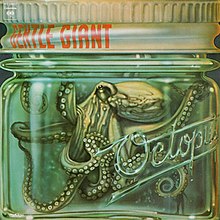
|
Posted By: MoodyRush
Date Posted: June 13 2011 at 15:32
|
I agree about the octopus cover; both are good.
And may I say, what is it with prog bands and naked behinds of men...
 Is a naked man really necessary? good album though. ------------- Follow me down to the valley below. Moonlight is bleeding from out of your soul. -Lazarus |
Posted By: Slaughternalia
Date Posted: June 13 2011 at 16:00
I can agree about the music. I've never seen the appeal in Mirage or Moonmadness. Snow goose is beautiful, though
|
Posted By: richardh
Date Posted: June 13 2011 at 16:36
yep those Hipgnosis people are completely useless apparently ELP wanted Salvidore Dali to do the cover but he quoted them some massive price and having considered the consequences to their bank balances went with a cheaper option. at least you didn't pick Brain Salad Surgery
|
Posted By: presdoug
Date Posted: June 13 2011 at 16:47
| I consider Guru Guru's album Hinten to be their very best, but the cover is the worst ever done by anybody. |
Posted By: Horizons
Date Posted: June 13 2011 at 18:26

The Mars Volta- Octahedron
 Rush - Roll the Bones
Edit: oops missed the whole. Epic part. baw >_<
|
Posted By: brido
Date Posted: June 13 2011 at 19:01
|
I think that most people accept that vinyl has a far superior sound to CD's!!!!!!! Its much warmer and altogether better! Ask anyone who knows about music and they'll prefer vinyl. (don't ask me though....I just know what I like, and not even in your wardrobe! |
Posted By: Horizons
Date Posted: June 13 2011 at 19:12
|
Posted By: Slaughternalia
Date Posted: June 13 2011 at 20:13
|
Posted By: Horizons
Date Posted: June 13 2011 at 20:17
|
Thanks. |
Posted By: Earendil
Date Posted: June 13 2011 at 20:26
|
I think simple artwork like Close to the Edge is fine, but what looks really bad is when a band tries too hard. Or puts a picture of themselves with sunglasses on the front. Foxtrot is pretty bad. And this...  |
Posted By: DisgruntledPorcupine
Date Posted: June 13 2011 at 20:52
I know about music. I prefer CDs. |
Posted By: The Dark Elf
Date Posted: June 13 2011 at 21:06
This. Terrible. ------------- ...a vigorous circular motion hitherto unknown to the people of this area, but destined to take the place of the mud shark in your mythology... |
Posted By: cstack3
Date Posted: June 13 2011 at 21:23
Flash's third album, "Out of our Hands," continues their fascination with human body parts in "Flash" and "Flash in the Can." This mess features a mish-mosh of human limbs, buttocks, knuckles and other stuff, with a naked young boy thrown in for the pederast crowd: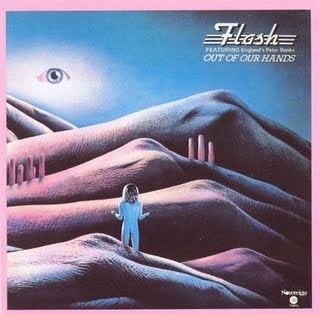 |
Posted By: catfood03
Date Posted: June 13 2011 at 21:39
This cover is awful but its not only the naked dude that kills it. I hate those ugly directional lines that zig zag all across the album. And those buildings don't help either. His butt is cute though! |
Posted By: Luna
Date Posted: June 13 2011 at 21:41
Also, this:  I absoutely love this album, but I can't look at the art without feeling like he is staring down my soul. I absoutely love this album, but I can't look at the art without feeling like he is staring down my soul.------------- https://aprilmaymarch.bandcamp.com/track/the-badger" rel="nofollow">
|
Posted By: catfood03
Date Posted: June 13 2011 at 21:47
What??? I love that one! Conceptually It doesn't make total sense, but so what? Nice and elaborate. It had the misfortune of being released just after the vinyl LP era. THIS is Rush's worst album cover, IMHO... 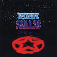 |
Posted By: Harry Hood
Date Posted: June 13 2011 at 22:47
Charizard, I choose you! ------------- 
|
Posted By: thehallway
Date Posted: June 14 2011 at 07:06
If you think vinyl is superior because a sample rate, no matter how high, can never get the full continuous sound....... then you'd be wrong. The CD sample rate is 44KHz, which is more than double the highest frequency humans can hear; hence, the sampling is impossible to notice and so, vinyls and CDs are equal in this respect. The only difference is that vinyls crackle, they often don't have a big range (equipment dependent) and their sound quality gets worse and worse over time. That is why I prefer CDs, and to be honest, I haven't heard any (let alone most) people say that vinyl has a better sound quality apart from when they are just completely ignorant of anything digital. If it's "warmer" then describe to me how a sound can have temperature. ------------- http://www.thefreshfilmblog.com/" rel="nofollow">
|
Posted By: Guldbamsen
Date Posted: June 14 2011 at 07:38
Pokemon reference to Camel? That´s a first for me... I´ve actually molded 50 Charizard masks out of sleeping mats, when I worked at a kindergarden Never want to see a glue gun again! ------------- The Guide says there is an art to flying or rather a knack. The knack lies in learning how to throw yourself at the ground and miss. - Douglas Adams |
Posted By: CCVP
Date Posted: June 14 2011 at 09:11
|
Bauer's http://www.progarchives.com/album.asp?id=6706" rel="nofollow - Astronauta Olvidado is one of the best albums I've listened this year, but the cover is terrible. Quite frankly, if they were not listed here, I would never check them out because the cover isn't attractive at all. -------------   
|
Posted By: Equality 7-2521
Date Posted: June 14 2011 at 10:12
 More uninspired than ugly but still ugly. ------------- "One had to be a Newton to notice that the moon is falling, when everyone sees that it doesn't fall. " |
Posted By: sleeper
Date Posted: June 14 2011 at 13:17
Your forgeting about compression. Most CD's will be recorded at 24bit/96KHz which, at even just 40 minutes of music, is far too big in terms of memory to fit on a CD, so it has to be compressed loosing the frequencies that are outside of human hearing (and maybe more if they have to) and though you cant hear those frequencies they do have an effect on the frequencies you can hear. However, the vast majority of people dont have Hi-Fi equipment good enough to really notice the difference so its all moot. ------------- Spending more than I should on Prog since 2005
|
Posted By: Horizons
Date Posted: June 14 2011 at 14:29
Also, 2112 isn't ugly in my opinon. It is just blan.
|
Posted By: thehallway
Date Posted: June 14 2011 at 14:31
And weren't a lot of vinyls compressed as well? ------------- http://www.thefreshfilmblog.com/" rel="nofollow">
|
Posted By: Guldbamsen
Date Posted: June 14 2011 at 14:45
I mentioned that one too - I think it is worse to have an uninspired coverart than ugly. Just look at Trout Mask Replica - not the most beautiful, but it has charm oppose to this...
------------- The Guide says there is an art to flying or rather a knack. The knack lies in learning how to throw yourself at the ground and miss. - Douglas Adams |
Posted By: richardh
Date Posted: June 14 2011 at 15:11
This looks like it took about 3 minutes to devise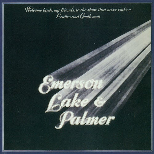 |