great album but boring art work
Printed From: Progarchives.com
Category: Progressive Music Lounges
Forum Name: Prog Recommendations/Featured albums
Forum Description: Make or seek recommendations and discuss specific prog albums
URL: http://www.progarchives.com/forum/forum_posts.asp?TID=61391
Printed Date: June 26 2025 at 17:39
Software Version: Web Wiz Forums 11.01 - http://www.webwizforums.com
Topic: great album but boring art work
Posted By: Icarium
Subject: great album but boring art work
Date Posted: September 20 2009 at 04:42
It often comes to my mind when i listen to Close to the Edge an album with such grate music, but then you look at the artwork of the record and all you see is green  why is it like that when the Fragile, Tales, Relayer and other Roger Deans artwork are so grate. I personly dont think the artwork compliments the music verry well. why is it like that when the Fragile, Tales, Relayer and other Roger Deans artwork are so grate. I personly dont think the artwork compliments the music verry well.are there any other albums that have grate music but are featured with a boring or uncreative artwork (or the opisite grate art work but bad album/music). kind of like the Asia albums, probably the gratest artworks of all time, but the music dosent sound as epic. and which bands do you think have the best artwork and moust creative, fun, longest streak of grate art.  |
Replies:
Posted By: Dean
Date Posted: September 20 2009 at 05:00
Ah, but Close To The Edge
 reveals its inner beauty:
 ------------- What? |
Posted By: Snow Dog
Date Posted: September 20 2009 at 05:02
|
I think the graduated green of Close to the Edge, makes ot more iconic.......more "classy".....and it has agreat logo. ------------- http://www.last.fm/user/Snow_Dog" rel="nofollow"> 
|
Posted By: progkidjoel
Date Posted: September 20 2009 at 05:04
^^
I recently got the mini-LP remaster CD as a gift for my dad - Fantastic packaging indeed! 
Those are both pretty awful... Just bland an unexciting. Music is great, cover art is very boring... |
Posted By: The Runaway
Date Posted: September 20 2009 at 05:12
|
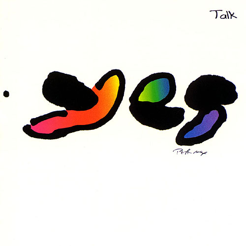
Yes's first album? How is it that we keep mentioning Yes godd ------------- http://www.formspring.me/Aragorn224" rel="nofollow - Trendsetter win! The search for nonexistent perfection. |
Posted By: Icarium
Date Posted: September 20 2009 at 05:25
|
^ becouse progers are positive people who likes to say yes more then no. and i forgott the artwork in side the album (ah nice concept) |
Posted By: theBox
Date Posted: September 20 2009 at 05:36
|
That's a very interesting subject. I find that the artwork works on a subconcious psycological level in conveying the "feel" or "atmosphere" of an album. There are MANY examples of how an "ugly" artwork (in quotes because of the subjectivity of this matter) brings down the overall enjoyment of an LP. Off the top of my head I would mention "Going for the One" , "Tormato" , and of course "The Yes Album". Had these albums featured a trademark Roger Dean arwortk, they could go up a whole star for me (in the PA rating system).The Same could be said for "The lamb lies down on broadway" although this album is a major musical let down for me, it would help to feature a more "fantasy" sleeve. ------------- |
Posted By: theBox
Date Posted: September 20 2009 at 05:43
|
...and while we are at it, as a general rule I would say that if the music is going to be SYMPHONIC prog, it HAD BETTER feature "Fantasy" or "Surreal" artwork. I helps the mind travel to those utopian landscapes that symphonic prog (for me at least) musically implies.
------------- |
Posted By: Dean
Date Posted: September 20 2009 at 05:46
|
^ Lamb Lies Down On Broadway is a superb Hypnosis cover - I think it reflects the gritty realism vs. fantasy of the music rather well.
Tormato is a bad cover made good by the addition of Rick Wakeman's lunch (if the story is to be believed, but knowing Hypnosis's predeliction for graphic "jokes" I'm not convinced)
Any cover with a photo of the band on it is pretty bad in my estimation, though King Crimson's Red is the exception to that rule.
Dream Theater have some good covers and some mediocre covers, I would say that Six Degrees is the poorest in terms of cover design, but it is also their poorest album (in my opinion) so does not fall into the bad cover - great music classification of this thread.
------------- What? |
Posted By: Snow Dog
Date Posted: September 20 2009 at 06:25
Just about disagree with everything you say here. ------------- http://www.last.fm/user/Snow_Dog" rel="nofollow">
|
 theBox wrote:
Posted By: Snow Dog
Date Posted: September 20 2009 at 06:28
Spot on!
That story always seemed a bit contrived. Could be based on reality though. In other words...it did happen, but the final cover is a mock up of it. Whichever....I like the cover anyway.  ------------- http://www.last.fm/user/Snow_Dog" rel="nofollow">
|
Posted By: theBox
Date Posted: September 20 2009 at 06:44
...well, as I said in my original post, these things can be VERY subjective. "I find that the artwork works on a subconcious psycological level in conveying the "feel" or "atmosphere" of an album" .....you mean to tell me that you even disagree with this??? ------------- |
Posted By: Snow Dog
Date Posted: September 20 2009 at 07:22
No...that I agree with. ------------- http://www.last.fm/user/Snow_Dog" rel="nofollow">
|
Posted By: questionsneverknown
Date Posted: September 20 2009 at 08:40
|
I've always been rather fond of the cover of Close to the Edge, actually (especially when held in full vinyl form). In general Yes has fared quite well in that area. ELP, on the other hand, er, uh, er. Brain Salad Surgery is a great cover and helps build the experience of the whole album. I like the music in Tarkus, but the cover is pretty inept (Greg Lake thought so, too). The debut cover's okay, but not great, and I've never really cared for the cover of Trilogy either. And then there's Love Beach. . . Blasphemy of blasphemies, I'll also say I don't really care for the cover for Genesis' Foxtrot. (I do like SEBTP, LLDOB, WAW.) Rush had great covers for Permanent Waves, Moving Pictures and Signals, but 2112 and a few others were not so good. Camel's cover for Moonmadness is great. PFM's Per Un Amico, not so great. And there are two versions of the cover for Gentle Giant's Octopus--the one with the raging octopod soaring atop the ocean is lovely; the one with the picked squid in the jar is horrible. Oh, so many more to talk about.
|
Posted By: questionsneverknown
Date Posted: September 20 2009 at 08:47
That should say, "pickled squid."
 |
Posted By: progmatic
Date Posted: September 20 2009 at 08:51
|
Camel had two covers for Moonmadness, the lovely UK cover with a pastoral image, and the horrid US cover which featured a camel in a spacesuit and moonboots. Egad!
Never was too fond of Caravan's "Caravan & the New Symphonia live" but love the covers of "In the Land of Grey and Pink" and "If I Could Do It All Over Again, I'd Do It All Over You."
The first four Clearlight albums have fantastic covers also, esp. "Symphony."
One more: David Bedford's "Instructions for Angels." ------------- PROGMATIC |
Posted By: Slartibartfast
Date Posted: September 20 2009 at 09:01
|
What a completely odd thing to say about Close To The Edge unless you're only talking about the front. Speaking of grates:
------------- Released date are often when it it impacted you but recorded dates are when it really happened... 
|

Posted By: Tsevir Leirbag
Date Posted: September 20 2009 at 11:39
Beautiful artworks...
    ------------- Les mains, les pieds balancés Sur tant de mers, tant de planchers, Un marin mort, Il dormira - Paul Éluard |
Posted By: Luke. J
Date Posted: September 20 2009 at 11:51
|
You may start throwing tormatoes at me. The Wall. It might fit. Nevertheless, it is not the best to do to an album as great as The Wall is. |
Posted By: akamaisondufromage
Date Posted: September 20 2009 at 11:54
|
Good grief!! What goes on The Lamb The Wall Going for the One ......Are all fantastic covers..
This one always makes me cringe
 ------------- Help me I'm falling! |
Posted By: A Person
Date Posted: September 20 2009 at 11:54
I agree, I have never seen the Art Zoyd album cover, but now I'm deeply intrigued. CTTE has a good cover in my opinion, the green background isn't the best, but the logo is probably one of my favorite on-album-cover band logos. PF's The Wall is similar to CTTE, but lacks even more visual appeal, IMO. |
Posted By: Snow Dog
Date Posted: September 20 2009 at 11:58
Have to agree...cheap, tacky...just pants!  ------------- http://www.last.fm/user/Snow_Dog" rel="nofollow">
|
Posted By: akamaisondufromage
Date Posted: September 20 2009 at 12:06
If you didn't know who it was by and you hadn't heard it before what would you think it was???
A character from 'Red Dwarf' maybe? ------------- Help me I'm falling! |
Posted By: The Runaway
Date Posted: September 20 2009 at 12:27
All the words in this quote are false in my opinion, except for the one for Octopus, in which case I think both covers are absolutely wonderful. ------------- http://www.formspring.me/Aragorn224" rel="nofollow - Trendsetter win! The search for nonexistent perfection. |
Posted By: Tsevir Leirbag
Date Posted: September 20 2009 at 12:36
 Another beautiful cover!
 ------------- Les mains, les pieds balancés Sur tant de mers, tant de planchers, Un marin mort, Il dormira - Paul Éluard |
Posted By: Evan
Date Posted: September 20 2009 at 12:37
Felt like this was worth mentioning again.  |
Posted By: Luke. J
Date Posted: September 20 2009 at 13:31
No, you are not. Up to now I thought it looked like some misplaced exhaust with fire bursting out. When I saw it in full size - just now.. ok. You're not alone. |
Posted By: Snow Dog
Date Posted: September 20 2009 at 13:36
|
Some people mentioned The Wall too I noticed. Whats wrong with simplicity? Another iconic cover in my book conveying ther bleakness inside. ------------- http://www.last.fm/user/Snow_Dog" rel="nofollow">
|
Posted By: The Quiet One
Date Posted: September 20 2009 at 13:38
I'm with you! I thought it was some kind of Pig due to the pinkish, but when I figured out it was a odd guy with a sword and a shield, it just made a cool cover-work to a lame one. |
Posted By: The Quiet One
Date Posted: September 20 2009 at 13:42
What do you think of these?:    |
Posted By: rpe9p
Date Posted: September 20 2009 at 13:49
And dont forget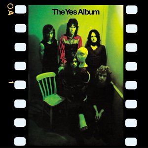 |
Posted By: Tsevir Leirbag
Date Posted: September 20 2009 at 14:02
Red is horrible, Led Zeppelin II is great.
These are superb
   And they all contain a picture of the band ------------- Les mains, les pieds balancés Sur tant de mers, tant de planchers, Un marin mort, Il dormira - Paul Éluard |
Posted By: Icarium
Date Posted: September 20 2009 at 14:03
If i hadent knew better i would guess this probably could be a EMO band but since i know better i know that this CD is one i should buy some time in close future |
Posted By: The Sleepwalker
Date Posted: September 20 2009 at 14:04
|
Brilliant music, but a very dull cover.  ------------- 
|
Posted By: Tsevir Leirbag
Date Posted: September 20 2009 at 14:08
|
^ You're right. But there's so much people who will tell you you're wrong... ------------- Les mains, les pieds balancés Sur tant de mers, tant de planchers, Un marin mort, Il dormira - Paul Éluard |
Posted By: Snow Dog
Date Posted: September 20 2009 at 14:10
Well.....yeah..he's wrong. ------------- http://www.last.fm/user/Snow_Dog" rel="nofollow">
|
Posted By: Progosopher
Date Posted: September 20 2009 at 14:15
------------- The world of sound is certainly capable of infinite variety and, were our sense developed, of infinite extensions. -- George Santayana, "The Sense of Beauty" |
Posted By: Gog
Date Posted: September 20 2009 at 14:26

Pretty awful, in my opinion. An ugly purple background, a nude woman that seems to be cut out of paper... This album cover art is an insult to women, and, putting all controversy aside, it is still downright embarrassing... Waters' music deserves better than that.
|
Posted By: CPicard
Date Posted: September 20 2009 at 14:35
| Oh, come on: we're talking about Roger "I have a temper" Waters... |
Posted By: Tarquin Underspoon
Date Posted: September 20 2009 at 14:41
Funny you should mention that, as the title for the album was originally "War Pigs", as you may already know. They designed the cover with that title in mind. Even though it's not a pig, it certainly fits that title better than "Paranoid". This is indeed a horrible cover.
Some other good albums with boring/bad art, in my opinion:
http://en.wikipedia.org/wiki/File:Genesis1976windandwuthering.jpg">
 Perhaps I just think this because of the contrast to earlier albums from Genesis.
http://www.amazon.com/gp/customer-media/product-gallery/B000003S0B/ref=cm_ciu_pdp_images_3?ie=UTF8&index=3">
 I this.
http://en.wikipedia.org/wiki/File:SymphonyXTheOdyssey.jpg">
 This is nearly as cheesy as the music.
Some bands just can't release a bad one, for instance:
Led Zeppelin
Pink Floyd
Porcupine Tree
And on a bit of a side note, I just wanted to bring up the eerie coincidence between the "V" artwork for both Symphony X and Spock's Beard
http://en.wikipedia.org/wiki/File:SpocksBeardValbumcover.jpg">
 http://en.wikipedia.org/wiki/File:SymphonyXV.jpg">
 ------------- "WAAAAAAOOOOOUGH! WAAAAAAAUUUUGGHHHH!! WAAAAAOOOO!!!" -The Great Gig in the Sky |
Posted By: KoS
Date Posted: September 20 2009 at 14:54
| Ever since I started buying download-able albums, I have stopped looking at cover art. Unless, of course it is really impressive. |
Posted By: keiser willhelm
Date Posted: September 20 2009 at 15:32
|
genesis and ELP (aside from their first) have consistently bad artwork. foxtrot and nursery crime are pretty embarassing, and Trilogy, Tarkus, and love beech are just bad.
------------- http://www.last.fm/user/KeiserWillhelm" rel="nofollow - What im listening to |
Posted By: The Quiet One
Date Posted: September 20 2009 at 15:41
^you simply do not have good taste, that's all 
|
Posted By: keiser willhelm
Date Posted: September 20 2009 at 15:48
   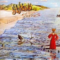 the genesis ones are just . . . flat and awkward. the ELP ones are just rediculous. soo over the top, which fits the music but its just silly. ------------- http://www.last.fm/user/KeiserWillhelm" rel="nofollow - What im listening to |
Posted By: The Quiet One
Date Posted: September 20 2009 at 15:56
|
^Genesis' ones flat? I would say very creative. The ELP ones are not great, but still good, specially the simiplicity of Trilogy. |
Posted By: KoS
Date Posted: September 20 2009 at 16:00
| Or you just may have a fetish for pastels... |
Posted By: friso
Date Posted: September 20 2009 at 16:19
The Genesis cover of Wind and Wuthering isn't boring at all! Do you have the vinyl version? On the flip side you will see that the tree has no leaves, but it was full of birds which fly away. A nice concept IMHO. |
Posted By: Dean
Date Posted: September 20 2009 at 16:34
|
^ yep - should never take Hipgnosis covers at face value
 ------------- What? |
Posted By: Tarquin Underspoon
Date Posted: September 20 2009 at 16:38
Can't say I have it. A nice concept, maybe, but I prefer the covers of Nursery Cryme, the Lamb, and Trespass.
I think that Foxtrot is too busy and a bit messy, mind you. Also, I the cover of Abacab. ------------- "WAAAAAAOOOOOUGH! WAAAAAAAUUUUGGHHHH!! WAAAAAOOOO!!!" -The Great Gig in the Sky |
Posted By: The Quiet One
Date Posted: September 20 2009 at 16:38
| ^I love that cover, it really fits with the music! |
Posted By: Tarquin Underspoon
Date Posted: September 20 2009 at 16:39
Oh wow. Ok, you guys win, that's awesome. That's what I get for not owning a physical copy. Shame on me. ------------- "WAAAAAAOOOOOUGH! WAAAAAAAUUUUGGHHHH!! WAAAAAOOOO!!!" -The Great Gig in the Sky |
Posted By: King Crimson776
Date Posted: September 20 2009 at 16:50
Wat? Red is awesome, it's just the three of them looking all dark and intense, perfect for the music. Bah, that LZ cover is lame, who the hell is that with them, pirates, sea captains of some sort? I've never gotten what was going on there. :P
|
Posted By: mrcozdude
Date Posted: September 20 2009 at 17:48
Great signature btw ------------- http://www.last.fm/user/cozfunkel/" rel="nofollow"> 

|
Posted By: mrcozdude
Date Posted: September 20 2009 at 17:50
Isn't it Led Zeppelin with Zeppelin crew of Nuremberg?Or did I think they were cleverer then they actually were? ------------- http://www.last.fm/user/cozfunkel/" rel="nofollow">
|
Posted By: Conor Fynes
Date Posted: September 20 2009 at 19:17
| As Close To The Edge goes, i think it's meant as a 'dont judge a book by it's cover.' if someone looks beyond the bland cover, they get something beautiful. |
Posted By: A Person
Date Posted: September 20 2009 at 19:52
| CttE kind of reminds me of Sigur Ros's ( ) cover. |
Posted By: MovingPictures07
Date Posted: September 20 2009 at 19:59
|
Am I alone in absolutely loving CTTE's cover? It may be my favorite ever. ------------- 
|
Posted By: Atavachron
Date Posted: September 20 2009 at 20:25
|
Trespass, Benefit, Trilogy, Drama, Houses of the Holy, U.K. |
Posted By: Petrovsk Mizinski
Date Posted: September 20 2009 at 21:25
Actually yeah, despite it being one of the best metal albums ever, that does look like crap. ------------- 
|

Posted By: topofsm
Date Posted: September 20 2009 at 21:50
I concur. The CTTE cover is beautiful.
I'll throw in pretty much anything in the traditional prog metal category, especially Pain of Salvation. None of their covers are particularly interesting. WTF is the cover of Entropia supposed to be? ------------- 
|
Posted By: ExittheLemming
Date Posted: September 20 2009 at 22:24
 Fantastic album sullied by 'zero gravity satellite TV installation by scantily clad astronaut' motif. ------------- 
|
Posted By: Tarquin Underspoon
Date Posted: September 20 2009 at 23:05
My nomination for Phrase of the Year ------------- "WAAAAAAOOOOOUGH! WAAAAAAAUUUUGGHHHH!! WAAAAAOOOO!!!" -The Great Gig in the Sky |
Posted By: Jake Kobrin
Date Posted: September 21 2009 at 01:25
I wish Steven Wilson would smash an iPod over your head. ------------- http://www.facebook.com/pages/Dr-Neil-Kobrin/244687105562746" rel="nofollow - SUPPORT MY FATHER AND BECOME A FAN Jacob Kobrin Illustration |
Posted By: theBox
Date Posted: September 21 2009 at 01:25
|
^^^^^ I always thought it was SCALES and some poor guy's FEET hovering up there in space....
------------- |
Posted By: progkidjoel
Date Posted: September 21 2009 at 01:30
Gotta love the anti-downloads mentality 
|
Posted By: Atavachron
Date Posted: September 21 2009 at 01:35
I always liked the Zep ll cover, they just superimposed their faces on a group shot of some old airship crew (or motorcycle gang, not exactly sure myself).. and the Red photo is just a lift from the With the Beatles classic cover |
Posted By: friso
Date Posted: September 21 2009 at 02:23
Yeah shame on you! We shall publibly nail you down!
|
Posted By: friso
Date Posted: September 21 2009 at 02:26
Damn... I thought it was a Van der Graaf Generator (science instrument) in space. The cover is however among my favourites! The strange this is: The one shown is dark blue, mine has a light blue cover and I've seen purple and white covers... strange that is . 
|
Posted By: explodingjosh
Date Posted: September 21 2009 at 02:39
Haha, the irony...... not only is the imagery strange, but the background color is strangely seen in different hues ------------- 
|
Posted By: Dean
Date Posted: September 21 2009 at 02:57
In 40 years I've never seen this as a strange image, I've always thought it was Themis, (Blind Justice).
 ------------- What? |
Posted By: ExittheLemming
Date Posted: September 21 2009 at 03:01
I think my tongue was maybe not a million miles away from my cheek re satellite TV -------------
|
Posted By: Icarium
Date Posted: September 21 2009 at 14:04
ehh not all Supertramp covers are that grate (its probably art for some peapol   what were they thinking what were they thinking
|
Posted By: Xanthous
Date Posted: September 21 2009 at 15:40
The Walls cover fits the contents perfectly for me. It's dull and it makes me angry.
|
Posted By: Teaflax
Date Posted: September 22 2009 at 04:59
|
The overrealiance on fantasy-like imagery by sub-Roger Dean imitators in the lower tier of modern Prog is just embarrassing (although it occasionally works, like on Trion's Tortoise). Even Dean has turned out some clunkers in his time, like the ABWH sleeve, which is a garish mess. The worst recent offender is Moon Safari's [blomljud], which looks like it was drawn by a color-blind ten-year-old. The logo is equally terrible.  Both Circa albums have sleeves that pretend to be minimalistically stylish, but are just lazy (the second one more so than the first, though). Also, is it some sort of weird-ass tribute to the opening post's gratingly repetitive use of "grate" that not a one of you can be bothered to spell Hipgnosis right? Hip = slang term meaning "with the times" Gnosis = esoteric spiritual knowledge -------------  
|
Posted By: Atavachron
Date Posted: September 22 2009 at 05:06
|
^ looks like a classic case of "hey my roommate's an artist, he could do the cover!" |
Posted By: Teaflax
Date Posted: September 22 2009 at 05:10
Actually, I think it's worse than that. It's "Hey, our singer can draw, right?" -------------
|
Posted By: Atavachron
Date Posted: September 22 2009 at 05:15
|
yeah that's more likely |
Posted By: harmonium.ro
Date Posted: September 22 2009 at 07:07
| Making art in an child-like style isn't bad at all, while it is done professionally and with real inspiration. That Moon Safari looks like it tries to emulate the cover of Genesis' Foxtrot... with no real success. |
Posted By: Snow Dog
Date Posted: September 22 2009 at 07:32
For me...one of the better aspects of that album is the cover. ------------- http://www.last.fm/user/Snow_Dog" rel="nofollow">
|
Posted By: Dean
Date Posted: September 22 2009 at 07:38
------------- What? |
Posted By: ColonelClaypool
Date Posted: September 22 2009 at 07:53
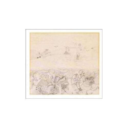 Robert Wyatt - Rock Bottom. Wonderful album, dreadful art work. ------------- With magic, you can turn a frog into a prince. With science, you can turn a frog into a Ph.D. and you still have the frog you started with. |
Posted By: Teaflax
Date Posted: September 23 2009 at 08:55
Oh, sure. Not that I think that Foxtrot is a great sleeve, but you can tell it's done by someone with some sort of artist's eye. Actually, properly capturing childlike innocence towards art as an adult is one of the hardest things in the world. -------------
|
Posted By: Teaflax
Date Posted: September 23 2009 at 09:02
It's okay, but you weren't the only one doing it. I realize that not everyone can see word-shapes the way I do (that's how I spell correctly - it's almost entirely a visual process for me), but to me the difference between Hipgnosis and Hypnosis is like the difference between Camelot and Camel. ;) -------------
|