| Author |
 Topic Search Topic Search  Topic Options Topic Options
|
akamaisondufromage 
Forum Senior Member


VIP Member
Joined: May 16 2009
Location: Blighty
Status: Offline
Points: 6797
|
 Posted: September 20 2009 at 12:06 Posted: September 20 2009 at 12:06 |
 Snow Dog wrote: Snow Dog wrote:
akamaisondufromage wrote:
Good grief!! What goes on The Lamb The Wall Going for the One ......Are all fantastic covers..
This one always makes me cringe
Maybe I am alone on thhis too? |
Have to agree...cheap, tacky...just pants!  |
If you didn't know who it was by and you hadn't heard it before what would you think it was???
A character from 'Red Dwarf' maybe?
|
|
Help me I'm falling!
|
 |
Snow Dog
Special Collaborator

Honorary Collaborator
Joined: March 23 2005
Location: Caerdydd
Status: Offline
Points: 32995
|
Posted: September 20 2009 at 11:58 |
akamaisondufromage wrote:
Good grief!! What goes on The Lamb The Wall Going for the One ......Are all fantastic covers..
This one always makes me cringe
Maybe I am alone on thhis too? |
Have to agree...cheap, tacky...just pants!
|
|
|
|
A Person
Forum Senior Member
Joined: November 10 2008
Location: __
Status: Offline
Points: 65760
|
Posted: September 20 2009 at 11:54 |
Tsevir Leirbag wrote:
Beautiful artworks...
|
I agree, I have never seen the Art Zoyd album cover, but now I'm deeply intrigued. CTTE has a good cover in my opinion, the green background isn't the best, but the logo is probably one of my favorite on-album-cover band logos. PF's The Wall is similar to CTTE, but lacks even more visual appeal, IMO.
|
|
akamaisondufromage
Forum Senior Member
VIP Member
Joined: May 16 2009
Location: Blighty
Status: Offline
Points: 6797
|
Posted: September 20 2009 at 11:54 |
Good grief!! What goes on The Lamb The Wall Going for the One ......Are all fantastic covers..
This one always makes me cringe
Maybe I am alone on thhis too?
|
|
Help me I'm falling!
|
|
Luke. J
Forum Senior Member

Joined: March 07 2008
Location: Germany
Status: Offline
Points: 380
|
Posted: September 20 2009 at 11:51 |
|
You may start throwing tormatoes at me.
The Wall. It might fit. Nevertheless, it is not the best to do to an album as great as The Wall is.
|
|
Tsevir Leirbag
Forum Senior Member

Joined: May 03 2009
Location: Montréal
Status: Offline
Points: 8321
|
Posted: September 20 2009 at 11:39 |
Beautiful artworks...
Edited by Tsevir Leirbag - September 20 2009 at 11:40
|
|
Les mains, les pieds balancés
Sur tant de mers, tant de planchers,
Un marin mort,
Il dormira
- Paul Éluard
|
|
Slartibartfast
Collaborator


Honorary Collaborator / In Memoriam
Joined: April 29 2006
Location: Atlantais
Status: Offline
Points: 29630
|
Posted: September 20 2009 at 09:01 |
What a completely odd thing to say about Close To The Edge unless you're only talking about the front. Speaking of grates: 
|
Released date are often when it it impacted you but recorded dates are when it really happened... 
|
|
progmatic
Forum Senior Member

Joined: August 22 2009
Location: Ohio
Status: Offline
Points: 1785
|
Posted: September 20 2009 at 08:51 |
Camel had two covers for Moonmadness, the lovely UK cover with a pastoral image, and the horrid US cover which featured a camel in a spacesuit and moonboots. Egad!
Never was too fond of Caravan's "Caravan & the New Symphonia live" but love the covers of "In the Land of Grey and Pink" and "If I Could Do It All Over Again, I'd Do It All Over You."
The first four Clearlight albums have fantastic covers also, esp. "Symphony."
One more: David Bedford's "Instructions for Angels."
|
|
PROGMATIC
|
|
questionsneverknown
Forum Senior Member
Joined: June 22 2009
Location: Ultima Thule
Status: Offline
Points: 605
|
Posted: September 20 2009 at 08:47 |
questionsneverknown wrote:
And there are two versions of the cover for Gentle Giant's Octopus--the one with the raging octopod soaring atop the ocean is lovely; the one with the picked squid in the jar is horrible.
|
That should say, "pickled squid." 
|
|
questionsneverknown
Forum Senior Member
Joined: June 22 2009
Location: Ultima Thule
Status: Offline
Points: 605
|
Posted: September 20 2009 at 08:40 |
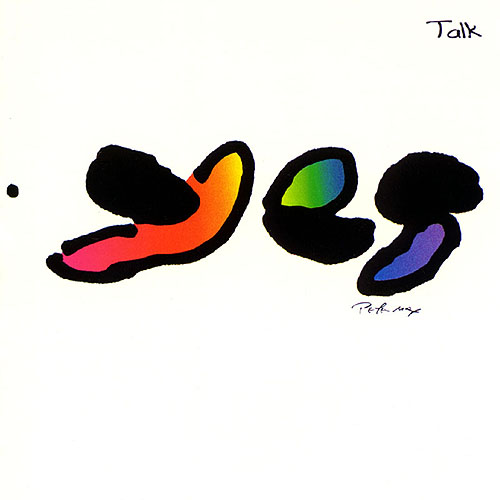
I've always been rather fond of the cover of Close to the Edge, actually (especially when held in full vinyl form). In general Yes has fared quite well in that area. ELP, on the other hand, er, uh, er. Brain Salad Surgery is a great cover and helps build the experience of the whole album. I like the music in Tarkus, but the cover is pretty inept (Greg Lake thought so, too). The debut cover's okay, but not great, and I've never really cared for the cover of Trilogy either. And then there's Love Beach. . .
Blasphemy of blasphemies, I'll also say I don't really care for the cover for Genesis' Foxtrot. (I do like SEBTP, LLDOB, WAW.) Rush had great covers for Permanent Waves, Moving Pictures and Signals, but 2112 and a few others were not so good.
Camel's cover for Moonmadness is great. PFM's Per Un Amico, not so great.
And there are two versions of the cover for Gentle Giant's Octopus--the one with the raging octopod soaring atop the ocean is lovely; the one with the picked squid in the jar is horrible.
Oh, so many more to talk about.
|
|
Snow Dog
Special Collaborator
Honorary Collaborator
Joined: March 23 2005
Location: Caerdydd
Status: Offline
Points: 32995
|
Posted: September 20 2009 at 07:22 |
theBox wrote:
Snow Dog wrote:
theBox wrote:
That's a very interesting subject. I find that the artwork works on a subconcious psycological level in conveying the "feel" or "atmosphere" of an album. There are MANY examples of how an "ugly" artwork (in quotes because of the subjectivity of this matter) brings down the overall enjoyment of an LP. Off the top of my head I would mention "Going for the One" , "Tormato" , and of course "The Yes Album". Had these albums featured a trademark Roger Dean arwortk, they could go up a whole star for me (in the PA rating system).The Same could be said for "The lamb lies down on broadway" although this album is a major musical let down for me, it would help to feature a more "fantasy" sleeve.
|
Just about disagree with everything you say here. |
...well, as I said in my original post, these things can be VERY subjective.
"I find that the artwork works on a subconcious psycological level in conveying the "feel" or "atmosphere" of an album" .....you mean to tell me that you even disagree with this???
|
No...that I agree with. 
|
|
|
|
theBox
Forum Senior Member
Joined: April 29 2005
Location: Greece
Status: Offline
Points: 427
|
Posted: September 20 2009 at 06:44 |
Snow Dog wrote:
theBox wrote:
That's a very interesting subject. I find that the artwork works on a subconcious psycological level in conveying the "feel" or "atmosphere" of an album. There are MANY examples of how an "ugly" artwork (in quotes because of the subjectivity of this matter) brings down the overall enjoyment of an LP. Off the top of my head I would mention "Going for the One" , "Tormato" , and of course "The Yes Album". Had these albums featured a trademark Roger Dean arwortk, they could go up a whole star for me (in the PA rating system).The Same could be said for "The lamb lies down on broadway" although this album is a major musical let down for me, it would help to feature a more "fantasy" sleeve.
|
Just about disagree with everything you say here. |
...well, as I said in my original post, these things can be VERY subjective. "I find that the artwork works on a subconcious psycological level in conveying the "feel" or "atmosphere" of an album" .....you mean to tell me that you even disagree with this???
Edited by theBox - September 20 2009 at 06:47
|
|
|
|
Snow Dog
Special Collaborator
Honorary Collaborator
Joined: March 23 2005
Location: Caerdydd
Status: Offline
Points: 32995
|
Posted: September 20 2009 at 06:28 |
Dean wrote:
^ Lamb Lies Down On Broadway is a superb Hypnosis cover - I think it reflects the gritty realism vs. fantasy of the music rather well.
|
Spot on!
Dean wrote:
Tormato is a bad cover made good by the addition of Rick Wakeman's lunch (if the story is to be believed, but knowing Hypnosis's predeliction for graphic "jokes" I'm not convinced)
|
That story always seemed a bit contrived. Could be based on reality though. In other words...it did happen, but the final cover is a mock up of it. Whichever....I like the cover anyway. |
|
|
|
Snow Dog
Special Collaborator
Honorary Collaborator
Joined: March 23 2005
Location: Caerdydd
Status: Offline
Points: 32995
|
Posted: September 20 2009 at 06:25 |
theBox wrote:
That's a very interesting subject. I find that the artwork works on a subconcious psycological level in conveying the "feel" or "atmosphere" of an album. There are MANY examples of how an "ugly" artwork (in quotes because of the subjectivity of this matter) brings down the overall enjoyment of an LP. Off the top of my head I would mention "Going for the One" , "Tormato" , and of course "The Yes Album". Had these albums featured a trademark Roger Dean arwortk, they could go up a whole star for me (in the PA rating system).The Same could be said for "The lamb lies down on broadway" although this album is a major musical let down for me, it would help to feature a more "fantasy" sleeve.
|
Just about disagree with everything you say here.
|
|
|
|
Dean
Special Collaborator

Retired Admin and Amateur Layabout
Joined: May 13 2007
Location: Europe
Status: Offline
Points: 37575
|
Posted: September 20 2009 at 05:46 |
^ Lamb Lies Down On Broadway is a superb Hypnosis cover - I think it reflects the gritty realism vs. fantasy of the music rather well.
Tormato is a bad cover made good by the addition of Rick Wakeman's lunch (if the story is to be believed, but knowing Hypnosis's predeliction for graphic "jokes" I'm not convinced)
Any cover with a photo of the band on it is pretty bad in my estimation, though King Crimson's Red is the exception to that rule.
Dream Theater have some good covers and some mediocre covers, I would say that Six Degrees is the poorest in terms of cover design, but it is also their poorest album (in my opinion) so does not fall into the bad cover - great music classification of this thread. 
|
|
What?
|
|
theBox
Forum Senior Member
Joined: April 29 2005
Location: Greece
Status: Offline
Points: 427
|
Posted: September 20 2009 at 05:43 |
|
...and while we are at it, as a general rule I would say that if the music is going to be SYMPHONIC prog, it HAD BETTER feature "Fantasy" or "Surreal" artwork. I helps the mind travel to those utopian landscapes that symphonic prog (for me at least) musically implies.
|
|
|
|
theBox
Forum Senior Member
Joined: April 29 2005
Location: Greece
Status: Offline
Points: 427
|
Posted: September 20 2009 at 05:36 |
|
That's a very interesting subject. I find that the artwork works on a subconcious psycological level in conveying the "feel" or "atmosphere" of an album. There are MANY examples of how an "ugly" artwork (in quotes because of the subjectivity of this matter) brings down the overall enjoyment of an LP. Off the top of my head I would mention "Going for the One" , "Tormato" , and of course "The Yes Album". Had these albums featured a trademark Roger Dean arwortk, they could go up a whole star for me (in the PA rating system).The Same could be said for "The lamb lies down on broadway" although this album is a major musical let down for me, it would help to feature a more "fantasy" sleeve.
|
|
|
|
Icarium
Forum Senior Member

VIP Member
Joined: March 21 2008
Location: Tigerstaden
Status: Offline
Points: 34098
|
Posted: September 20 2009 at 05:25 |
|
^ becouse progers are positive people who likes to say yes more then no.
and i forgott the artwork in side the album (ah nice concept)
|
|
The Runaway
Forum Senior Member
Joined: May 28 2009
Location: London
Status: Offline
Points: 3144
|
Posted: September 20 2009 at 05:12 |
Yes's first album? How is it that we keep mentioning Yes godd  nit!
|
|
|
|
progkidjoel
Prog Reviewer
Joined: March 02 2009
Location: Australia
Status: Offline
Points: 19643
|
Posted: September 20 2009 at 05:04 |
^^ 
I recently got the mini-LP remaster CD as a gift for my dad - Fantastic packaging indeed!

Those are both pretty awful... Just bland an unexciting. Music is great, cover art is very boring...
|
|
Donate monthly and keep PA fast-loading and ad-free forever.
/PAlogo_v2.gif "Progarchives.com Homepage")


 great album but boring art work