/PAlogo_v2.gif "Progarchives.com Homepage")
|
|
Post Reply 
|
Page <1 2345> |
| Author | ||
darksideof 
Forum Senior Member 

Joined: February 22 2007 Location: Newark N.J. Status: Offline Points: 2318 |
 Posted: October 12 2010 at 16:28 Posted: October 12 2010 at 16:28 |
|
 True! we spoke about that. I hope it will ok. Get the Ok first. I contact the painter from of Aqualung ( Burton Silverman) and he said it is ok. I know the Artist who did KC in the court had passed. but the rest I guess try to contact. them first. True! we spoke about that. I hope it will ok. Get the Ok first. I contact the painter from of Aqualung ( Burton Silverman) and he said it is ok. I know the Artist who did KC in the court had passed. but the rest I guess try to contact. them first. |
||
|
http://darksideofcollages.blogspot.com/
http://www.metalmusicarchives.com/ https://www.facebook.com/pages/Darksideof-Collages/ |
||
 |
||
|
TheGazzardian
Prog Reviewer 

Joined: August 11 2009 Location: Canada Status: Offline Points: 8844 |
Posted: October 12 2010 at 16:26 |
|
|
For example on what i mean about the eye not being drawn to the logo, we have some well placed items (Aqualung is facing towards the logo as is the Leftovertures guy) but the Court head way to the left could have drawn the eye closer to it.
I think it might have looked better with the logo centered and larger, with items facing left on the right side and items facing right on the left side, so that your eye is inevitably drawn to the center. (Just as one idea)
Edited by TheGazzardian - October 12 2010 at 16:26 |
||
|
||
|
TheGazzardian
Prog Reviewer
Joined: August 11 2009 Location: Canada Status: Offline Points: 8844 |
Posted: October 12 2010 at 16:24 |
|
|
I hate to voice in against it, especially considering the quality, but I feel that more consideration could have been given to where it appears on the site and its size. The collages usually look good in full size, but as small as this one is many of the images appear tiny and hard to discern, and it seems very visually heavy and noisy, drawing the eye into it but not really focussing anywhere. Again, with collages this is typically fine, but I feel some more technique could have been used to draw the eye towards the prog archives logo and the salient points around the logo in the site.
|
||
|
||
|
darksideof
Forum Senior Member
Joined: February 22 2007 Location: Newark N.J. Status: Offline Points: 2318 |
Posted: October 12 2010 at 16:21 |
|
thank you sooo much! Max I really apriciate it!. |
||
|
http://darksideofcollages.blogspot.com/
http://www.metalmusicarchives.com/ https://www.facebook.com/pages/Darksideof-Collages/ |
||
|
||
|
Evolver
Special Collaborator 

Crossover & JR/F/Canterbury Teams Joined: October 22 2005 Location: The Idiocracy Status: Offline Points: 5484 |
Posted: October 12 2010 at 15:52 |
|
|
I like it as art, but it's too busy for a site header.
|
||
|
Trust me. I know what I'm doing.
|
||
|
||
|
Windhawk
Special Collaborator

Honorary Collaborator Joined: December 28 2006 Location: Norway Status: Offline Points: 11401 |
Posted: October 12 2010 at 15:22 |
|
|
It's good looking, but the sites logo does drown in it. Applying the logo on a white background in a gradient towards blank might be an option, so that the logo gets illuminated amidst all the colours, with the gradient ending 4-5 millimeters away from the logo. Or something like that. Experiment so that the site logo gets a tad more focus, basically.
|
||
|
Websites I work with:
http://www.progressor.net http://www.houseofprog.com My profile on Mixcloud: https://www.mixcloud.com/haukevind/ |
||
|
||
|
Finnforest
Special Collaborator

Honorary Collaborator Joined: February 03 2007 Location: The Heartland Status: Offline Points: 17589 |
Posted: October 12 2010 at 14:47 |
|
I'm with you Snowie, just because i happen to like traditions and classic brandings/logos. Nothing against the artist Abel.
I love old buildings too, and how many Eurpean towns and cities maintain their classic look architectural streetfronts. Here in the States, everything looks like just another Applebees.
|
||
|
||
|
Logan
Forum & Site Admin Group
Site Admin Joined: April 05 2006 Location: In repose. Status: Offline Points: 38923 |
Posted: October 12 2010 at 14:39 |
|
|
As Rob pointed out, as long as it does not violate any copyrights for images, then it's fine (I think under fair dealing/ fair use legislation it's acceptable). I would rather the Prog Archives: Your Ultimate Prog Rock Resource" logo thing stood out more rather than having it blend in so much (I would either lighten or darken the area around it or highlight it more in some manner). I also find the collage too busy for my tastes, especially around the "Prog Archives" part. Too many men in the picture too (including man hiney). Personal preference, I'd rather see more females (Gabriel in a dress, and there's a similar other one, doesn't cut it) or non-people things. Though this would have been nice worked into it:
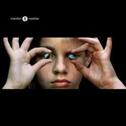
 Wouldn't expect it, but I'd rather something more original that captures the spirit of Progressive Music somehow. Maybe something a little shocking/ disturbing/ bizarre like a brain or two wearing headphones. One brain is electrically charged, and one is exploding (this is your brain on Prog) Then we could have some guy screaming rather like the King Crimson cover while someone else is laughing. Or, I'd like and angels and demons scene where the angels and demons are dancing on broken vinyl records. Or some good trip/ bad trip imagery. But that's just me. |
||
|
Watching while most appreciating a sunset in the moment need not diminish all the glorious sunsets I have observed before. It can be much like that with music for me.
|
||
|
||
|
Chris S
Special Collaborator
Honorary Collaborator Joined: June 09 2004 Location: Front Range Status: Offline Points: 7028 |
Posted: October 12 2010 at 14:23 |
|
|
Love it......great refresh and most prog lovers will immediately identify with the imagery.
|
||
|
...As I venture through the slipstream, between the viaducts in your dreams...[/COLOR] |
||
|
||
|
Marty McFly
Special Collaborator

Honorary Collaborator Joined: March 23 2009 Location: Czech Republic Status: Offline Points: 3968 |
Posted: October 12 2010 at 14:23 |
|
Ian, Ian. But ProgArchives name isn't lost in the background. This orange monster is virtually shining there. Indeed, I have moderate brightness setting on my laptop. With 1280x800 resolution, it's big enough, but you're right that it's not that sharp as it could have been. But I'm fan of sharpened images. Not extremely, but on sharp <=> blurry scale I'm more inclined to sharp point of view. I'm not sharp dressed man though. And third one, I enjoy collages. M@X ? Were you thinking about my suggestions, particulary the one about moving genres / popular bands / alphabetical listing of artists into combo boxes ? It can save a lot of space.
|
||
|
There's a point where "avant-garde" and "experimental" becomes "terrible" and "pointless,"
-Andyman1125 on Lulu  Even my |
||
|
||
|
Shevrzl
Forum Senior Member

Joined: July 27 2009 Location: OP Status: Offline Points: 316 |
Posted: October 12 2010 at 14:22 |
|
|
Not really, I prefer the old one too. This new one seems err... too colourful? Sort of being too prominent. |
||
|
||
|
lazland
Prog Reviewer
Joined: October 28 2008 Location: Wales Status: Offline Points: 13891 |
Posted: October 12 2010 at 14:21 |
|
|
Yep, like it
 Robert, though, has introduced a note of caution - don't get yourself sued M@X, we sure would miss this place |
||
|
Enhance your life. Get down to www.lazland.org
Now also broadcasting on www.progzilla.com Every Saturday, 4.00 p.m. UK time! |
||
|
||
|
rushfan4
Special Collaborator
Honorary Collaborator Joined: May 22 2007 Location: Michigan, U.S. Status: Offline Points: 66811 |
Posted: October 12 2010 at 14:13 |
|
|
||
|
||
|
||
|
Snow Dog
Special Collaborator
Honorary Collaborator Joined: March 23 2005 Location: Caerdydd Status: Offline Points: 32995 |
Posted: October 12 2010 at 14:10 |
|
|
I'm in the minority again.

|
||

|
||
|
||
|
snobb
Special Collaborator

Honorary Collaborator Joined: August 20 2009 Location: Vilnius,LT,EU Status: Offline Points: 3584 |
Posted: October 12 2010 at 14:09 |
|
|
I like this new one

Old one was really.... old-fashion one, and too serious for my taste |
||
|
||
|
Epignosis
Special Collaborator

Honorary Collaborator Joined: December 30 2007 Location: Raeford, NC Status: Offline Points: 32587 |
Posted: October 12 2010 at 14:07 |
|
|
It often takes me a while to warm up to changes when I am used to something, but I seem to quite like this.
My only concern is to be sure using the various images is not a legal problem (I know this has been discussed with respect to Abel's collages themselves, but I just wanted to be sure about the images being used as a heading for a website). But yes, I do like it. |
||
|
||
|
Snow Dog
Special Collaborator
Honorary Collaborator Joined: March 23 2005 Location: Caerdydd Status: Offline Points: 32995 |
Posted: October 12 2010 at 14:03 |
|
Ok....From a design point its not as clean or neat looking now, The PROG ARCHIVES gets lost in the background. The background itself doesn't seem very high res either. The third point is more personal in that I am not a huge fan of collages I hope thats better!
 |
||
|
|
||
|
||
|
toroddfuglesteg
Forum Senior Member

Retired Joined: March 04 2008 Location: Retirement Home Status: Offline Points: 3658 |
Posted: October 12 2010 at 13:59 |
|
|
Will this be released as banners which we can use for our own websites too, M@X ? The current banners are rather toothless compared to the new design you have just implemented to my satisfaction/joy. Please remove your current banners and use the new heading as banners. ............. Did I mention I like the new heading ? No ? Well, it has my thumbs up. Edit: Your current banners are squirrel droppings awful, M@X. Please use the new design, compact it a bit and release it as the new banners. Edited by toroddfuglesteg - October 12 2010 at 14:03 |
||
|
||
|
M@X
Forum & Site Admin Group
Co-founder, Admin & Webmaster Joined: January 29 2004 Location: Canada Status: Offline Points: 4078 |
Posted: October 12 2010 at 13:59 |
|
|
^ no no no , I am not upset, I just wonder what you don't like (more precisions, to help improve maybe)
 |
||
|
Prog On !
|
||
|
||
|
Snow Dog
Special Collaborator
Honorary Collaborator Joined: March 23 2005 Location: Caerdydd Status: Offline Points: 32995 |
Posted: October 12 2010 at 13:57 |
|
Sorry [email protected] asked for comments. Did you just want positive ones? Oh God.....I've upset M@X now!
 |
||
|
|
||
|
||
|
Post Reply
|
Page <1 2345> |
| Forum Jump | Forum Permissions You cannot post new topics in this forum You cannot reply to topics in this forum You cannot delete your posts in this forum You cannot edit your posts in this forum You cannot create polls in this forum You cannot vote in polls in this forum |


 New site header design, thanks to ABEL ADAMES
 Topic Options
 Epignosis wrote: