Progarchives.com has always (since 2002) relied on banners ads to cover web hosting fees and all.
Please consider supporting us by giving monthly PayPal donations and help keep PA fast-loading and ad-free forever.
/PAlogo_v2.gif "Progarchives.com Homepage") |
Bands without logos |
Post Reply 
|
Page 12> |
| Author | |||||
judahbenkenobi 
Forum Senior Member 
Joined: September 09 2017 Location: Guatemala Status: Offline Points: 831 |
 Post Options Post Options
") Thanks(0) Thanks(0)
 Quote Reply Quote Reply
 Topic: Bands without logos Topic: Bands without logosPosted: February 07 2021 at 21:45 |
||||
|
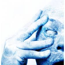
Logo is Greek for "word", so the PF prism and GG's face are definitely not logos.
That would mean all bands have logos... Except for Prince's "symbol" album. But then again, Prince was not a band... I think I confused myself 
|
|||||
 |
|||||
|
miamiscot
Forum Senior Member
Joined: April 23 2014 Location: Ohio Status: Offline Points: 3426 |
Post Options
Thanks(0)
Quote Reply
Posted: February 02 2021 at 09:51 |
||||
Great band. Yeah, those first two albums were awesome. I played the hell out of them when I needed a break from Yes, King Crimson, Genesis, ELP, Jethro Tull and Pink Floyd.
|
|||||
|
The Prog Corner
|
|||||
|
|||||
|
CPicard
Forum Senior Member
Joined: October 03 2008 Location: Là, sui monti. Status: Offline Points: 10837 |
Post Options
Thanks(2)
Quote Reply
Posted: February 01 2021 at 13:34 |
||||
|
So... I thought it was a topic about bands WITHOUT logos... Who made it derail???
 |
|||||
|
|||||
|
Shadowyzard
Forum Senior Member
Joined: February 24 2020 Location: Davutlar Status: Offline Points: 4506 |
Post Options
Thanks(0)
Quote Reply
Posted: February 01 2021 at 12:22 |
||||
|
"Do you see what happens when you f**k a logo in the ass?" (Compare it with my signature.)

Edited by Shadowyzard - February 01 2021 at 12:24 |
|||||
|
|||||
|
dr wu23
Forum Senior Member
Joined: August 22 2010 Location: Indiana Status: Offline Points: 20477 |
Post Options
Thanks(0)
Quote Reply
Posted: February 01 2021 at 10:24 |
||||
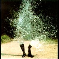
 BOC...on all lp's so it is a band symbol at least. The BOC logo was created by Bill Gawlik, the artist who created the band's first and second album covers. It is a stylization of the astronomical symbol for the planet Saturn
|
|||||
|
One does nothing yet nothing is left undone.
Haquin |
|||||
|
|||||
|
Ronstein
Forum Senior Member
Joined: October 13 2020 Location: Wiltshire, UK Status: Offline Points: 1275 |
Post Options
Thanks(0)
Quote Reply
Posted: February 01 2021 at 04:13 |
||||
|
Traffic used a logo (as opposed to the band name).
 I thought that the Rolling Stones lips logo was used for the Rolling Stones Records record label though (a bit like the Beatles and Apple)
|
|||||
|
|||||
|
Frenetic Zetetic
Forum Senior Member
Joined: December 09 2017 Location: Now Status: Offline Points: 9233 |
Post Options
Thanks(0)
Quote Reply
Posted: January 30 2021 at 23:18 |
||||
Anybody have a high-res rip of band logos just like the above, PNG/TIFF? Thank you in advance!
|
|||||
|
"I am so prog, I listen to concept albums on shuffle." -KMac2021 |
|||||
|
|||||
|
cstack3
Forum Senior Member
VIP Member Joined: July 20 2009 Location: Tucson, AZ USA Status: Offline Points: 6761 |
Post Options
Thanks(0)
Quote Reply
Posted: January 30 2021 at 23:13 |
||||
|
Bands with multiple members (ELP) or long names seemed to use logos, i.e. GTR:
|
|||||
|
I am not a Robot, I'm a FREE MAN!!
|
|||||
|
|||||
|
Easy Money
Special Collaborator 
Honorary Collaborator / Retired Admin Joined: August 11 2007 Location: Memphis Status: Offline Points: 10336 |
Post Options
Thanks(0)
Quote Reply
Posted: January 30 2021 at 16:01 |
||||
|
This was very common at one time, maybe still is? [/IMG]https://clipground.com/pic/get Edited by Easy Money - January 30 2021 at 16:05 |
|||||
|
|||||
|
AFlowerKingCrimson
Forum Senior Member
Joined: October 02 2016 Location: Philly burbs Status: Offline Points: 16242 |
Post Options
Thanks(0)
Quote Reply
Posted: January 30 2021 at 15:53 |
||||
I stand corrected then. I wasn't thinking of live albums. Yes, Seconds out has the same band lettering(font) as lamb and also the same as and then there were three. Genesis live uses the same font as Foxtrot and NC. I forgot that but it makes sense.
|
|||||
|
|||||
|
Awesoreno
Forum Senior Member

Joined: October 07 2019 Location: Culver City, CA Status: Offline Points: 2888 |
Post Options
Thanks(1)
Quote Reply
Posted: January 30 2021 at 14:12 |
||||
Pretty sure Seconds Out also uses the Lamb font. The group The Musical Box also uses the Nursery Cryme/Foxtrot font for their band, understandably.
|
|||||
|
|||||
|
suitkees
Forum Senior Member
Joined: July 19 2020 Location: France Status: Offline Points: 8731 |
Post Options
Thanks(0)
Quote Reply
Posted: January 30 2021 at 14:10 |
||||
Actually, I stand corrected: reading the wiki-page on this, what should be a tour poster at first became intentionally something more "branding". The fact they didn't continue to use it as their logo on subsequent albums (which led me to my statements) clearly doesn't mean it was not intended as a logo (maybe ephemeral at first, but it became too iconic not to use it again).
Edited by suitkees - January 30 2021 at 14:15 |
|||||
|
The razamataz is a pain in the bum |
|||||
|
|||||
|
rushfan4
Special Collaborator
Honorary Collaborator Joined: May 22 2007 Location: Michigan, U.S. Status: Offline Points: 65939 |
Post Options
Thanks(0)
Quote Reply
Posted: January 30 2021 at 14:02 |
||||
|
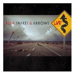
One of my favorite bands and probably my favorite logo. i was always doodling this on my book covers back in my high school days many, many years ago. 
Edited by rushfan4 - January 30 2021 at 14:03 |
|||||
|
|||||
|
|||||
|
AFlowerKingCrimson
Forum Senior Member
Joined: October 02 2016 Location: Philly burbs Status: Offline Points: 16242 |
Post Options
Thanks(0)
Quote Reply
Posted: January 30 2021 at 13:58 |
||||
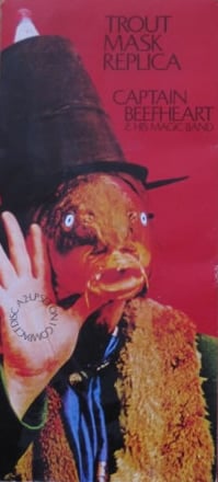
Not that I change my answers but I think this makes things a bit more flexible. Some on here were being a bit inflexible about what a logo is and admittedly my definition may have been a bit loose. To some on here logo equals image but image doesn't equal logo(I suppose). But when you say image there's no way the GG guy and PF's prism don't qualify as those band's most recognized images. |
|||||
|
|||||
|
AFlowerKingCrimson
Forum Senior Member
Joined: October 02 2016 Location: Philly burbs Status: Offline Points: 16242 |
Post Options
Thanks(0)
Quote Reply
Posted: January 30 2021 at 13:53 |
||||
|
^My god, if the rolling stones lips and tongue isn't a band logo then nothing is.

|
|||||
|
|||||
|
suitkees
Forum Senior Member
Joined: July 19 2020 Location: France Status: Offline Points: 8731 |
Post Options
Thanks(0)
Quote Reply
Posted: January 30 2021 at 13:49 |
||||
I understand your point, but for me this is just an image that has become very identifiable with a band (not to say "product"), like the bearded guy has become for Gentle Giant. But firstly it wasn't designed as logo and secondly they didn't use it consistently, not even on the subsequent albums, as their "brand mark" or as logo as such, and I doubt they used it in their letter heads (but I must admit that I never received a letter from the Rolling Stones). For me, a very identifiable image can become emblematic/iconic, but it doesn't make it a logo, which is something intentionally designed to communicate a brand name (or band name, for that matter). This
Edited by suitkees - January 30 2021 at 13:52 |
|||||
|
The razamataz is a pain in the bum |
|||||
|
|||||
|
AFlowerKingCrimson
Forum Senior Member
Joined: October 02 2016 Location: Philly burbs Status: Offline Points: 16242 |
Post Options
Thanks(0)
Quote Reply
Posted: January 30 2021 at 13:47 |
||||
The tongue was on an album? If so I can't remember which one. Yes, I googled logos and for PF the prism came up. It's definitely a log in my opinion. I just didn't feel like arguing with him so I said "agree to disagree" otherwise the discussion would go around in circles for the next ten years. Anyway, I admit there can be a thin line be between a logo and a band's lettering but that's a different thing. By the way, typically responses go under the quotes. It makes it easier to find responses and thus easier to read.
 Edited by AFlowerKingCrimson - January 30 2021 at 13:49 |
|||||
|
|||||
|
JD
Forum Senior Member

Joined: February 07 2009 Location: Canada Status: Offline Points: 18373 |
Post Options
Thanks(0)
Quote Reply
Posted: January 30 2021 at 12:29 |
||||
|
^^which is why I would support
Edited by JD - January 30 2021 at 12:29 |
|||||
|
Thank you for supporting independently produced music
|
|||||
|
|||||
|
The Anders
Forum Senior Member

Joined: January 02 2019 Location: Denmark Status: Offline Points: 3529 |
Post Options
Thanks(0)
Quote Reply
Posted: January 30 2021 at 12:27 |
||||
|
If there is a band logo I actually like, it will have to be this one. The band Tv-2 was formed in 1981 at a time when the national broadcaster DR still had monopoly on television. Right-wing politicians had been pushing forward for many years for a TV2 because they thought DR was too left-wing (The broadcaster TV2 didn't see the light of day until 1988). I guess the band Tv-2 wanted to ironise on the debate (their lyrics are often very ironic). It works well because it really looks like a TV logo. |
|||||
|
|||||
|
suitkees
Forum Senior Member
Joined: July 19 2020 Location: France Status: Offline Points: 8731 |
Post Options
Thanks(0)
Quote Reply
Posted: January 30 2021 at 12:16 |
||||
|
^ Yes, I do...
 But these are more classic logos, i.e. the name or initials logotyped. But there are not many brands that accomplished to use just an image or symbol as their logo (some petrol companies, some banking companies, nike...), let alone bands... But these are more classic logos, i.e. the name or initials logotyped. But there are not many brands that accomplished to use just an image or symbol as their logo (some petrol companies, some banking companies, nike...), let alone bands... |
|||||
|
The razamataz is a pain in the bum |
|||||
|
|||||
|
Post Reply
|
Page 12> |
| Forum Jump | Forum Permissions You cannot post new topics in this forum You cannot reply to topics in this forum You cannot delete your posts in this forum You cannot edit your posts in this forum You cannot create polls in this forum You cannot vote in polls in this forum |


 Topic Options
 TerLJack wrote:
