| Author |
 Topic Search Topic Search  Topic Options Topic Options
|
Dean 
Special Collaborator


Retired Admin and Amateur Layabout
Joined: May 13 2007
Location: Europe
Status: Offline
Points: 37575
|
 Posted: October 13 2010 at 16:51 Posted: October 13 2010 at 16:51 |
|
twinging?
|
|
What?
|
 |
GY!BE
Forum Senior Member

Joined: July 27 2010
Location: Montreal
Status: Offline
Points: 538
|
Posted: October 13 2010 at 16:58 |
|
It can be worse but it's definitly not the best one, it's a bit too much, simple is better.
|
|
Formentera Lady
Forum Senior Member

Joined: August 20 2010
Location: Germany
Status: Offline
Points: 1768
|
Posted: October 13 2010 at 17:05 |
 DisgruntledPorcupine wrote: DisgruntledPorcupine wrote:
TheGazzardian wrote:
I think this one is the best one compositionally. Visually, the other elements don't distract from the progarchives logo, which is nicely centered. The faces on either side are the most prominent of the other elements, and they face towards the center, so they really draw the eye to the logo. The background has lots of nice details, but they feel like the background. The only thing that maybe could be changed in this one is using some of the iconic album art used in the one we hav now - I don't actually recognise too much of what's in this one. |
You perfectly described my thoughts about it.  |
I agree to the above. Also I think the header should more blend into its surrounding. The blue colour of the current header does not really fit to the surrounding violet colour, IMHO.
|
|
Stooge
Forum Senior Member

Joined: April 09 2009
Location: Toronto, Canada
Status: Offline
Points: 1003
|
Posted: October 13 2010 at 17:07 |
Of the ones in the initial post, I like the 1st (the current header), 3rd and 4th ones the best for what my opinion is worth. The 6th and 7th ones work for me as well. As for the vote, the closest option for me is the 4th one. I like it, but I wouldn't be bothered by any tweaks if they are requested and implemented. I can't think what I'd change about it, maybe if the logo was centered??? I'd say "sharpen" the logo or something to that effect, but my graphic design jargon is rather rusty  . I guess some of the character overlap of the logo is a concern, so maybe a more defined border around the lettering could hep (at least for where that Kansas guy stands). It's probably easier to leave it as it is than to try to decipher what I'm trying to suggest. I'm better off giving thumbs up or thumbs down with regards to these issues. In terms of better or worse with how the main page looks, I'll say better than from how I remember it.
Edited by Stooge - October 13 2010 at 17:20
|
|
Evolutionary Sleeper
Special Collaborator
Honorary Collaborator
Joined: December 30 2008
Location: Berkeley, CA
Status: Offline
Points: 7037
|
Posted: October 13 2010 at 17:40 |
 I like this one best.
|
|
|
|
Slartibartfast
Collaborator


Honorary Collaborator / In Memoriam
Joined: April 29 2006
Location: Atlantais
Status: Offline
Points: 29625
|
Posted: October 13 2010 at 18:28 |
Hey dude, careless is two words unless you actually mean careless.... Well, I've changed my mind, the last time I looked at it, it sprained my eyes. Now I have no choice to sue. Either that or Wake Up Little Susie. 
Edited by Slartibartfast - October 13 2010 at 19:09
|
Released date are often when it it impacted you but recorded dates are when it really happened... 
|
|
darksideof
Forum Senior Member
Joined: February 22 2007
Location: Newark N.J.
Status: Offline
Points: 2318
|
Posted: October 13 2010 at 20:11 |
|
|
|
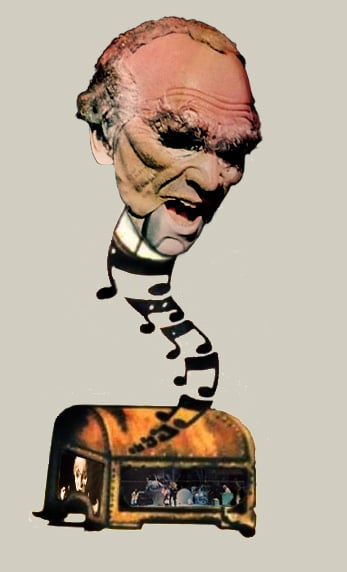
http://darksideofcollages.blogspot.com/
http://www.metalmusicarchives.com/
https://www.facebook.com/pages/Darksideof-Collages/
|
|
clarke2001
Special Collaborator

Honorary Collaborator
Joined: June 14 2006
Location: Croatia
Status: Offline
Points: 4160
|
Posted: October 13 2010 at 20:12 |
|
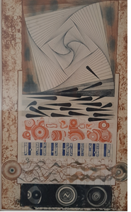
I don't like it, and it looks half-baked.
Why?
1. Well, I don't mind the change, and the collage, but first and foremost it clashes with traditional PA colours: it's blue - moreover it's Royal Navy Bule - and the rest of the website's surface is purple. If it had been purple (and/or orange) I wouldn't object.
2. The characters from the various album covers look they're cut out in papers and glued to the surface, not doing justice to the effort the designer did with blending, transparent layers, and authors drawing (as seen in the right corner).
3. In my opinion, it should be more sublime and less fanboyish.
4. It should 'melt' with the background, perhaps with some nice gradient on the edges, so that is not visible the banner is square, more like a hazy nebula without defined edges. Or, it may have the rough edges but then it must with the rest of the site's appearance.
5. I can forgive everything (and get used to) but I can't stand a smudge of purple colour that remain in 'P' of 'ProgArchives'.
There's more (as well as a few positive things) but enough of my criticism.
|
|
|
|
darksideof
Forum Senior Member
Joined: February 22 2007
Location: Newark N.J.
Status: Offline
Points: 2318
|
Posted: October 13 2010 at 20:18 |
Let see if you guys can notice the improvements or a bit changes that I just did. 
Edited by darksideof - October 13 2010 at 20:25
|
|
http://darksideofcollages.blogspot.com/
http://www.metalmusicarchives.com/
https://www.facebook.com/pages/Darksideof-Collages/
|
|
darksideof
Forum Senior Member
Joined: February 22 2007
Location: Newark N.J.
Status: Offline
Points: 2318
|
Posted: October 13 2010 at 20:21 |
Lark the Starless wrote:
It's alright but, it needs some improvement...better than anything I could muster up though  |
check it out.!
|
|
http://darksideofcollages.blogspot.com/
http://www.metalmusicarchives.com/
https://www.facebook.com/pages/Darksideof-Collages/
|
|
darksideof
Forum Senior Member
Joined: February 22 2007
Location: Newark N.J.
Status: Offline
Points: 2318
|
Posted: October 13 2010 at 20:34 |
Dean wrote:
twinging? |
I am horrbible speller  Man! I meant tingling.
|
|
http://darksideofcollages.blogspot.com/
http://www.metalmusicarchives.com/
https://www.facebook.com/pages/Darksideof-Collages/
|
|
40footwolf
Forum Senior Member
Joined: March 08 2010
Status: Offline
Points: 651
|
Posted: October 13 2010 at 22:05 |
|
Compositionally it's an improvement, but that color scheme has still got to go.
|
|
Heaven's made a cesspool of us all.
|
|
peart_lee_lifeson
Forum Senior Member
Joined: February 22 2009
Location: North Dakota
Status: Offline
Points: 305
|
Posted: October 13 2010 at 22:06 |
|
I like it. Some of the others are better though.
|
|
cyclysm748
Forum Senior Member

Joined: August 28 2008
Location: ND
Status: Offline
Points: 116
|
Posted: October 13 2010 at 22:14 |
|
I like the simplicity and elegance of the original.
|
|
stonebeard
Forum Senior Member

Joined: May 27 2005
Location: NE Indiana
Status: Offline
Points: 28057
|
Posted: October 13 2010 at 22:35 |
|
In all seriousness, PA needs some of that good old Geocities charm.
|
|
|
|
Jörgemeister
Forum Senior Member

Joined: February 10 2008
Location: Nauticus
Status: Offline
Points: 2296
|
Posted: October 13 2010 at 22:45 |
Cone and jaw crusher? damn! my work still haunts me even at PA forums
|
|
I Could have bought a Third World country with the riches that I've spent
|
|
Chela
Forum Senior Member

Joined: July 27 2010
Location: California
Status: Offline
Points: 165
|
Posted: October 14 2010 at 01:11 |
My problem with it, is that it's a bit too bright 
that, and nothing seems to flow, images are just put on there...
Not as bright as THIS, but still bright :
These two are my favorite though :
Don't recognize the images on the first one, but i love the color scheme and both seem to flow right to the logo 
Good job on all these though  I could never do that 
|
|
Ivan_Melgar_M
Special Collaborator
Honorary Collaborator
Joined: April 27 2004
Location: Peru
Status: Offline
Points: 19535
|
Posted: October 14 2010 at 01:17 |
I like more the original serious one, not because the collage is bad, but because we have already a personality (this looks more like a fan club art), and also looks too similar to the idea of the one used by Musica Progresiva.org
Which BTW is much more sober than ours.
But most important, I will talk as a lawyer:
All this drawings are protected by copyright laws, and even when some artists and bands are friendly, some are not.
Even when the author of the "ITCOTCK" has died, the band already protected this art cover with a copyright sign I verified) and King Crimson's lawyers are not famous for authorizing the use of their property.
If I'm not wrong, they already made Prog Archive delete all the samples of King Crimson music.
We are risking ourselves to a legal process, and that will end the site as we know it, because even if we win, the costs will be so high that M@X could be able to close the site.
So unless you have got the EXPRESS CONSENT of each and every artist and band, I would suggest to delete it.
Iván
Edited by Ivan_Melgar_M - October 14 2010 at 01:22
|
|
|
|
progkidjoel
Prog Reviewer
Joined: March 02 2009
Location: Australia
Status: Offline
Points: 19643
|
Posted: October 14 2010 at 02:11 |
Exactly what I was thinking 
|
|
|
|
someone_else
Forum Senior Member
VIP Member
Joined: May 02 2008
Location: Going Bananas
Status: Offline
Points: 23998
|
Posted: October 14 2010 at 02:41 |
Voted for the 3rd option, but I like this one:
and this one:
as well.
|
|
|
|
Donate monthly and keep PA fast-loading and ad-free forever.
/PAlogo_v2.gif "Progarchives.com Homepage")


 Do you like the new PA Header?