Progarchives.com has always (since 2002) relied on banners ads to cover web hosting fees and all.
Please consider supporting us by giving monthly PayPal donations and help keep PA fast-loading and ad-free forever.
/PAlogo_v2.gif "Progarchives.com Homepage") |
|
Post Reply 
|
| Author | |
topofsm 
Forum Senior Member 
Joined: August 17 2008 Location: Arizona, USA Status: Offline Points: 1698 |
 Topic: WTF is up with the progressive metal color scheme? Topic: WTF is up with the progressive metal color scheme?Posted: July 21 2009 at 01:55 |
|
I mean just look at it!
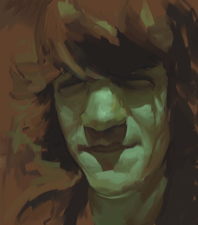
A lot of the albums have just a bland tan/brown/yellowish color scheme! Scenes From a Memory, The Perfect Element, Second Life Syndrome. BORING.
Others just have other muted colors, like LTE 2 and Perfect Symmetry. Real cool guys, yeah you are all really creative.
And then some of them are just greyscale with maybe one or two coloroed spots, like Operation Mindcrime, Out of Myself, and Awake. UGH!
I mean what's happening? Are the progressive metal guys not even trying to come up with a decent cover? Do they think that by making plain colored albums will make them stand out in the crowd? Or maybe they just think that their music is so great that a decent cover will kill the listening experience.
In any event, they should learn from their more br00tal counterparts in the Tech/Extreme category. These guys know how to make album covers. BLACK, BLACK, BLACK, some deep reds or blues and weird humanoid figures all over the place. In any event, these are cool covers, and they match the music inside the package, which is actual metal, and not just standard rock with more distorted guitars like those in the Progressive metal category.
Maybe Progressive Metal bands are just afraid to use the cool black colors because they're afraid the extreme metal heads will beat them senseless for stealing their color scheme, so they just use other neutral colors that aren't as br00tal.
In any event, this is definetely why progressive metal isn't as good as tech/extreme prog metal. Their album covers simply aren't as good. Plain as that.
An only sort of serious rant by topofsm.
|
|
 |
|
 |
|
|
Conor Fynes
Prog Reviewer 
Joined: February 11 2009 Location: Vancouver, CA Status: Offline Points: 3196 |
Posted: July 21 2009 at 02:03 |
|
Well... let's take Opeth for example here.
Opeth make music that coincides perfectly with their album art... Would you be able to see an album cover for 'Still Life' that had rainbows and lots of colour to it? Blackwater Park, for another example...?
It just wouldn't fit in. 'Metal' is generally alot less whimsical and colourful than other genres.
|
|
|
|
|
Atavachron
Special Collaborator 

Honorary Collaborator Joined: September 30 2006 Location: Pearland Status: Offline Points: 64598 |
Posted: July 21 2009 at 02:15 |
|
depends on the artwork, I rather like Riverside's covers use of a monochromatic palette.. the problem with many metal album covers is lack of originality, it's almost always some dripping, skull-laden scene with winged creatures and spiky logos
|
|
|
|
|
Epignosis
Special Collaborator

Honorary Collaborator Joined: December 30 2007 Location: Raeford, NC Status: Offline Points: 32482 |
Posted: July 21 2009 at 06:09 |
|
Complain if you like, but in the Dream Theater artwork poll I made, Scenes from a Memory came out on top.
Metal people like brown and yellow. Go figure. |
|
|
|
|
horsewithteeth11
Prog Reviewer

Joined: January 09 2008 Location: Kentucky Status: Offline Points: 24598 |
Posted: July 21 2009 at 14:32 |
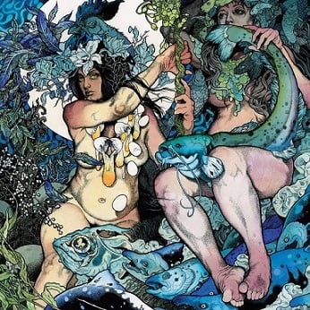
Green is my favorite color and always has been. That should tell you what album has one of my favorite covers (hint: it's not a metal album).  Edited by birdwithteeth11 - July 21 2009 at 14:33 |
|

|
|
|
|
|
JJLehto
Prog Reviewer

Joined: April 05 2006 Location: Tallahassee, FL Status: Offline Points: 34550 |
Posted: July 21 2009 at 14:34 |
I like black and only black. The color of my soul......... *runs into the forest shrieking* |
|
|
|
|
Plankowner
Special Collaborator
Honorary Collaborator Joined: April 09 2008 Location: Florida Status: Offline Points: 4006 |
Posted: July 21 2009 at 22:42 |

Duck.
|
|
|
|
|
Atavachron
Special Collaborator
Honorary Collaborator Joined: September 30 2006 Location: Pearland Status: Offline Points: 64598 |
Posted: July 21 2009 at 22:57 |
CttE |
|
|
|
|
topofsm
Forum Senior Member
Joined: August 17 2008 Location: Arizona, USA Status: Offline Points: 1698 |
Posted: July 22 2009 at 01:29 |
|
Thanks for taking my thread so seriously. Now I can continue and talk about how the Crossover peoples use too much white and that the Jazz Fusion guys have some kind of an obsession with celestial bodies and shiny things.
|
|
|
|
|
|
|
|
Post Reply
|
|
| Forum Jump | Forum Permissions You cannot post new topics in this forum You cannot reply to topics in this forum You cannot delete your posts in this forum You cannot edit your posts in this forum You cannot create polls in this forum You cannot vote in polls in this forum |


 WTF is up with the progressive metal color scheme?
 Topic Options
 Epignosis wrote: